| Image |
Comment |
| 08/31/2008 09:13:21 PM |
The Wingwalkersby taljComment: You should have ordered up some clear blue skies for this one! (OK, I suppose there are some things that you can't control.)
Good composition, and clarity. |
 Photographer found comment helpful. Photographer found comment helpful. |
| 08/31/2008 09:11:26 PM |
VvrrrooooooomM!by timwest167Comment: Seems a little early to start steering to the left. Seriously. . . Dude! Go straight!
Ok, I really like this one. It's not really a new idea, but I guess that having the right gear makes all the difference! |
| Photographer found comment helpful. |
| 08/31/2008 09:09:18 PM |
Silent Lookoutby beneeComment: While I like your composition and choice of subject, there is not a lot to make this image stand out here. The colors are a little subdued, and the main subject does not really pop. |
| Photographer found comment helpful. |
| 08/31/2008 09:03:38 PM |
that lookby mcieslakComment: She's a pretty girl, but other than that, I don't see a lot making this image stand out from the crowd.
I do like the sharpness of the main subject and the effective use of DOF to isolate her from the background, though. |
| Photographer found comment helpful. |
| 08/31/2008 08:57:37 PM |
Land Meets Seaby wickee_oneComment: Nothing wrong with this image. There is a great panoply of color and the composition is pleasing. Even the sky is cooperating with the lines drawing the eye to the main subject at the end of the pier.
My only wish here would be to see more detail in the house. I think this might give the image a much more active main subject as it seems to be almost lacking one as is. |
| Photographer found comment helpful. |
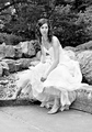
| 08/31/2008 08:41:54 PM |
Waitingby JeniYComment: First off, she's beautiful and I would love to see the outtakes from this shoot. Perhaps a close up with her looking into the camera. . . but I digress.
I really want to like this image, but I find that the centered composition detracts as does the B&W treatment. It really doesn't leave enough contrast between the white of her dress and the surroundings for my taste. |
| Photographer found comment helpful. |
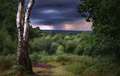
| 08/31/2008 08:36:59 PM |
A DISTANT STORMby dippydazComment: I will give you props for the lighting here. This almost looks like an indoor set, with the foreground and backdrop lighting absolutely perfect. At the same time, I find it difficult to find a single focal point in this image and the colors are a bit drab. |
| 08/31/2008 08:31:25 PM |
Giraffe at Sunriseby bspurgeonComment: I love it! Forget the fact that it's sharp as a tack and wonderfully composed. . . It made me chuckle! This is a great shot! There are 489 shots in this challenge. I'm through 5 of them, and I already hope to see you on the front page! |
| Photographer found comment helpful. |
| 08/31/2008 08:23:15 PM |
downtownby kolasiComment: I just want to rotate this image about 8.32 degrees clockwise. Maybe I'm a bit OCD. Still, I really like the B&W processing of your shot and the lines all tend to draw you up and into the image. Nicely done. |
| Photographer found comment helpful. |
| 08/31/2008 08:16:22 PM |
Weatheredby neilvanComment: Great detail! So much so, that I'm not sure where to look. You have effectively used the DOF to give a sharpness to the red areas, but my overall impression is of a very busy image. |
| Photographer found comment helpful. |
Home -
Challenges -
Community -
League -
Photos -
Cameras -
Lenses -
Learn -
Help -
Terms of Use -
Privacy -
Top ^
DPChallenge, and website content and design, Copyright © 2001-2025 Challenging Technologies, LLC.
All digital photo copyrights belong to the photographers and may not be used without permission.
Current Server Time: 04/12/2025 05:35:29 PM EDT.