| Image |
Comment |
| 10/10/2006 01:40:08 PM |
Tuborg Goldby saevarjoComment: Nice lighting & colours & black background, but WAY too much "sky". Try cutting most of the top off the picture for a wide aspect ratio |
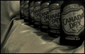
| 10/10/2006 01:38:10 PM |
Canada Dryby SnyderslComment: nice perspective line. I like the horizontal texturing. It's a shame the front and rear cans are not both in focus, but you can't have everything. |
 Photographer found comment helpful. Photographer found comment helpful. |
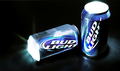
| 10/10/2006 01:36:03 PM |
|
| Photographer found comment helpful. |
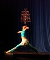
| 10/10/2006 01:35:17 PM |
So Good- You Can't Have Just One...by JadeComment: For me, this is not advertising a drink. In my opinion this also gets close to a photo of (moving) art, rather than an arty photo. Fine line, and I'm sure others will disagree. |
| Photographer found comment helpful. |
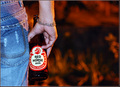
| 10/10/2006 01:32:55 PM |
Roughin' It!by derekmartinigComment: Colourful, bold composition. And funny. I have one compositional comment - the hand posture is not at all natural for someone lying in a bath - it looks like the bottle is being held for the photo, possibly even with the wrong hand. I would expect a hand to wrap around more. And a niggle - there's some jpeg noise on the feet. |
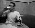
| 10/10/2006 01:29:32 PM |
Harp Beer.............Enjoyby squidviciousComment: I like the way everything works together to give an impression of, oo, I dunno, 1960s? Table, chair, tiles, glasses, hair. I like the contrast. The man seems out of focus. There are several jpeg artefacts from making the picture too compressed, especially around the elbow, glass and table edge. The vertical lines are not vertical. |
| Photographer found comment helpful. |
| 10/10/2006 01:25:47 PM |
real man's choice.by kundimansabuwanComment: Great colours and lighting. The subject seems a little too much to the left for me. Maybe the horse head should be 1/3 across. The hand pose looks a little uncomfortable as if the bottle is deliberately being held to show the label. |
| Photographer found comment helpful. |
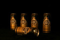
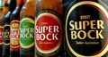
| 10/10/2006 01:22:18 PM |
Selectionby xvixComment: I like the choice of colours and perspective, and just the right amount of condensation.
There's something about the front two bottles that makes me feel a bit queasy, though, like they're tipping forwards or to the left or something. Perhaps the image is cropped off-centre from an original that had strong tapering parallels. |
| Photographer found comment helpful. |
Home -
Challenges -
Community -
League -
Photos -
Cameras -
Lenses -
Learn -
Help -
Terms of Use -
Privacy -
Top ^
DPChallenge, and website content and design, Copyright © 2001-2025 Challenging Technologies, LLC.
All digital photo copyrights belong to the photographers and may not be used without permission.
Current Server Time: 04/09/2025 07:59:51 AM EDT.