| Image |
Comment |
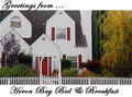
| 11/20/2006 05:37:25 AM |
Welcome to Heron Bayby IndigoButterflyComment: This picture feels a little unbalanced to me. I think it has to do with the thick white borders you have chosen. They seem to merge with the tops of the chimney and dormers and the top of the house is cropped off. Also, there is so much white going on except for just 1/3 of the vertical where the tree resides. Score: 5. |
 Photographer found comment helpful. Photographer found comment helpful. |
| 11/20/2006 05:30:21 AM |
|
| Photographer found comment helpful. |
| 11/20/2006 05:29:04 AM |
F#CK SHOESby kdeleonComment: Nice shot. I've been to Wrightsville beach and I like the way you mangaged to minimize the number rocks (there were a tone of them rocks/shells). From a postcard perspective, it is good. Score: 6. |
| 11/20/2006 05:27:36 AM |
|
| Photographer found comment helpful. |
| 11/20/2006 05:27:13 AM |
|
| Photographer found comment helpful. |
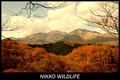
| 11/20/2006 05:25:43 AM |
Autumn in Japanby TOYComment: Great Shot. Would suggest a different choice of text. Comes off as wavy letters and too block in style. Score: 8. |
| Photographer found comment helpful. |
| 11/20/2006 05:21:59 AM |
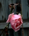
The Last Roseby NikonJebComment: I'm just not sure what this would convey from a "postcard" perspective. It's a decent shot, but just not something I would think of purchasing. It has a depressing feel to it with the dead stalk and the drooping pink rose. Score: 4. |
| Photographer found comment helpful. |
| 11/20/2006 05:19:21 AM |
Treehuggers Welcome!by Army of nOneComment: Cute shot. Nice bokeh and great capture of the squirrel. You might want to bump the contrast of the text up a bit as it needs to stand out a bit more in my opinion. Score: 6. |
| 11/20/2006 05:16:46 AM |
THE CATHEDRALby rosiehallComment: The composition is great, but you may want to rethink the text. It is very pixelated and the purples just seem out of place. Score: 5. |
| Photographer found comment helpful. |
| 11/20/2006 05:15:15 AM |
I ONLY HAVE EYES FOR YOUby krglComment: This just doesn't convey "Postcard" to me. I like the lines and it looks like a drawing, but the drawing looks more sorrowful than happy or romantic. Score: 5. |
| Photographer found comment helpful. |
Home -
Challenges -
Community -
League -
Photos -
Cameras -
Lenses -
Learn -
Help -
Terms of Use -
Privacy -
Top ^
DPChallenge, and website content and design, Copyright © 2001-2025 Challenging Technologies, LLC.
All digital photo copyrights belong to the photographers and may not be used without permission.
Current Server Time: 04/08/2025 03:04:11 PM EDT.