| Image |
Comment |
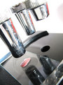
| 07/04/2006 02:45:47 AM |
Microscope Glass Slideby meendeeComment: Very nearly spot-on. The composition, the framing, the angle, the depth of field (just narrow enough), the white-point (bleaching out whatever is above the lens barrels) - all great. The three lense barrels lead the eye nicely down to the specimen on the slide - inspired.
I wonder, though, if the lense barrels could've been cleaned up a bit for the shot. And some of the specs of dust cleaned away from around the slide.
Picky, picky, picky... |
 Photographer found comment helpful. Photographer found comment helpful. |
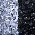
| 07/04/2006 02:39:04 AM |
Ebony and Ivoryby Elvis_LComment: There's a lot I like about this shot. The mix of clear and frosted glass, allowing for transluscence, refraction and reflection to all feature. The strong contrast between left and right. The way the refraction allows light to travel into the "dark" side, and vice versa.
But does it need to be so nearly symmetrical? And vertical? And square? Maybe you tried other positioning, and it didn't work so well... |
| Photographer found comment helpful. |
| 07/04/2006 02:34:24 AM |
|
| Photographer found comment helpful. |
| 07/04/2006 02:33:20 AM |
|
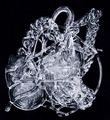
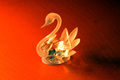
| 07/04/2006 02:31:51 AM |
Swan with the light of a candleby melancoholicComment: I think you've worked the properties of the glass quite powerfully here - both the refraction of the clear glass and the transluscence of the frosted glass. It creates a pleasing effect. The contrast with the red background works well too, as does the fade from bright red to black.
The subject does look just a little "plonked in the centre", though. |
| 07/04/2006 02:29:25 AM |
|
| Photographer found comment helpful. |
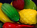
| 07/04/2006 02:27:54 AM |
Black and whiteby xantangummiComment: A nice idea. The shot is well framed, and taking the "black and white" theme right through the cruets' contents, the title and the choice of monochrome reproduction is good.
It's a shame that the detail is kinda washed out in the middle by the backlight, and that you didn't have sufficient depth of field to keep the pepper kernels in focus. |
| Photographer found comment helpful. |
| 07/04/2006 02:23:18 AM |
|
| Photographer found comment helpful. |
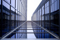
| 07/04/2006 02:12:00 AM |
Stairway to Heavenby fotojunkieComment: Nicely done.
I particularly like the broken curve of the reflection of the right-hand building. It's rather incongruous given that the buildings are all (presumably) built straight. Something for the eye to ponder...
I wonder whether you could have framed it so that the high-point of the buildings wasn't dead-centre of the composition. But then you might have lost the framing effect of the lowermost sills at the bottom and right edge. Could you have cropped it to get a similar framing effect on the left, too?
It's a shame that the sky is bleached out. Maybe the shot would've worked better at a different time of day?
For all that, it's still a fine shot. |
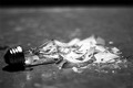
| 07/04/2006 02:01:41 AM |
Lights out!by acrotideComment: Evocatively captured. The stark lighting and use of monochrome works well to create a sense of urban blight that goes beyond a mere broken light bulb. |
| Photographer found comment helpful. |
Home -
Challenges -
Community -
League -
Photos -
Cameras -
Lenses -
Learn -
Help -
Terms of Use -
Privacy -
Top ^
DPChallenge, and website content and design, Copyright © 2001-2025 Challenging Technologies, LLC.
All digital photo copyrights belong to the photographers and may not be used without permission.
Current Server Time: 04/13/2025 01:00:58 PM EDT.