| Image |
Comment |
| 04/07/2004 01:16:30 PM |
|
 Photographer found comment helpful. Photographer found comment helpful. |
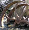
| 04/07/2004 01:13:24 PM |
Old-Mill Wheelby rileyComment: The exposure is a little blown out in the back. Cool subject, but a different time of day may have made for better lighting. |
| Photographer found comment helpful. |
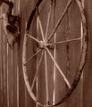
| 04/07/2004 01:12:25 PM |
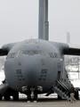
Wheels Of Oldby linkybonComment: I think the cropping here was a little too tight. Maybe a little breathing room on the bottom and/or the show the entire wheel on top? |
| Photographer found comment helpful. |
| 03/30/2004 04:55:33 PM |
|
| 03/28/2004 11:31:20 AM |
Cat Fancyby SharonSComment: I generally don't like cat photos. This is an extraordinarily well lite cat. I think you could drop cats and dogs all day long into the potrait setup and you'd have a nice flow of side money coming in from pet lovers. Wow. I don't see anything off the mark here, and I've been looking. 10 |
| Photographer found comment helpful. |
| 03/28/2004 11:27:21 AM |
The Golden Years - Springby zeuszenComment: Nice theme, and good use of B & W. I think the aspect ratio is little wider than I would suspect for a magazine. This gets the message across well. |
| Photographer found comment helpful. |
| 03/28/2004 11:26:05 AM |
|
| Photographer found comment helpful. |
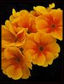
| 03/28/2004 11:25:34 AM |
Flower & Gardenby jjbeguinComment: Very well done. Excellent contrast between the colors and black. I even like the border select on the redish orange. I hope this does well for you. |
| Photographer found comment helpful. |
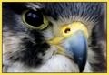
| 03/28/2004 11:22:48 AM |
TIMEby RonBComment: Great framing. This really looks like it would be on the Cover of TIME. The composition is strong as well. The only thing keeping it back from the highest marks is a bit of camera shake. It appears the shutter was too low? Below 1/60 perhaps, or a long lense vibrated on you. Not much you can do about this now, but this is great entry. If it was crystal clear, I'd think you might have ribbon'd. |
| Photographer found comment helpful. |
| 03/27/2004 04:40:46 PM |
Bird Timesby pitsamanComment: The border is a bit overwhelming and the landscape format detracts from the Magazine Cover idea. Outside of those two items, strong image, very well captured. |
| Photographer found comment helpful. |
Home -
Challenges -
Community -
League -
Photos -
Cameras -
Lenses -
Learn -
Help -
Terms of Use -
Privacy -
Top ^
DPChallenge, and website content and design, Copyright © 2001-2025 Challenging Technologies, LLC.
All digital photo copyrights belong to the photographers and may not be used without permission.
Current Server Time: 04/11/2025 11:08:41 PM EDT.