| Image |
Comment |
| 08/08/2006 02:32:29 PM |
|
 Photographer found comment helpful. Photographer found comment helpful. |
| 08/08/2006 07:49:48 AM |
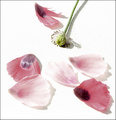
Pieces of flowerby sessaComment: Just a touch over exposed. I am not sure if you meant to do it on purpose, but I would actally like to see a bit more of the edge of the petals where the white meets white.... I have an image that I'm currently working on fixing a similar problem with. In yours, it looks like there is enough information there that you could probably make the adjustment in photoshop CS using the Image> Adjustments> Shadow/Highlight, as suggested in this turorial:
//www.photoshopsupport.com/tutorials/jennifer/fix-overexposed.html |
| Photographer found comment helpful. |
| 08/08/2006 07:40:39 AM |
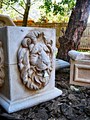
Pieces of a Fountainby BK26Comment: Looks like the image is a little over saturated- makes the shadows look un-naturally blue, and the leaves/sky in the background are over exposed which is a little distracting from the subject. |
| 08/08/2006 07:34:20 AM |
|
| Photographer found comment helpful. |
| 08/02/2006 10:20:18 AM |
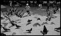
Water Fight Stalemateby vtruanComment: What a fun picture!
I would adjust the levels on the green channel just a bit, just to reduce some of the greenish tint. |
| Photographer found comment helpful. |
| 08/02/2006 10:17:06 AM |
freeby mrsamsaComment: Nice photo! I would suggest adjusting the levels a bit... brighten up the mid-tones and the whole image just a bit. |
| Photographer found comment helpful. |
| 07/27/2006 08:12:18 AM |
Shaken, not stirred.by StudyinLightComment: I just didn't really like this photograph- it didn't really jump out at me as a compelling image when I compare it to others in this challenge. Kind of dark and blurry. However, it is nicely framed and the tilt helps the composition- makes for an interesting shape with the lights in the upper left. |
| 07/26/2006 07:46:29 PM |
|
| Photographer found comment helpful. |
| 07/26/2006 09:47:55 AM |
LOCOby fordmanf1Comment: Love it... nice composition and the hint of color in the reflections is great. |
| Photographer found comment helpful. |
| 07/26/2006 09:46:38 AM |
Circle of Shapesby siexhasxADDComment: hmm.. maybe I just don't "get it"... but I rated this low because it's blurry and I didn't feel that the pattern was all that interesting on its own. |
| Photographer found comment helpful. |
Home -
Challenges -
Community -
League -
Photos -
Cameras -
Lenses -
Learn -
Help -
Terms of Use -
Privacy -
Top ^
DPChallenge, and website content and design, Copyright © 2001-2025 Challenging Technologies, LLC.
All digital photo copyrights belong to the photographers and may not be used without permission.
Current Server Time: 04/07/2025 06:22:30 AM EDT.