| Image |
Comment |
| 09/02/2006 09:10:36 PM |
I See Youby avtramsayComment: What a fun image! Just wish you had taken advantage of the 720 pixel width allowance, I want to see it bigger:) |
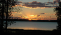
| 09/02/2006 06:55:04 PM |
Sunset on the Bayby magrovesComment: Pretty colors, the sun rays make for a nice effect and I like that the trees frame the composition. The horizon line needs to be leveled. |
 Photographer found comment helpful. Photographer found comment helpful. |
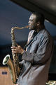
| 09/02/2006 02:38:59 PM |
A Swingin' Affairby rhipsterComment: Very good clarity and detail. Seems a little too tall, would crop from the top to get rid of some of that background space, maybe halfway between where it is now and his head. |
| Photographer found comment helpful. |
| 09/02/2006 02:24:50 PM |
Mother & Childby manic35Comment: I like they they are wearing similar outfits. I think though that the white shirts against the white background blend a little too much, especially on the mother's back. Myabe grey shirts.. or a grey or slightly textured background... or just some burning where the shirt lines are. I think compositionally this would be more grounded if the foot was not cut off. Also, and this is a nit-picky thing, I can see quite a bit of pixelation on the white background- not counting that against you, just thought I'd mention it... I can only see it because I recently calibrated my monitor, otherwise I would have never known. 6 |
| Photographer found comment helpful. |
| 09/01/2006 12:09:23 PM |
Freedomby parrotheadComment: Great composition, nice colors. The edges of the silhouette are a little strange- over sharpened maybe? |
| Photographer found comment helpful. |
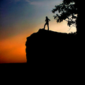
| 09/01/2006 11:45:57 AM |
"Gotcha!"by jrjrComment: Very nice composition... maybe a bit over processed? There is a halo around the figure... and some noise... but, it can be improved with a little bit of work. |
| Photographer found comment helpful. |
| 09/01/2006 11:28:41 AM |
The Silent Standby JudiComment: Lots of wow factor for me. The detail in the umbrella designs is very cool!
I think if you spend some more time with this applying advanced editing techniques, it might be worth the work to paint/sharpen the ground and horizon outlines and blend in the saturation halos. |
| Photographer found comment helpful. |
| 09/01/2006 11:24:32 AM |
A Tranquil and Peaceful Eveningby woodseyComment: Back and forth on whether or not I like the amount of detail... Curious to see what it would look like with some layer ajustments to remove the details and up the brightness of the blue. Also could use a counterclockwise rotation to level the horizon. |
| Photographer found comment helpful. |
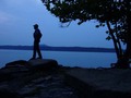
| 09/01/2006 11:21:12 AM |
Jetti Walking At Duskby Penny LaneComment: Very nice image, so colorful and I like that the silhouette of the pier leads to the interesting cloud formation in the upper right. Could use a small clockwise rotation to better level the horizon line. |
| Photographer found comment helpful. |
| 09/01/2006 08:29:44 AM |
As the city awakens...by diablo2097Comment: The lighting and reflections are very pretty. I like the colorfulness of this image and the quietness conveyed. I would suggest a slight clockwise rotation to level the horizon lines so that the building look more upright instead of the slight lean to the left.7 |
| Photographer found comment helpful. |
Home -
Challenges -
Community -
League -
Photos -
Cameras -
Lenses -
Learn -
Help -
Terms of Use -
Privacy -
Top ^
DPChallenge, and website content and design, Copyright © 2001-2025 Challenging Technologies, LLC.
All digital photo copyrights belong to the photographers and may not be used without permission.
Current Server Time: 04/07/2025 06:16:30 AM EDT.