| Image |
Comment |
| 08/04/2006 05:49:11 AM |
|
 Photographer found comment helpful. Photographer found comment helpful. |
| 08/04/2006 05:40:20 AM |
Mana from heavenby BrennanOBComment: I really like this and it fits the challenge very well. I'm not even quite sure what is going on but I love the kids faces and actions!
I would say it could use a bit more saturation and contrast. Otherwise, great compostion and photo! |
| Photographer found comment helpful. |
| 08/04/2006 05:40:11 AM |
Out of the Blueby ZoomdakComment: I have no idea what's going on here and I love it!
Composition, colors and subject are great. Very Nice! |
| Photographer found comment helpful. |
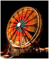
| 08/04/2006 05:39:30 AM |
Dizzy Lightsby DeniseBernadetteComment: I love this. Colors and subject are great. Could have been cropped a little better so it wasnt centered and bottom 1/3 is a little messy. |
| Photographer found comment helpful. |
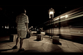
| 08/03/2006 08:57:12 AM |
Last Train to Nowhereby CutterComment: This is my favorite. I love the tones and lighting. My only critque is maybe the focus should be a little more on the train movement. Cropping out some of the left side would have helped this. |
| Photographer found comment helpful. |
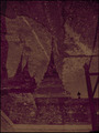
| 07/15/2006 01:01:20 PM |
101 Years of Progressby Jason_CrossComment: great image. I really like the subject and idea. Only critique would be the framing, it seems oddly cropped at the bottom. |
| Photographer found comment helpful. |
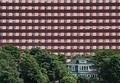
| 07/15/2006 12:58:17 PM |
Is Bigger Better?by KarenNfldComment: I love this image. I love the perspective (and what its commenting on)I love the color contrast. I think the way you framed it so thee larger building takes up the entire frame is perfect. My only critique would be I wish you could see a little bit of the ground plane, it feels chopped off at the bottom. |
| Photographer found comment helpful. |
| 07/15/2006 12:58:15 PM |
|
| Photographer found comment helpful. |
| 07/03/2006 08:59:31 AM |
|
| 07/03/2006 08:59:03 AM |
Kitchen Tableby fernandacapibaribeComment: This lacks creativity. These pieces dont actually fit the category (doesnt hold water). Also the background looks as if it was supposed to be white, but its kind of pink instead. |
Home -
Challenges -
Community -
League -
Photos -
Cameras -
Lenses -
Learn -
Help -
Terms of Use -
Privacy -
Top ^
DPChallenge, and website content and design, Copyright © 2001-2025 Challenging Technologies, LLC.
All digital photo copyrights belong to the photographers and may not be used without permission.
Current Server Time: 04/07/2025 06:12:59 AM EDT.