|
|
| Image |
Comment |
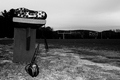
| 10/26/2006 06:00:27 PM | Forgottenby DJWoodwardComment: I like nearly everything in this shot. Only minor thing is the tops of the goal posts get lost in the clouds a bit, but that's pretty minor. I love the positions and lighting on the shoes. Good job! |  Photographer found comment helpful. Photographer found comment helpful. |
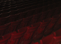
| 10/26/2006 05:58:36 PM | Seat Patternby gg3rdComment: Crisp focus, good lighting, the contrasting colors really pop. I would have cropped it differently, though, maybe doing square with one of the yellow stripes running diagonally through it to enhance the abstractness of it. Well done. | | Photographer found comment helpful. |
| 10/26/2006 05:55:47 PM | 'Til Next Sundayby ElaineComment: Oooh, so close! This would have been a fantastic shot with a bit more contrast and maybe brightened up a bit. From the looks, the lighting must have been pretty low, but I can't help but think some post-proc would have made everything snap a bit more. | | Photographer found comment helpful. |
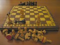
| 10/26/2006 05:54:17 PM | CheckMateby RefreshComment: Nice try on challenge interpretation, but the execution didn't make it work. The contrast is way too flat, particularly for an indoor shot like this, and it looks to have a yellow-greenish cast to it. I know this is nit-picky, but having played chess, I can't think of a way the pieces could have gotten into this layout, and in the way I'm used to playing, the captured pieces would be on opposite sides (white player keeps black pieces, and vice-versa). With a couple things fixed, though, this would have been a nice shot. |
| 10/26/2006 05:48:41 PM | Basketball Game's Over - Go On Homeby crewmndComment: For such a stark image, the subject is very subtle. I had to look a couple times before I realized what my perspective was. I find myself trying hard to like this, but my eye keeps wandering off the right side of the picture into that big expanse of darkness. Technically quite well done, though. | | Photographer found comment helpful. |
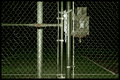
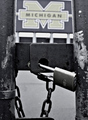
| 10/26/2006 05:43:50 PM | Come back next weekendby sandeep_tataComment: Nice concept, but the execution didn't quite make it. Given the prominance of the lock and gate, I feel it should have been in crisp focus. Must have been an overcast day, too, for the image to have such flat contrast. | | Photographer found comment helpful. |
| 10/26/2006 05:40:57 PM | Der Anti-Sporterby renefunkComment: I struggled scoring this one. I get what you're trying to do, pushing the limits of the challenge and all, but between fighting with the challenge description (no sports, no venue, and people in the image), and my visceral reaction to the model's annoying expression, I just can't bring myself to like this shot. | | Photographer found comment helpful. |
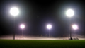
| 10/26/2006 05:36:32 PM | October Fogby becky-leeComment: Good concept, pretty well executed. If it had been me, I would probably have cropped in a bit, maybe doing portrait mode to get the rightmost two lights, bleachers, and some of the grass. As it is, the brightness of the lights keep my eyes so high, I almost miss the beautifully lit fog. |
| 10/26/2006 05:34:01 PM | Empty Car Parkby sunraygpComment: Within the possibilities of the lighting, this was technically well executed. Tough to work with such flat lighting, though. I'm sure it would have turned out better with a bit more sunlight to make the colors pop and give some more contrast. Unfortunately, nothing in this shot jumps out at me and grabs my attention. When I look at it, my mind goes "Eh, another stadium". | | Photographer found comment helpful. |
| 10/26/2006 05:31:31 PM | Reckless Abandonby paulb_17Comment: I can't tell what the subject is, but I'll give you the benefit of the doubt and guess it is a golf course. Not a bad shot, but the sky dominates so much it detracts from the subject. Compared to the sky, though, the foreground feels muddy, which further reduces the impact of what (I think) the subject is. | | Photographer found comment helpful. |
Home -
Challenges -
Community -
League -
Photos -
Cameras -
Lenses -
Learn -
Help -
Terms of Use -
Privacy -
Top ^
DPChallenge, and website content and design, Copyright © 2001-2025 Challenging Technologies, LLC.
All digital photo copyrights belong to the photographers and may not be used without permission.
Current Server Time: 04/07/2025 05:52:25 AM EDT.
|