| Image |
Comment |
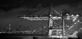
| 02/04/2008 06:12:33 PM |
Rainy Terminalby AshatseaComment: Great view of seattle! Seems a little overexposed on the right, and perhaps just a little fuzzy/too noisy on the left. Suprised you got this close and this shot with security. Ive tried to get here before and definately got turned away. Its really very nice, but says industry more than architecture to me |
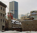
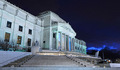
| 02/04/2008 05:57:04 PM |
Overshadowing Historyby codfishComment: good concept. Problem here is that there is so much white. Also, I think things need a bit more saturation anyway. Like I said, great concept, just needed a bit more on the execution |
 Photographer found comment helpful. Photographer found comment helpful. |
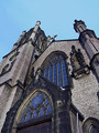
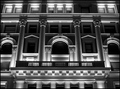
| 02/04/2008 05:54:10 PM |
St. James Episcopal Churchby ZeppKashComment: The exposure really brings out the stone work on this, which is very nice. Good color, contrast and everything. The problem is that my eye wanders because there is not that main, great thing to catch it. Good photo, but maybe a different angle would provide the final touch it needs |
| Photographer found comment helpful. |
| 02/04/2008 02:51:52 PM |
|
| Photographer found comment helpful. |
| 02/04/2008 02:51:20 PM |
|
| Photographer found comment helpful. |
| 02/04/2008 02:50:50 PM |
|
| Photographer found comment helpful. |
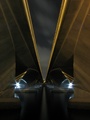
| 02/04/2008 02:49:58 PM |
Where Art Livesby Nikolai1024Comment: BEAUTIFUL lighting and angle on this. One of my faves I think. The sky in the background ads a lot. So dramatic. Great work! |
| Photographer found comment helpful. |
| 02/04/2008 02:47:53 PM |
Detailby bjoernComment: Cool location and lamp. I think shooting this at night when the lamp is on would have been great! |
| Photographer found comment helpful. |
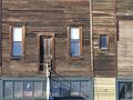
| 02/04/2008 02:47:14 PM |
Windowsby gminkComment: I would try a totally different approach to this shot. IMHO, the most fascinating part of this building are the old windows in the brown section with the white shades, and the cool old wood around them. I think that zooming in on those, turning it to black and white, and really playing with the contrast and levels of this photo would have brought out some cool detail in the wood. Right now, its to straight on. |
| 02/04/2008 02:33:24 PM |
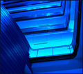
Blue Buildingby notaniceguytoknowComment: Its blue alright! Its a very nice, different look. I think that some of the brighter areas are a bit blown out though. Good work on being creative with the angle! |
| Photographer found comment helpful. |
Home -
Challenges -
Community -
League -
Photos -
Cameras -
Lenses -
Learn -
Help -
Terms of Use -
Privacy -
Top ^
DPChallenge, and website content and design, Copyright © 2001-2025 Challenging Technologies, LLC.
All digital photo copyrights belong to the photographers and may not be used without permission.
Current Server Time: 04/14/2025 01:17:30 PM EDT.