| Image |
Comment |
| 11/05/2008 10:29:19 PM |
|
 Photographer found comment helpful. Photographer found comment helpful. |
| 10/01/2008 12:47:51 AM |
businessby MephistoComment: nice light / tones. I would be interested to know your lighting setup. |
| Photographer found comment helpful. |
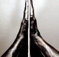
| 09/10/2008 08:17:46 AM |
just say a little prayerby cutoutComment: I like the original concept and the composition with the two hands. Unfortunately there is for me a number of technical issues: the shot is very noisy and the right hand is cut at the top. So i gives me the feeling of a good idea but a disappointing execution. |
| Photographer found comment helpful. |
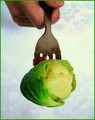
| 09/10/2008 08:14:52 AM |
Come on.......ahhhh.......the last train to Brussels!by naomikComment: ok it did take me a bit of a while to get it. duh I'm slow I hope (for you) that people are quicker than me. Nice idea. Having said that, two things I would have preferred differently for my taste: 1/ the dirty fork. ok I get that it should feel like it's the end of the meal, but still I would have preferred a clean fork. 2/ the central part of the background looks burnt out on my supposedly calibrated monitor. |
| Photographer found comment helpful. |
| 09/10/2008 08:06:08 AM |
|
| Photographer found comment helpful. |
| 09/08/2008 09:39:22 AM |
|
| Photographer found comment helpful. |
| 09/04/2008 08:46:56 AM |
Difficultby silverfoxxComment: I'm a bit less fan of this one - at least as a stand-alone photo. Of course it's my personal opinion. I'm sure it must fit well in the series, but I find it too mundane (?), in particular the wooden wall. I don't see the black make-up on your eyes and overall I don't feel this strangeness that I like in the rest of the series. |
| Photographer found comment helpful. |
| 09/04/2008 04:42:07 AM |
touchingby Martini_BeachComment: not sure the finger adds anything, to the contrary , at least for my taste |
| Photographer found comment helpful. |
| 09/04/2008 04:40:24 AM |
Curiousby JacksonGarietyComment: there are some mistakes in this image for my taste, which is unfortunate because lighting and subject are good. The too distracting mistakes for me are the shadow to the left, which would have been easily erased in PP, and the fact that the right hand covers part of the face. |
| Photographer found comment helpful. |
| 08/08/2008 12:39:14 AM |
Un charme fouby benpicturesComment: completely underrated -well imo at least. Gave you a 9. The colors and composition are so good. |
| Photographer found comment helpful. |
Home -
Challenges -
Community -
League -
Photos -
Cameras -
Lenses -
Learn -
Help -
Terms of Use -
Privacy -
Top ^
DPChallenge, and website content and design, Copyright © 2001-2025 Challenging Technologies, LLC.
All digital photo copyrights belong to the photographers and may not be used without permission.
Current Server Time: 04/18/2025 07:42:38 AM EDT.