| Image |
Comment |
| 02/22/2008 06:19:17 PM |
Oops! (original image_ID=36236)by NobodyComment: beautiful take on the original. nice and sharp, clean, simple - I like that you added the whisk - lighting is great, no harsh reflections... no nitpicks even |
 Photographer found comment helpful. Photographer found comment helpful. |
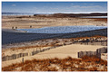
| 02/22/2008 06:18:02 PM |
Whiterook's "Shifting Sands" (522887)by Bear_MusicComment: wow, this looks almost like the same place as the original. beautiful remake. I love your colors, the compostion, the sharpness - even the cloud shadows add interest (also fantastic that your horizon is straight) |
| Photographer found comment helpful. |
| 02/22/2008 06:15:57 PM |
Morning Coffee #45691by h2Comment: beautiful remake of the original. very sharp, interesting background, great composition - the only thing is you're probably getting comments on the light reflections |
| Photographer found comment helpful. |
| 02/22/2008 06:14:41 PM |
"Beauty Remains" (Bits & Pieces Challenge)by LizArtDesignComment: very nice take on the challenge. everything looks great - very sharp, beautiful colors, no harsh glare on the glass - the only nitpick would be if you could possibly get the background whiter and the contents of the bowl just a tad brighter without affecting the glass reflections |
| Photographer found comment helpful. |
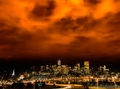
| 02/22/2008 06:09:50 PM |
30 Seconds or More - City on Fireby CutterComment: very beautiful take on the original. love your sky though it looks a bit grainy. your city is perfect, very sharp and perfectly lit. I think for your personal pic, I would try to clone out the green road sign at the bottom |
| 02/22/2008 06:07:26 PM |
Rhythm IIIby mangoComment: nice take on the original - the background is a little distracting and your keys don't seem to have much sharpness and could use some more contrast. the angle is interesting and this is a definite improvement over the original |
| Photographer found comment helpful. |
| 02/22/2008 06:06:05 PM |
|
| Photographer found comment helpful. |
| 02/22/2008 06:04:50 PM |
|
| Photographer found comment helpful. |
| 02/22/2008 06:02:57 PM |
blurry dreams of a lost childhoodby tnunComment: I think you've captured the feel that the original photographer was trying to create. I think this photo is a hard one to redo in the first place. maybe doing more of a close-up to a particular piece of playground equipment could have given this more interest. I think you did a great job keeping the focus and the lighting good with such a dark (outside) photo |
| Photographer found comment helpful. |
| 02/22/2008 06:00:29 PM |
Complementary Portrait - A Tribute to 'Dark Portrait'by mchalmersComment: I like that you used the actual complementary colors - your lighting could have been better... or maybe you used photoshop to turn your background orange. the orange seems to be flooding onto your model and shadow looks odd. your focus seems pretty good and I like the composition |
| Photographer found comment helpful. |
Home -
Challenges -
Community -
League -
Photos -
Cameras -
Lenses -
Learn -
Help -
Terms of Use -
Privacy -
Top ^
DPChallenge, and website content and design, Copyright © 2001-2025 Challenging Technologies, LLC.
All digital photo copyrights belong to the photographers and may not be used without permission.
Current Server Time: 04/07/2025 06:15:51 AM EDT.