| Image |
Comment |
| 10/06/2006 12:59:50 PM |
Majesticby jwillertonComment: Would have been a 10, but the border threw me off, since the scene travels outside that frame. |
| 10/06/2006 12:49:41 PM |
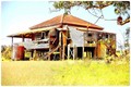
Abandoned Queenslander Homesteadby coolblueComment: Blowing out the colors as you have makes this shot seem much more unique than the standard run-down house shot. A little more definition in the foreground would lead the eye to the house a bit more, though. |
| 10/06/2006 12:46:52 PM |
|
 Photographer found comment helpful. Photographer found comment helpful. |
| 10/06/2006 12:37:52 PM |
Mosportby jduffettComment: The definition on the vehicle's hood and trunk are lost. Perhaps a light bit of sharpening applied to the car itself would bring that back out? |
| Photographer found comment helpful. |
| 10/06/2006 12:36:39 PM |
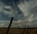
Ruralby eye has not seenComment: Technically, very nice leading lines and cloudscape. The overall shot seems somewhat underexposed, however. |
| 10/06/2006 12:34:24 PM |
Horrorby max90034Comment: The highlights seem way too blown out, and the sharpening on the spider when contrasted with the blur of the legs is distracting |
| Photographer found comment helpful. |
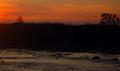
| 10/05/2006 02:56:55 PM |
Fire Skyby iianComment: Given the darkness of the shot, if you'd cut out the water portion where there remains some definition and left the definition in the sky and the bottom of the frame isolated the sheer black of the midground would act as such a stark division between the top and bottom thirds. |
| Photographer found comment helpful. |
| 10/05/2006 02:55:04 PM |
Flowby paulb_17Comment: this doesn't strike a chord with me. Contrast yes, but I'm missing the message implied by the contrast. |
| 10/05/2006 02:53:24 PM |
Harvestby fordmanf1Comment: Contrasting I get here, and more cleverly than most oversaturated black/whites in this challenge, but you've sharpened to the point of having haloes around the silhouettes, which detracts from the overall aesthetic for me. |
| Photographer found comment helpful. |
| 10/05/2006 02:49:46 PM |
Forktastic!by moonwellComment: While the contrast is definitely present, the oversharpening detracts from the overall frame. If the fork had been heavily sharpened, I could understand the contrast between the "oversharpened fork" will dull tines, however. |
| Photographer found comment helpful. |
Home -
Challenges -
Community -
League -
Photos -
Cameras -
Lenses -
Learn -
Help -
Terms of Use -
Privacy -
Top ^
DPChallenge, and website content and design, Copyright © 2001-2025 Challenging Technologies, LLC.
All digital photo copyrights belong to the photographers and may not be used without permission.
Current Server Time: 04/07/2025 06:16:20 AM EDT.