| Author | Thread |
|
|
10/07/2006 11:32:49 PM |
|
Comments Made During the Challenge  |
|
|
10/07/2006 11:14:49 AM |
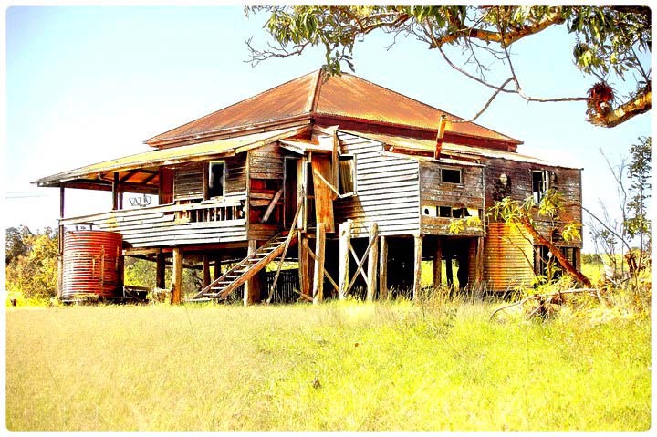
| Ouch. This seems to be really, really over exposed. Maybe you were going for that, but it just doesn't work for me. Sorry. |
|
|
|
10/07/2006 03:45:38 AM |
| love this so very much..... |
|
|
|
10/06/2006 12:49:41 PM |
| Blowing out the colors as you have makes this shot seem much more unique than the standard run-down house shot. A little more definition in the foreground would lead the eye to the house a bit more, though. |
|
|
|
10/04/2006 07:39:13 PM |
| very interesting building...strong colors |
|
|
|
10/04/2006 05:11:45 PM |
|
|
|
10/03/2006 07:23:14 AM |
| I believe the image may be a bit overexposed. Nice subject matter though. |
|
|
|
10/03/2006 06:24:17 AM |
|
|
|
10/02/2006 12:52:12 PM |
| In general this image is a little over-bright for my taste, but the colours and detail in the home seem to have been preserved well and add to the parched look of it all. |
|
|
|
10/01/2006 07:50:08 PM |
| The light is harsh, maybe moved in closer and lost some of the foreground. |
|
|
|
10/01/2006 03:07:27 PM |
| The whites are a bit overblown in this. Nice composition. |
|
|
|
10/01/2006 02:32:52 PM |
| Very nice subject and good use of the tree as framin, but it is definitely too washed out for my tast. Also, I think it might look a little better if shot from a lower angle or maybe a little closer so that the tree does not cover the top of the roof. 6 |
|
|
|
10/01/2006 01:58:39 PM |
| Nice - looks like a painting. A lot of visual interest here, but maybe would do better if darkened a bit. |
|
|
|
10/01/2006 04:59:24 AM |
| I bet there are a few red back spiders under the veranda and a snake or two as well. I remember the sound of rain (ever so rare I admit) on the corrugated tin roof. My mother, father and I drove the outback of Australia for the first years of my life in the 50s. 8. |
|
|
|
10/01/2006 04:42:22 AM |
| too much saturation and the brightness is really hard on my eyes. I think this would be excellent in black and white and toned down a bit. |
|
 Photographer found comment helpful. Photographer found comment helpful. |
|
|
09/30/2006 09:12:18 PM |
| This almost looks like a painting,and very nicely done.... |
|
Home -
Challenges -
Community -
League -
Photos -
Cameras -
Lenses -
Learn -
Help -
Terms of Use -
Privacy -
Top ^
DPChallenge, and website content and design, Copyright © 2001-2025 Challenging Technologies, LLC.
All digital photo copyrights belong to the photographers and may not be used without permission.
Current Server Time: 04/07/2025 02:01:17 PM EDT.