| Image |
Comment |
| 03/30/2007 11:50:48 AM |
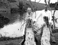
ring-a-ring-a-rosieby raltonComment: The image is too small. You should use all 640 pixels across. Unfortunately the motion does not come through in my opinion. |
| 03/30/2007 11:49:37 AM |
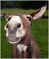
Herr Flickby michael_pComment: Great capture, I really like the contented expression on her face. Focus and exosure are perfect, nice composition. I border is a bit distracting, I feel it would work better if it was plain black and white. I am sure I won't be the only person to point out the typo in the title... |
 Photographer found comment helpful. Photographer found comment helpful. |
| 03/30/2007 11:45:52 AM |
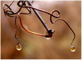
Trio.jpgby jpochardComment: I really like the almost abstract nature of this image. My favourite part of this image is the curves of the metal(?). The creamy background really makes the subject stand out. |
| Photographer found comment helpful. |
| 03/30/2007 11:43:30 AM |
Grievingby jpochardComment: I didn't vote on this challenge, but would have scored this highly. I can immediately see the personification. The plain black background helps to not steal attention away from the subjects of this image. The catch light on the falling tear drop just completes it. |
| Photographer found comment helpful. |
| 03/30/2007 11:39:46 AM |
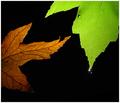
Boxed Inby jpochardComment: Awesome concept. I am not such a fan of the pink border, though that might just be me as I usually prefer simple black and white borders. The image could be sharper. |
| Photographer found comment helpful. |
| 03/30/2007 11:35:33 AM |
|
| Photographer found comment helpful. |
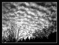
| 03/30/2007 11:34:08 AM |
Skyline Silhouette web.jpgby jpochardComment: I like the colours in the sky, and the reflected colours in the water. The "streak" at the stop adds nothing to the image IMHO, and I would clone it out. |
| Photographer found comment helpful. |
| 03/30/2007 11:31:20 AM |
|
| Photographer found comment helpful. |
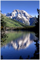
| 03/30/2007 11:29:00 AM |
8110 web.jpgby jpochardComment: Beautifully captured landscape. The symmetry and portrait orientation really works with this image. The branches on the left and the right help to frame the image and draw ones eye in. I do find the branches on the bottom of the frame slightly distracting, they throw off the symmetry. I would personally clone them out. |
| Photographer found comment helpful. |
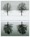
| 03/30/2007 11:25:34 AM |
By the Pond by jpochardComment: The simplicity really makes this shot. I like the symmetry that you have here on the vertical and horizontal axes. |
| Photographer found comment helpful. |
Home -
Challenges -
Community -
League -
Photos -
Cameras -
Lenses -
Learn -
Help -
Terms of Use -
Privacy -
Top ^
DPChallenge, and website content and design, Copyright © 2001-2025 Challenging Technologies, LLC.
All digital photo copyrights belong to the photographers and may not be used without permission.
Current Server Time: 04/07/2025 06:27:29 AM EDT.