| Image |
Comment |
| 06/14/2006 03:30:44 AM |
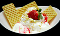
If It Makes You Happyby isonajComment: Nice image, but the white of the icecream is a little overbearing - maybe a bit more strawberry syrup would have helped. |
 Photographer found comment helpful. Photographer found comment helpful. |
| 06/14/2006 03:29:25 AM |
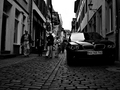
No Need to Walkby jgm5015Comment: I like your thinking on this, but the car doesn't really stand out; I certainly don't get a strong sense of indulgence.
The whole photo seems a bit dark to me; I can't see any tonal differentiation between much of the front car and the shadows underneath; the right side of the car (middle of the picture) blends into the background too much.
I guess you were trying to stop the reflections on the windscreen from blowing out. Perhaps another location, where some sort of roof or overhang blocked those shadows would have been better? |
| Photographer found comment helpful. |
| 04/06/2006 12:25:25 AM |
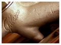
Tasty and Fillingby ericwooComment: Sorry, I didn't get to comment during the voting.
I was one of those who voted you 3. The technical aspects are quite good, the only possible problem is the washed-out highlights, but this is pretty minor. However, the image was just to ho-hum for me. For an abstract macro to create interest for me, there needs to be an interesting interplay of colour and/or shapes and/or lines and/or textures. The only one of these that your photo could be said to have is textures (colour is primarily middlish grey, shape is almost an amorphous blob with no strong shape or lines), and even the texture of the scratches and dents or the word is not that interesting visually.
A looser crop (to get more of the shape) might have helped - would probably need some changes to the lighting though. A tighter crop to about 1/6 of the photo in the top left corner (taking in the straight lines in the corner, plus cropping through the word so you get only some of the curves) could have been a more interesting composition.
I also felt the white border didn't really add anything in this particular image.
I hope this helps! |
| Photographer found comment helpful. |
| 03/30/2006 03:52:01 AM |
|
| Photographer found comment helpful. |
| 03/30/2006 12:32:31 AM |
Shell I Seaby blue jean babeComment: I think this would have worked better if there was more in focus, or less. The only sharp parts are right at the edge of the image leading the eye out of frame. |
| Photographer found comment helpful. |
| 03/30/2006 12:13:55 AM |
holeyby sodastreamerComment: Interesting idea, but i find it a bit uncomfortable to look at. |
| Photographer found comment helpful. |
| 03/30/2006 12:03:58 AM |
Modern touchby alintatocComment: A bit too busy for my liking, and the more interesting parts seem to be out of focus. |
| 03/29/2006 11:58:21 PM |
Carnivoreby phylsy7Comment: The fact that I can tell it is a venus fly trap does not deny the fact that it's a pretty good abstract. |
| 03/29/2006 11:56:15 PM |
|
| Photographer found comment helpful. |
| 03/29/2006 11:50:36 PM |
These are my favorite things...by AilurophileDJComment: It looks like there is a hair on your sensor, winding down the left half of the picture. I suspect it's actually part of what ou were photographing, but it spoils what would otherwise be a decent abstract study on line and shape. |
| Photographer found comment helpful. |
Home -
Challenges -
Community -
League -
Photos -
Cameras -
Lenses -
Learn -
Help -
Terms of Use -
Privacy -
Top ^
DPChallenge, and website content and design, Copyright © 2001-2025 Challenging Technologies, LLC.
All digital photo copyrights belong to the photographers and may not be used without permission.
Current Server Time: 04/07/2025 06:15:30 AM EDT.