| Image |
Comment |
| 06/21/2006 06:11:25 PM |
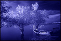
The River's Edgeby BudComment: Interesting infra-red type feel. Good composition. Normally I like saturated colours but the purple is just a little too intense for me. |
 Photographer found comment helpful. Photographer found comment helpful. |
| 06/21/2006 06:09:28 PM |
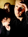
No Evilby LN13Comment: I like this image - the way the model is staring off into the middle distance suggests some sort of scary evil. The middle part has the most expressive face, it would be intreesting to see another version with a little more expression of fear, loathing or shock on the other two. Choice of simple white clothing helps to keep attention on the three faces, without hiding the fact that she is an attractive model.
|
| Photographer found comment helpful. |
| 06/21/2006 06:04:28 PM |
|
| Photographer found comment helpful. |
| 06/21/2006 06:02:59 PM |
2am... Still no idea what to shootby TygerrComment: I quite like this, an interesting take on a portrait/self-portrait. I'll be interested to see how you did it because it looked like it was manipulated. The red showing on the collar of the lower-left portrait is a little distracting. I'm in two minds about whether the large dark space in lower right is a little too large or not - but maybe that's part of the image, staring into nothingness. |
| Photographer found comment helpful. |
| 06/21/2006 05:57:08 PM |
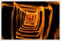
Burning Box of Fireby dan501Comment: Impressive image! I like the fact that you the flames go right to edge/corner of frames to reinforce the depth and feel of being "inside the box". If you wanted to, you could experiment with putting some sort of object at the end of the tunnel to add interest to the focal point. |
| 06/21/2006 02:37:56 AM |
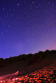
By the Fire Under the Skyby jdannelsComment: Good image. I like the opposing focal points of the fire in the bottom left versus the concentric circles drawing the eye to the upper right. Adding a little more (but not too much!) lighting of the grass etc. in the central band of the photo would have enhanced I think... with an exposure as long as yours, this would have been possible with a handheld light or even a controlled off-camera flash. But overall well conceived and executed. |
| Photographer found comment helpful. |
| 06/20/2006 11:19:14 PM |
Frozelicious Chocoladrippyberry Weddingcookieby rblantonComment: I'm having trouble beliving this didn't do better, it was the only one in the challenge that I scored 10. I thought met the subject perfectly, the composition is excellent and elegant in its simplicity, and the technical aspects were well executed, especially given the difficult extremes of contrast in the image. I thought you should have ribboned. Oh well. |
| Photographer found comment helpful. |
| 06/15/2006 05:33:08 AM |
Luxurious Train Ride - Indulge Your Sensesby adamwebComment: It's an interesting take on the topic... a little borderline though.
As an image, the composition and technicals seem to be fine, but the foreground scenery is rather dull and uninteresting to my mind. An image that concentrated on the mountains and the trees in front of it would be stronger, I think - although it wouldn't meet the challenge itself, of course. |
| Photographer found comment helpful. |
| 06/14/2006 07:53:12 AM |
Grabby UrfaKComment: I'm having trouble working out what it is... my best guess is something dangling down from the back of a woman's waist - something to grab? I'll be intrigued to find out what it is afterwards.
Anyway, it's an interesting abstract image! However it looks like you've done a little too much adjustment of the levels or curves, because I can see obvious colour banding in several parts, particular the light pinkish patch in the bottom-centre of the frame (that I interpreted as a woman's inside thigh). |
| Photographer found comment helpful. |
| 06/14/2006 07:20:53 AM |
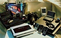
A Treadmill for your Walletby mComment: This fits the theme, but the arrangement of so many items just becomes awkward and messy; the objects look like they were arranged for a TV game show, I don't get any sense of strong composition or design in their placement. The harsh lighting and shadows hasn't helped either. I think this is a case of "less is more" - try with just two or three items, in an arrangement that either looks more artistic, or more "natural" like they belong together. |
| Photographer found comment helpful. |
Home -
Challenges -
Community -
League -
Photos -
Cameras -
Lenses -
Learn -
Help -
Terms of Use -
Privacy -
Top ^
DPChallenge, and website content and design, Copyright © 2001-2025 Challenging Technologies, LLC.
All digital photo copyrights belong to the photographers and may not be used without permission.
Current Server Time: 04/07/2025 06:19:15 AM EDT.