| Photograph Information |
Photographer's Comments |
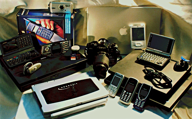
Challenge: Indulgence (Basic Editing III)
Camera: Canon EOS-20D
Lens: Canon EF 28mm f/1.8 USM
Location: EST5EDT
Date: Jun 8, 2006
Galleries: Still Life, Science and Technology
Date Uploaded: Jun 8, 2006
|
Upgrading, and staying on the forefront of technology.
I envy Ned Ludd.
I lost my cheap tripod in the hubbub of moving (misplaced, is more accurate), and my good tripod is at somebody else's house, I think (oops). Lighting is a hack, and could have been better (even with what I had: one 60W lamp from above, one freestanding flashlight from the left, and a mirror partially reflecting the lamp from the front left (illuminating primarily the faces of the three mobiles).
To be fair, there are actually three things in this picture still in use, only because what I wanted to use are missing or on loan. Speaking of things on loan, I'm missing three phones that I wanted to sprinkle about the picture ...
I also don't know where my M505 or Vx are. Basically, I just wanted to see how much stuff I just had laying around not being used. I also wanted to put my film point+shoot next to the digital one, but it seems to have grown legs as well.
Focal length : 28.0mm (35mm equivalent: 45mm)
Exposure time: 0.050 s (1/20)
Aperture : f/4.0
ISO equiv. : 1600 |
| Author | Thread |
Comments Made During the Challenge  |
|
|
06/20/2006 03:33:36 AM |
| yeah i'm a gadget guru too.... |
|
|
|
06/17/2006 05:05:59 AM |
| This probably is a man's point of view of indulgence. Good photo! |
|
 Photographer found comment helpful. Photographer found comment helpful. |
|
|
06/17/2006 03:20:04 AM |
| You have definitely met the topic of indulgence :-) but I think there's a little too much. To use the photo-critic style of some things I've read, my eye has nowhere to rest. |
|
| Photographer found comment helpful. |
|
|
06/15/2006 01:22:55 PM |
| Hehehehe...reminds me of my place. |
|
| Photographer found comment helpful. |
|
|
06/14/2006 07:20:53 AM |
| This fits the theme, but the arrangement of so many items just becomes awkward and messy; the objects look like they were arranged for a TV game show, I don't get any sense of strong composition or design in their placement. The harsh lighting and shadows hasn't helped either. I think this is a case of "less is more" - try with just two or three items, in an arrangement that either looks more artistic, or more "natural" like they belong together. |
|
| Photographer found comment helpful. |
Home -
Challenges -
Community -
League -
Photos -
Cameras -
Lenses -
Learn -
Help -
Terms of Use -
Privacy -
Top ^
DPChallenge, and website content and design, Copyright © 2001-2025 Challenging Technologies, LLC.
All digital photo copyrights belong to the photographers and may not be used without permission.
Current Server Time: 04/07/2025 12:23:46 AM EDT.