| Image |
Comment |
| 05/07/2006 04:24:42 AM |
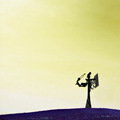
The Sorcerer's Might.by Dan_CottleComment: This is a comment from the Critique Club;
Let me tell you what I like;
-Nice use of space
-Composition is very good
-Subject is interesting and though ptovoking (also don't know what it is)
What needs work;
The score this image is about right for this image at DPC - DPC'ers like a crisp, sharp image with nice colours. Your blue and yellow doesn't fall into this category 100%. Some voters might vote you down for lack of knowing what the subject is. Maybe for something like this, try creating a name that is a bit more discriptive - which compliments the photo.
I see most of your entries is in the upper 4's and 5's. Now is the dificult imes to convert those to sixes. Love your work though. Good Luck. |
| 05/07/2006 01:54:57 AM |
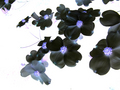
Seeing Purple Through Yellowby docurrieComment: This is a comment from the Critique Club;
Lovely flower shot. IMHO - the yellow forground doesn't work though. That is why this image didn't score above 6. Love the purple though. Can't see how people see it as "oversharpened". In fact, in my opinion the purple flower needs a tad more sharpening.
DOF and composition is very good.
I see you have a couple of positive 6 entries - This one was almost there. I know people would've punsihed you for that yellow. I see that somebody mistook DOF for noise - My opinion - and commented on the yellow and gave you a 2 :-( Think loads of votes went like this.
Anyhow - great work - keep it up.
marcel |
| 05/07/2006 01:46:16 AM |
Inverted Dogwoodby dpcollinsComment: This is a comment from the Critique Club;
Very nice image, good sharpness - works well as a negative. I like the background - gives a "glowing effect"
I agree with the crop issue. You have loose flowers on the top left hand side that "pulls" the eye.
I see you ended with almost 5,5 -which is basically in the range of your latest entries. You are now in that difficlut stage on how to get from 5 to 6 and then 7. Like your work though. |
 Photographer found comment helpful. Photographer found comment helpful. |
| 05/07/2006 01:39:41 AM |
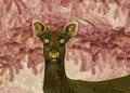
Designer Deerby ShutterPugComment: This is a comment from the Critique Club;
I agree with the commenters - you were robbed with this one. Great image, nice composition, Nice Contrast and good background.
Only thing I see that seems a bit off is the focus on the dear (ears specifically) Seems like the focus is strong on the background (which works well I might add), but not enough on the dear.
Other than that - 4.7 way too low for this image - At least a 5.7 or higher.
ps - maybe the dear was saw a Pug? |
| Photographer found comment helpful. |
| 05/07/2006 01:31:54 AM |
aibrubusby chriskoryComment: This is a comment from the Critique Club;
I liked this image in the challenge. It is simple yet very effective. Like how the sky makes the houses look like "doll houses". Image might not've been much to look it if it wasn't negative. Nice composition - colours work nice and I like that powerline. Reminds me of the game - DELTA FORCE.
Image does lack a bit of sharpness though. I see this is your first entry and to score above 5 on your first entry is good work. Keep it up and remember one thing at DPC - People here like clear, Sharp colourfull images. Go through the Challenge Archives to get an idea what score well and what not.
Best of luck. |
| 05/07/2006 01:25:01 AM |
harbor landscapeby renefunkComment: This is a comment from the Critique Club;
Great night shot. I think you got punished on this one due to the "Did not meet Challenge" issue. Some people might've had a hard time looking for the contrasting colours. I think that was your main problem on this one.
Commenting on the image - GREAT shot. Lovely colour and Sharpness. Maybe could've cropped a little away from the sky and include more of the water. Lots of "dead" space at the top.
Photo might also be a bit small - Try using the full 640pixels allowed.
Remember that this is my views only. Take it or leave it - Up to you. |
| Photographer found comment helpful. |
| 05/07/2006 12:06:50 AM |
harbor landscapeby renefunkComment: This is a comment from the Critique Club;
Let me tell you what I like;
Great night shot. Very little to no noise, Love the lights (I am a sucker for night shots). Nice long exposure to smoothen the water surface. All in All - Above average night shot.
What brought your scores down (IMHO);
The "does not fit the challenge issue". Think this is the most influencing factor that contributed to such a low score for such a nice image.
Complimenting on the night shot - Sharpness is good - Might try to crop our some of the sky though. Get more of the water in.
Truly a nice image. Pity about the DNMC issue. Keep up the good work.
Marcel |
| Photographer found comment helpful. |
| 05/06/2006 11:53:19 PM |
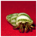
Red Carpet Strollby davidus428Comment: This is a comment from the Critique Club;
Had a look at some of your other stuff and I must comment on that - You have some great talent my friend, think you let yourself down with this entry (just a little bit)
First of all - let me tell you what I like -
Great composition, Interesting subject, Lovely colours, nice tecture.
What would I have done diferently -
If it was me, I would've made the DOF less. Try to get more of the shell in focus (also the carpet) to get more green in with the red.
Little bit of detail is lost on the crabs "face". Maybe a tad lighter with a bit more contrast.
All in all, a very good image. You must've had a lot of patience with this shot. These guys are small and shy.
What also might've influenced the lower score is the fact that not alot of people know what this is.
Great work - KEEP IT UP. Remember that this is "in my opinion".
Marcel |
| Photographer found comment helpful. |
| 05/06/2006 11:21:29 PM |
Troubled Kingby andresbgComment: This is a comment from the Critique Club;
First of all, let me tell you what I like about this image - I love the idea - I also like the background, it compliments the image nicely. I like the fresh angle you tried to capture - adds to the title.
What you could've done differently - The blue colour. If it was me, I would've done the shot in B&W and then take it to negative. The knight in the front is a bit distracting. It draws the eye away from the king. The foot of the knight is also cropped away (part of it).
Maybe try to have the tild in such a way that it goes from the top left corner (which you got) to the bottom right corner. This will compliment the black vs white idea nicely (two halves).
The edge (borders) of the chess board is also visible - bit distracting on right.
Other than that - nicely done. Cool idea and good execution. I see it is your highest challenge result and you also have one favourite. Good Work. |
| 05/06/2006 10:56:58 PM |
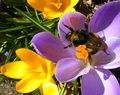
First Bee of Springby raishComment: This is a comment from the Critique Club;
First of all, let me tell you what I like - Like the colours of this shot. Fits in nicely with the Challenge. I also love the idea of the bee on the flower - Nice detail.
Stuff that needs work - Your image seems a bit soft - could do with some Sharpening - Especially on the yellow flowers and the bee.
Try using a bit more DOF. Your background is a tad distracting. OR you could make the background a solid colour by placing a background there. Black would've worked nice here.
The yellow on the flowers are a bit blown out. When taking a photo - rather underexposed than overexposed. Underexposed photos can still be worked on, but when the are blown out - nothing much you can do.
You can always try to change the angle of the shot as well - maybe get the bee on the purple flower in focys and use DOF to get the yellow flowers in the background. This will draw the viewers attention to the bee.
Lastly let me say this - although this is a good effort, you must always remember that there are thousands of flower shots out there. People will compare your flower shots to others (maybe they just paged through a gardening magazine etc) and this will influence your rating. You need to do something above the ordinary for your flower shot to stand out. Voters at DPC like to see Clear, Sharp, colourful images.
Good luck with other entries. |
| Photographer found comment helpful. |
Home -
Challenges -
Community -
League -
Photos -
Cameras -
Lenses -
Learn -
Help -
Terms of Use -
Privacy -
Top ^
DPChallenge, and website content and design, Copyright © 2001-2025 Challenging Technologies, LLC.
All digital photo copyrights belong to the photographers and may not be used without permission.
Current Server Time: 04/12/2025 07:15:05 AM EDT.