| Author | Thread |
|
|
05/07/2006 08:24:42 AM |
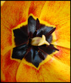
This is a comment from the Critique Club;
Let me tell you what I like;
-Nice use of space
-Composition is very good
-Subject is interesting and though ptovoking (also don't know what it is)
What needs work;
The score this image is about right for this image at DPC - DPC'ers like a crisp, sharp image with nice colours. Your blue and yellow doesn't fall into this category 100%. Some voters might vote you down for lack of knowing what the subject is. Maybe for something like this, try creating a name that is a bit more discriptive - which compliments the photo.
I see most of your entries is in the upper 4's and 5's. Now is the dificult imes to convert those to sixes. Love your work though. Good Luck. |
|
Comments Made During the Challenge  |
|
|
05/02/2006 10:02:39 PM |
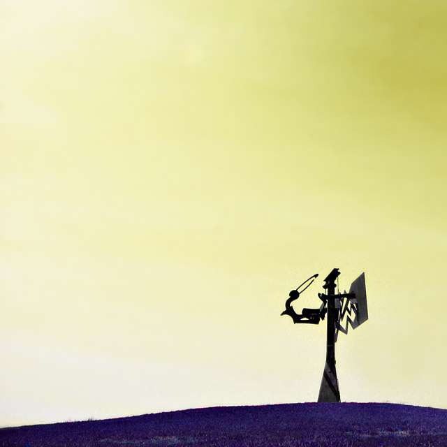
I like the figure, but what is he doing that makes him so mighty??
anyway, good pic :) |
|
|
|
05/02/2006 06:16:38 PM |
| It is a little difficult to distinguish what it is, but it a reall cool shot. |
|
|
|
05/01/2006 06:24:21 PM |
| Which complementary colors are here? Interesting for a silhouette or minimalism challenge, though. |
|
|
|
04/30/2006 07:01:26 PM |
|
|
|
04/30/2006 04:52:23 PM |
|
|
|
04/30/2006 04:42:43 PM |
| excellent shot, the colors are wonderful and the placement of the subject is right on |
|
|
|
04/29/2006 09:46:48 PM |
| this is a great picture; I'm sure it will do well here. It would have done great in the other challenge as well!!! |
|
|
|
04/29/2006 08:11:26 PM |
| seems like the colors were forced somehow. |
|
|
|
04/29/2006 02:22:04 PM |
| very very strange .... no idea what I'm looking at |
|
|
|
04/28/2006 04:28:47 PM |
| I wonder what this is - some sculpture? Curious to see the comment under the picture when the voting is over. |
|
|
|
04/27/2006 09:28:46 AM |
| Nice use of negative space. I think the colors are just not rich enough for this to work for complementary but I'd love it in black and white. I think it'd be an interesting study done that way. |
|
|
|
04/26/2006 11:17:34 PM |
|
|
|
04/26/2006 10:57:28 PM |
| 6 - Like this. Obviously a bit of hue adjusting pp, but it works in my opinion. Like to have seen the yellow sky more vivid if possible. No idea what the subject is. Perhaps a variation in composition, especially this size, may have given this a little extra in my opinion. |
|
|
|
04/26/2006 03:35:05 PM |
| Woah ! I don't know what it is, but I like it ! |
|
|
|
04/26/2006 04:59:23 AM |
| interesting...not sure what that is |
|
Home -
Challenges -
Community -
League -
Photos -
Cameras -
Lenses -
Learn -
Help -
Terms of Use -
Privacy -
Top ^
DPChallenge, and website content and design, Copyright © 2001-2026 Challenging Technologies, LLC.
All digital photo copyrights belong to the photographers and may not be used without permission.
Current Server Time: 02/01/2026 12:08:20 PM EST.