| Image |
Comment |
| 02/02/2003 12:56:54 PM |
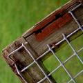
Absent Squares by paynekjComment: A wonderful use of shallow selective DOF. The crisp feel and texture of the wood and galvanized fence are visually deliciouso. The rust stain bit is the coup de grace. Good strong rural theme. The angled composiotion is a perfect choice along with the close up view. Very well done! |
| 02/02/2003 10:44:25 AM |
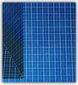
Squarewayby r_sandlerComment: Hot highlights, cor fringing on the bars and not total depth of field may tick a few marks off from the snobbish crowd. But hey I like the idea of climbing into heaven light myself with some guardian rainbow splashes. I also like the warm splash of sunlight contrasting with the subtle bluish tinge. And the vertical and horizontal lines are perfectly level or perpendicular, a well done feat of camera position. The high key light atmosphere of this image is charming. Warms my techno age heart. Good go! |
 Photographer found comment helpful. Photographer found comment helpful. |
| 02/02/2003 10:37:10 AM |
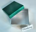
Something Too Rareby togtogComment: Well done intellectual comment. I should give you a 10 just for that (haha). The spanky colors certainly attract lots of attention. But my fav visual element is the really cool color contamination among the shadows from multiple lights. The subtle color interplay among reflections form the silver part and green casts from the upper lid are simply mahvelous my dear. Good tight composition and suitable DOF. Superior creative input deserves much applause. Great show! |
| Photographer found comment helpful. |
| 02/02/2003 10:30:59 AM |
ArchiSquaresby Dallas_TXComment: Great concept of geometry. And fab color to boot. Solid composition. Good pattern shot. |
| Photographer found comment helpful. |
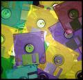
| 02/02/2003 10:28:56 AM |
Technology for squaresby MarklaneComment: I like the random splash of CD's. The odd brightish highlight may offend those purist nitpickers but not me. Some of the metal parts of the CD's have really cool colour tints, which I personally would like to view more of. Like the funky color thing. As a wee suggestion I find that reds are real eye grabbers and I tend to use them sparingly as accents in a composition. Hence that burgundy square in the top right is hauling my attention more so into that corner. Otherwise a reasonably good image. |
| Photographer found comment helpful. |
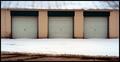
| 02/02/2003 10:22:09 AM |
Garage Squaresby alanfreedComment: I like the simple tones and easy on the eyes composition. A hair bright on the roof but that's liveable in my books. I would have cropped out the brown driveway to give the semi illusion of dangling teeth. But if the bottom brown works for you to give stability to the lower image section that is cool too. A nice comfortable image that settles well with a mug of hot cocoa. |
| Photographer found comment helpful. |
| 02/02/2003 10:18:12 AM |
Las Vegas Checkersby keoneComment: A good crisp shot with bright eye catching colors. A hair more elbow room around the board would be a bonus. Fits the challenge well. I would also like to see a blurry ghost hand move a marker to break up the static quality of the image ( just a personal whim ). A good straight forward shot. |
| Photographer found comment helpful. |
| 01/31/2003 03:48:44 PM |
The Unheardby AntithesisComment: Ghastly by George! Creative talent here which gets big kudos from this corner. I like the texture rippled glass and the shadowed body openings. Even more dramatic harsh shadows, a more hellish red and gritty beat up smokey frame could further accentuate your terrific idea. Make it Dantes inferno. Good luck. |
| Photographer found comment helpful. |
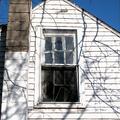
| 01/31/2003 03:42:53 PM |
Square in disrepairby 3boyzMomComment: A good idea. The crackle of branch shadows add to the psychological depth of your image. As my choice I would like to wave a magic wand and get closer to eliminate the sky and chimney as the story is told by the windows themselves. Only a suggestion to your worthy moment of inspiration. |
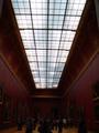
| 01/31/2003 03:36:19 PM |
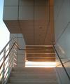
Louve Ceiling Panesby peggyComment: The power and visual weight of the light panel dwarfing the figures in the gloomy room is a marvel. Almost like a light chasm bursting through oppresion. A good strong photo with an unusual touch of the human element. The dark shadows and restrained hues are very efective. |
Home -
Challenges -
Community -
League -
Photos -
Cameras -
Lenses -
Learn -
Help -
Terms of Use -
Privacy -
Top ^
DPChallenge, and website content and design, Copyright © 2001-2025 Challenging Technologies, LLC.
All digital photo copyrights belong to the photographers and may not be used without permission.
Current Server Time: 04/11/2025 04:41:40 PM EDT.