|
|
| Image |
Comment |
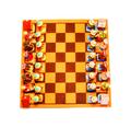
| 02/06/2003 05:45:33 PM | (simplicity) one big square - sixty four small squares - infinite outcomes (complexity)by tomzinhoComment: Greetings from the Critique Club!
COMPOSITION... I find the composition very pleasing, if not for some of the technical errors I will cover in my next paragraph... I think it fits the challenge very strongly, a very pleasing and symmetrical composition. Your description mentions your board is at an angle, but its too slight for me even to notice. I like the bird's eye framing, and the fact that its a unique and colorful chess set you just can't find anywhere. The whiteboard provides an elegant natural frame to the photo and really makes the colors stand out by putting them next to a space with absolutely no color at all. i didn't find there was too much negative space, and this comes from someone who generally does not like empty space in photos :) I think if you took out more white, it would look like an ordinary shot of a chess board.
TECHNIQUE... It was apparent even without your comments that the photo's saturation and exposure were pushed to the extreme. I'm not exactly sure why you chose to do this, though I do understand that it was intentional and not an "error" on your part. Nonetheless, I find the over saturation deteriorates the quality of the image you have, and makes it appear grainier than it should. Not a grain that's typical of a high speed 35mm film, but a grain that's courser, more pixellated and not as appealing as film grain. I tried reversing the saturation back to a normal level, and also removing some of the overexposure, and find the resulting image just as appealing, if not more appealing than this interpretation. I think the shot would actually look more fine and detailed without the extreme image modifications made. If you want to give your photo more punch, before saturating, try a levels adjustment. After i de-saturated the image, I played with that and the final result looked really sharp, and still colorful and full of a wide variety of tones.
OVERALL... good composition and subject matter, but I think your score and image quality suffered from the extreme post-editing performed on your shot. |  Photographer found comment helpful. Photographer found comment helpful. |
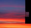
| 02/04/2003 05:37:30 PM | fragmented ladder to the skyby ritaardComment: Greetings from the Critique Club...
FIRST IMPRESSION... As an honest disclaimer, I am generally not fond of photographs that have lots of empty space (not that your space is technically empty), but I've always liked photos having dominant subjects. That said, my personal preference has never influenced my contest scores, or allow me to acknowledge good shots such as the one you've managed to capture.
COMPOSITION... I feel that putting something at the extreme edge of a photo works really well when complimenting something else that is more dominant. For instance, if you had another square structure on the lower left of the photo that went into the shot more (say, that filled the whole lower left third), then the two shapes might work together in providing a pleasing composition. Alone like that, I would have moved the frame to the right so that the dark object falls directly on an imaginary line dividing the photo into thirds. The sky is cropped very well, with a dramatic shift in light color on a low horizon line. I think that works very nicely. I would have just liked to see the frame filled with something more than just sky and a small structure to the left. (Keep in mind, even like you've presented it, the composition still works - it imparts a very abstract quality, reminds me of that painting with just the different colored and sized squares)
TECHNIQUE... I must say the exposure is just right for the sky, and as a result, having the structure completely dark except for the small hint of color reflecting off that small piece is a nice touch (whew, run-on sentance, i can see my english teacher wincing). Quality of digital image is also very good. Don't think there's really much else on the technical side...
OVERALL... I can't say I was there to see what subject you had to work with, if moving the frame to the right would help or hinder the subject. Also, Whenever I want to see empty space I want to just crop it out and move in closer to what's there. If you did that it in this case, you wouldn't have an interesting picture - obviously the space is an essential component to your photo... In these cases, I just try to put as much in as needed rather than try to fill the frame with empty space. |
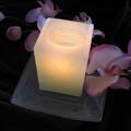
| 02/03/2003 08:21:28 PM | A candle and an orchidby shohnComment: Greetings from the Critique Club...
FIRST IMPRESSION... Right off the bat I'd say this image has a high "emotive" factor - it has the right look and feel, and evokes a sense of calm and serenity. Nothing too complex, a small number of objects shot against a black background, but that's what adds to the peacefulness of the shot.
COMPOSITION... Perhaps the composition is a little too static. I don't think people should adhere to the "rule" of thirds,but in some cases it can help a shot. The flowers are lying down and create horizontal lines in your photo, so a landscape type shop with flowers leading from one end to the other, and the candle in a corner might be one possiblity. I think you made a good choice in the camera angle though - not too high and the angle adds some subtle perspective to the candle.
TECHNIQUE... I think the photo suffers from some sharpness. I'm not sure what could have caused this... Movement during exposure? too close to the subject? I also find the colors just a bit washed out... I'd recommend a slight boost in saturation to make it a bit more vivid. My monitor shows a bit of the felt used in the background. If you wanted to make the background completely black, you could play with levels in photoshop and move the middle slider until its just enough to make the folds in the cloth vanish. i made an example of your image with the above adjustments I just mentioned but my internet is acting up. As soon as I get it online, I will provide you the link to show you the above version...
OVERALL... I think its still a beautiful shot overall that can be improved with some minor post-processing. (except maybe the focus, that was probably a problem that existed during the shooting of the picture - did you try sharpening it in your image editing program come to think of it? I'm not sure how much it would help) | | Photographer found comment helpful. |
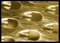
| 01/31/2003 04:07:31 PM | Don't Rub me the Wrong Wayby KonadorComment: Greetings from the Critique Club...
FIRST IMPRESSION... Well it took me a while to even realize what this was, and how it was related to milk, but your prediction says it all - its not that closely linked to the challenge, but it nonetheless is a remarkable image. And it looks like your score reflects that regardless of how close it fits the theme.
COMPOSITION... I've tried framing this other ways but I keep coming back to how you've presented it here. I especially like how you made your background, and how the lighting gives it depth. That was one of the reasons I couldn't identify the object at first. They don't look like holes - but bumps, due to the shading in each individual hole. That separates this image from a typical macro of a cheese grater - the light gives it further abstract quality as it fools the eye into seeing shapes that are not there! Well done indeed...
TECHNIQUE... I mentioned the lighting above. Not only is the background effectively rendered, but the lighting really brings out the scratches. I like the look it imparts on the photo. Gives the surface some texture. I find the contrast could be improved slightly. What I did in photoshop is make a level adjustment and brought the middle slider down to a value of ~ 0.65 Mostly a personal preference - I like having both extremes (dark shadows, almost white highlights) in photographs. Also makes a great image in black and white, but I think its more apparent that its contrast needs to be tweaked when viewing it in b&w. Always keep in mind that although I've calibrated my monitor to the best of my ability, it is possible many people here are looking at the same image and seeing quite a difference when it comes to brightness and contrast.
OVERALL... A very well lighted and composed shot. Don't think there's much that needs to be done to improve it. Really made me stop and stare at it for a while trying to figure it out :) | | Photographer found comment helpful. |
| 01/31/2003 06:56:11 AM | Got Cookiesby daysezComment: Greetings from the Critique Club...
FIRST IMPRESSION... when first looking at the challenge entries for milk, this is not one that jumped out at me. I'm not saying its bad, its just missing an element that would make it stand out from others.
COMPOSITION... pretty standard here. I think what hurts the composition is that lack of a simpler background. A solid black or white background would have worked much better. The pattern on the tablecloth distracts my eyes somewhat. Another possibility to improve its "wow" factor would be the lighting. Its very good lighting as it is, very even, not harsh, no distracting shadows, but it would be nice to have catchlights on the glass or something to give the subject "volume". Another possibility might be to get closer in: see if there's an interesting pattern or composition when close: it might make the ordinary subject look extra-ordinary! I'm aslo thinking maybe the framing could be a more vertical one, sort of an anti-landscape crop. This would enforce the vertical lines of the milk glass. Not entirely sure about this. I wanted to try cropping but I'm at a computer with no photo-editing software! If this framing doesn't look better, perhaps it would work on the same subject but shot at a further distance than this one... ? Experimenting with lots of different angles and view points is key :)...
TECHNIQUE... I sorta covered that above when I spoke of the lighting. Everything is is very well done. Very good depth of field, good overall contrast. | | Photographer found comment helpful. |
| 01/30/2003 07:59:20 PM | Total Eclipseby bil99Comment: Greetings from the Critique Club...
COMPOSITION... There are several aspects to the composition that can be improved, and they mainly center on the placing of elements in the photo. The cars overlap and would probably be better at opposite ends of the photo with the sign in the center. Would make more of an impact, with one car moving away from a sign that is pointing in the other direction. I know that shots like this aren't really planned, they just happen, and not much planning can really be done to ensure you're at the right view point at the right time, but then luck will often play an element in photography :)
That said, there is too much overlapping, one car on top of the other, the signpost cutting across both cars. The background is slightly distracting with so many elements in it. On stretches of roads such as these there are probably some areas that have a nice, clear background. Even if you're fixed to this spot because you were capturing the sign, you can try moving to your left and right...sometimes a small adjustment in your position changes the nature of your image drastically.
TECHNIQUE... Perhaps you needed a faster shutter speed, the cars look slightly blurred, and I think the light that's reflecting off the cars is a little to harsh... Not much can be done there, the rest of the image is very well exposed, maybe the timing of day played a role. Its important to shoot at times where the light's working in your favor and not causing any harsh or unintended reflections.
OVERALL... a little luck and a different viewpoint that makes a cleaner composition is all I think it needed. Either than that, you managed to capture an example of very good timing :) |
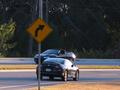
| 01/30/2003 07:03:53 PM | Untitledby hartlComment: Greetings from the Critique Club...
COMPOSITION... Can't really say anything bad about the composition, but at the same time there's not much going on either. I think mainly because I'd expect for the sign to say something about the environment its in... The sign seems to be just there. What's the motivation for choosing a "no trucks allowed" sign as opposed to other signs? I guess other than that, the image has the feel of a snapshot, taken from the vantage point of someone simply looking at the sign. If you explore different ways of composing your images, try to find unique angles and view points. Try getting very low, high, diagonal, putting in leading eye objects, etc. Background's not cluttered, the elements of your photo are simple and clear. I actually like the many different colors in the background, gives the photo something else interesting to look at, but I would have liked them more if they weren't blurry...see next part
TECHNIQUE... I like the fact the sign appears unusually bright, done with flash I would suspect. Really makes the subject standout. As for the buildings, they really should be sharper, and perhaps should have been exposed a bit longer, I don't know if that would have made them slightly more visible.
OVERALL... A tripod would have certainly helped here. If no tripod's around try finding some sort of support - a mailbox, fence, anything to steady your camera when taking nightshots that require a long exposure. You may have not needed a long exposure to capture the sign with your flash but I think the background could have benefitted by a steady, long exposure. | | Photographer found comment helpful. |
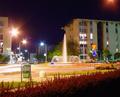
| 01/29/2003 06:11:12 PM | It's rondo!by andlbComment: Greetings from Critique Club...
FIRST iMPRESSION... If I were casually looking through the images in this week's challenge, I may have passed this one. It misses having a strong subject that captures the viewer's attention. Criiquing the image though, I see that there are aspects of the image which are well done.. such as lighting and image quality...
COMPOSITION... I find the composition a little busy, with no strong dominant subject or focus. My eye keeps scanning the image, looking for something to settle on. Perhaps choosing an angle where the road sign or the fountain was more dominant could have helped in this area. The light coming out of nowhere from the top right corner was also a little distracting, and could be cropped out. Actually cropping out most of the sky seems kind of interesting... It lets the viewer focus more on the cityscape and lights. I know it can't be helped, but the foreground looks a little cluttered by the unecessary elements (that green object, and round white bump)
TECHNIQUE... This is an extremely well lighted night scene, and the flare and halos eminating from the light sources are what I find make up the appealing aspects of the image. Very vivid colors. I would expect to see a noisy image given similar conditions.
CONCLUSION... A very well lit scene due to the different colors of lights, with a nice fountain that just screams to have it be the main subject of the photo... or the secondary one of course, since you need a road sign in there naturally :) A pretty good night scene overall, just needs a stronger subject. |
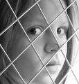
| 01/27/2003 03:13:45 PM | Looking Throughby PaigeComment: I knew the fence theme would come up in the square competition, and this one is executed quite well. It is an effective portraiture: The subject seems to have an expression befitting someone who seems caged. My only gripe is that the contrast could have been improved with your image editor. A look at the histogram of the photo would show this. Would have also been nice if both her eyes were sharp. | | Photographer found comment helpful. |
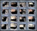
| 01/27/2003 03:08:22 PM | Fresh Air Vent?!by MonaComment: A very unique grate, makes for an intense and interesting abstract. I think its the symmetry and and the textured look of the grate that keep you staring at the photo. One thing that can't be helped is the break in color in the background. If it was all grey or all pink, it wouldn't stand out. As it is, my eye is constantly drawn to it and it breaks a bit of the symmetry. Not much could have been done there. A little bit of the grate seems out of focus, but it can be my eye plauing tricks on me...after all, the grate is relatively flat and I can't see how one part of the grate can be in focus and another one not. Overall, an excellant photo with very little flaw! | | Photographer found comment helpful. |
Home -
Challenges -
Community -
League -
Photos -
Cameras -
Lenses -
Learn -
Help -
Terms of Use -
Privacy -
Top ^
DPChallenge, and website content and design, Copyright © 2001-2025 Challenging Technologies, LLC.
All digital photo copyrights belong to the photographers and may not be used without permission.
Current Server Time: 04/11/2025 04:41:34 PM EDT.
|