| Author | Thread |
|
|
03/18/2005 04:36:20 PM |
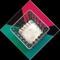
I really like this photo. There's a kind of role reversal here between negative space and subject that strikes me as being quite novel. Usually negative space exists to focus one' s attention on the subject. In this case, however, the subject is quite plain and it is the negative space that is colorful and interesting.
And, by the way, there are a number of squares one might find here. Nice. |
|
|
|
02/04/2003 10:37:30 PM |
Greetings from the Critique Club...
FIRST IMPRESSION... As an honest disclaimer, I am generally not fond of photographs that have lots of empty space (not that your space is technically empty), but I've always liked photos having dominant subjects. That said, my personal preference has never influenced my contest scores, or allow me to acknowledge good shots such as the one you've managed to capture.
COMPOSITION... I feel that putting something at the extreme edge of a photo works really well when complimenting something else that is more dominant. For instance, if you had another square structure on the lower left of the photo that went into the shot more (say, that filled the whole lower left third), then the two shapes might work together in providing a pleasing composition. Alone like that, I would have moved the frame to the right so that the dark object falls directly on an imaginary line dividing the photo into thirds. The sky is cropped very well, with a dramatic shift in light color on a low horizon line. I think that works very nicely. I would have just liked to see the frame filled with something more than just sky and a small structure to the left. (Keep in mind, even like you've presented it, the composition still works - it imparts a very abstract quality, reminds me of that painting with just the different colored and sized squares)
TECHNIQUE... I must say the exposure is just right for the sky, and as a result, having the structure completely dark except for the small hint of color reflecting off that small piece is a nice touch (whew, run-on sentance, i can see my english teacher wincing). Quality of digital image is also very good. Don't think there's really much else on the technical side...
OVERALL... I can't say I was there to see what subject you had to work with, if moving the frame to the right would help or hinder the subject. Also, Whenever I want to see empty space I want to just crop it out and move in closer to what's there. If you did that it in this case, you wouldn't have an interesting picture - obviously the space is an essential component to your photo... In these cases, I just try to put as much in as needed rather than try to fill the frame with empty space. |
|
Comments Made During the Challenge  |
|
|
02/02/2003 08:15:33 AM |
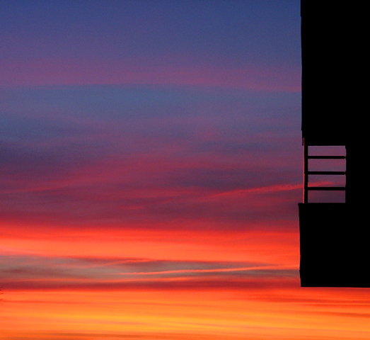
| Gorgeous colours. Interesting inclusing of the building on the right. |
|
|
|
02/01/2003 10:12:51 PM |
| Excellent! I love the colours and the ladder and just everything about this photo. |
|
|
|
02/01/2003 05:12:31 AM |
| This pic has some really really nice colors. I'm not getting what I'm looking at on the right side. Looks almost like a piece of an observation tower. - Inspzil |
|
|
|
02/01/2003 02:50:24 AM |
| You know, I really like this photo, I really do. The colors are lovely and the ladder on the side gives a strange twist to the photo. I can't score it high because it has NO SQUARE anywhere in the photo. The photo itself is square, and that is all. I feel we have to stick to our challenge theme for the rules to mean anything at all. |
|
|
|
01/31/2003 08:10:58 PM |
| Holy zappola look at those colors Batman. Snap on the shades to take in all that ultra glo. Pretty intense hues countered by a mysterious dangling shadowed manbit. A big score for the intense graphic and suck your lungs clean dry of air color. Looks like a top 20 score this week to me. Let the drama unfold. |
|
|
|
01/31/2003 01:53:49 PM |
| The colors in this photo are amazing. I like the way the wavy lines in this photo move your eye. The square in this photo is not the main focus. |
|
|
|
01/31/2003 12:22:20 PM |
Composition: Good
Technical: Good focus/colour.
Meets challenge: Pushing it a bit, I think! :-)
Overall impression: A really nice pic, but I'm not seeing a square really. 5 |
|
|
|
01/30/2003 06:35:48 PM |
| not realy a square but I can imagine the dark staircase squareing out. Excellent abstract and use of color...ecpecially the light on the railing. well done. |
|
|
|
01/30/2003 01:15:16 AM |
| Awesome picture, but where are the squares? |
|
|
|
01/30/2003 12:46:02 AM |
| That is a great sky! The square is less interesting. |
|
|
|
01/29/2003 11:24:50 PM |
| wow, I had a dream similar to what this looks like.... |
|
|
|
01/29/2003 05:38:51 PM |
| the sunset looks nice. not enough color in the subject. |
|
|
|
01/29/2003 02:09:01 PM |
| you do not know what a square is. I like the sky though. |
|
|
|
01/29/2003 04:24:53 AM |
| nice colours, great composition. 10-martin |
|
|
|
01/28/2003 10:04:32 PM |
| have you turned this upside down? |
|
|
|
01/28/2003 06:29:24 AM |
| interesting abstract looking image... |
|
|
|
01/28/2003 06:02:06 AM |
| Amazing sky! Beautiful concept. |
|
|
|
01/27/2003 11:11:07 PM |
| Now I'm all torn. I wish I had this in my portfolio, and not a square in sight. Oh, well... plenty of other people to punish you for that. Very fine work. |
|
|
|
01/27/2003 06:21:20 PM |
| Very pretty, but there's no squares. |
|
|
|
01/27/2003 04:13:55 PM |
|
|
|
01/27/2003 12:17:35 PM |
| I love the colors in this. |
|
|
|
01/27/2003 11:41:34 AM |
| nice sky. nice angle on the structure. |
|
|
|
01/27/2003 02:56:44 AM |
| Very nice. Interesting design. WHere is this, Cali? |
|
|
|
01/27/2003 12:39:52 AM |
|
Home -
Challenges -
Community -
League -
Photos -
Cameras -
Lenses -
Learn -
Help -
Terms of Use -
Privacy -
Top ^
DPChallenge, and website content and design, Copyright © 2001-2026 Challenging Technologies, LLC.
All digital photo copyrights belong to the photographers and may not be used without permission.
Current Server Time: 02/01/2026 06:58:18 AM EST.