|
|
| Image |
Comment |
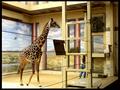
| 02/17/2003 06:51:29 PM | Joanna Giraffeby BAMartinComment: Greetings from the Critique Club!
FIRST IMPRESSION..Wee! This was the last photo I added to my favorites last night after the contest ended! Guess you're going to get a favorable review :)
COMPOSITION...The only thing I did not like about the placement of objects in the photo is the person! Wouldn't fit the contest anymore I know, especially when I say I don't like the fact she's hidden and in a corner... That was the whole point of the contest, granted, but I find her position in the photo to hurt the rest of the composition... I just love the way everything else in the photo fits together! The giraffe is slightly off center and facing inwards, the lines in the foreground seem to have the same effect - leading the eye inwards and then those strong horizontal lines are balanced by the verticals in the painted columns, and the structure on the right. The photo as a whole has an inherent surrealistic feel to it - doesn't look like a giraffe fits in there at all - which is exactly what makes it stand out all the more. Does not look like your typical zoo :) The colors are bright, and all tones in the photo go well together, as well as the giraffe. I guess one last nit-picky thing about the composition the object on the foreground wires that looks like its there to feed the giraffe, also gets in t he way. Too bad you can't have that moved...sometimes ya just gotta go with what's there cause you can't make better of the situation...
TEcHNIQUE.... Photo looks great. There's not much I can mention here except the blur on the giraffe's leg - A faster shutter speed would rectify that. If you are at the limit of your camera, (looks like your aperture is anyway)well there's not much you can do.
OVERALL... Excellent job on a great capture! Your score may not reflect how I feel about the shot but beauty is in the eye of the beholder :) At the end of the day, its taking shots you admire and are proud of that counts., |  Photographer found comment helpful. Photographer found comment helpful. |
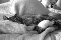
| 02/16/2003 06:22:45 AM | Kitty at sleepby JannickComment: Greetings from the Critique Club!
COMPOSITION... The composition can be improved by moving in closer to your subject. Try cropping the bottom and top portions of your picture, right up to the cat's body. I find it cuts some of the distraction the background provides, especially in the upper right corner. Its also too bad the face is so obscured -> An angle a little more to the right and/or above may have allowed you to catch more of the face. The cat's body is just a little bit too obscured by the blankets. From what I can see of the cat's face, you did manage to capture a genuine moment, only is a little too hidden.
TECHNIQUE...Contrast, lighting are very good, focus.. it seems to me from the midsection of the cat to the rear is out of focus. try shooting at narrower apertures: That would mean requiring a tripod, but at shutter speeds of 1/10, I hope you're using one already :)
OVERALL.., A good moment, lighting very well done, could just use some more depth of field and less blanket :) |
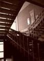
| 02/14/2003 12:26:38 PM | Stairsby DustinComment: Greetings from the Critique Club!
COMPOSITION... I find this area can be improved upon somewhat, depending on what kind of picture you are going for in the end. For an interesting abstract of stairs, I would try getting in closer and looking for a pattern in all those angles. Try a couple of different viewpoints and see what turns out. If you are trying to take a more pulled-back shot, i would choose another angle that obscures any distracting elements in the photo. For instance, the posters on the wall detract my attention from the shapes of the stairs. Actually, I think this is the only major distraction in this shot - Imagining what the photo would look like compositionally without these posters produces pleasing results. Also the photo is slightly tilted - you can use Photoshop's crop tool whenever you see your photo is slightly angled.
TECHNIQUE ... I'd only be repeating what's in the comments already here - I do find there is just too much shadows in the photo. I like the sepia look to the photo - regular color might have made it a bit too run of the mill. Anyway, overexposing the photo a little more would solve the shadow issue, or as Olyuzi suggested, using reflectors or firing your flash could have also solved your problem.
OVERALL.. A very good first attempt. Welcome to DPChallenge!.. hope you enjoy taking part in future challenges!... |
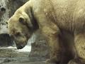
| 02/12/2003 05:40:45 PM | What Are You Lookingby joshuamliComment: Greetings from the Critique Club!
COMPOSITION... Wow! What an excellent shot of a polar bear! And its close to looking like it was actually shot in the wild! The detail in the shot is first rate, especially the way the bear's fur stands out. I like the tightness of the crop - 1) It probably prevented something distracting from being in the background 2) Makes you feel closer to the subject, lets the subject dominate the photo, and 3) Probably made for a more dynamic composition instead of having the usual, whole shot of a polar bear. In animal photos, having a good expression with the animal's face, and capturing the eyes is key, and I can that those elements are fulfilled in this photo - you can see the gleam in the bear's eyes and it seems to be very contemplative about something :) background's just great, so many zoo shots are ruined by that small object in the background that distracts the viewer's attention. You have a huge plus with your equipment in being able to take (with the right lens) zoomed in shots like this. (Unless u actually did manage to get close to a polar bear :)
TECHNIQUE... I put three images of this bear at //photos.yahoo.com/sylandrix (in the DPChallenge Critique folder). Leftmost photo is your original shot. Opening the photo in Photoshop, and looking at the histogram reveals that the photo is not using a full range of tones from light to dark. You can make a level adjustment and move the left slider to the beginning of the histogram, resulting in the second version of the photo. Its harder to see in such a small version of the photo but the difference can be substantial when looking at a full size photo. Its the number 1 image adjustment you can make to improve almost any photo, in my opinion. Finally I noticed that this polar bear was breaking convention by not being white so I made a selective color adjustment on the yellows to result in the third pic. That one is a matter of taste - I find the "warm" look of the above photo just as appealing. Apart from that, what is there to say? Excellent image quality, depth of field, and technique!
OVERALL... You didn't get a ribbon but congratulations anyway on an amazing capture! As evidenced by your two ribbons, you seem to have a knack for capturing wildlife, keep on shooting! |
| 02/11/2003 04:15:34 PM | Curvesby NatashaComment: Greetings from the Critique Club!...
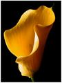
COMPOSITION... I don't think I'll find anything to complain about here...The flower's graceful curves gives some very strong lines for the eyes to follow, and its a joy to look at. I like the touch of softness in the image, I think it all fits together to produce a calming and soothing still life. You've provided a background that contrasts well with the subject, and filled the frame with the flower, and picked a great angle with the petals almost covering the flower's insides but not quite... The colors are nicely saturated, providing further contrast with the background.
TECHNIQUE... Though I do like the small lack of sharpness, it would be a more technically sound image if the flower in total focus. I'm wondering if the cause of this was distance to subject. If you're in macro mode and you're too far, or in normal mode and you're too close, this will happen. The other obvious cause such as depth of field (not likely with an aperture of 7.8) or camera movement may have been a possibility... I find the highlights slightly blown out. Having the light slightly diffused could solve this problem, or in a non dpc world, perhaps the offending sections could be dodged so they don't appear as bright
OVERALL.. A breathtaking image, and an adept subject for the challenge. Excellent lighting except for the two small problematic areas, but still a shot to be proud to hang up on your wall :) | | Photographer found comment helpful. |
| 02/10/2003 03:17:14 PM | display copy only / pop art revisitedby SharQComment: Greetings from the Critique Club!...
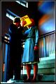
COMPOSITION... I find the way this shot was composed to be very appealing - shooting low, a different vantage point from usual, can yield effective results as we se here. Also like the steps that lead the eye outward, and the textures on the surfaces - walls and the models clothing. I'm not crazy about being able to see anyone's face, but I surmise that's the point of the picture - makes it look like its the woman who's for display purposes only... I also wonder if there was an alternative angle that would prevent the window "growing" from the man's face. Its really not as obvious as the usual examples we see in this area, but I do think the composition would be better without that window there.
TECHNICAL... I just love the surreal colors applied to the shot! What technique did you use? I also didn't know you could blur things for DPC...I love softening my photos but since I started participating in the contests, I never tried, thinking it was illegal...Some parts look more out of focus then blurry, which definitely would lower your score, seeing as there's a bias towards blurry photos. Of course there is a distinction between blurring and softening your shot, one which may be DPC legal but the other not. I believe in this case you did a straightforward blur, which just made the picture look slightly out of focus. I also find to be too much shadow in the man's suit - no tonal information present in the entire area. I know that sometimes it can really add to to the picture, but seeing how the rest of the shot is not made that way - only the upper wall is in shadows - having one of the main subjects almost enshrouded in darkness just seems a little odd.
OVERALL...apart from that, I think its a very unique shot -> Which might not make it belong in the cliche section, and which might explain a low score despite the originality and creativity of the photo. | | Photographer found comment helpful. |
| 02/09/2003 05:20:45 PM | A:\by KonadorComment: Greetings from the Critique Club!
FIRST IMPRESSION.. My first impression is that what are the odds, of doing about 6-7 reviews from what I guess is 250 photos, to review your shot again :) On to the photo... :)
COMPOSITION...once again, your description says it all... If more people self-critiqued their work it would make our jobs easier :) You're right, some shots cannot be improved by using the rule of thirds, and I fail to see what would be accomplished by shifting the diskette over to one of the sides. I do think the diskette should have been taken straight on though - the perspective makes the diskette look less of a square than it could have been head on. And not a very photogenic diskette - I guess it would be hard to find a diskette w/o a serial number, but I find as a main element of the photo, the numbers are a distraction. Perhaps also a very dark or very light diskette would have really stood out against the sea of CDs. Just a tad nit-picky, but we all must be sometimes :) ... I've also been wondering what kind of different effect you would get if you stacked something underneath the diskette - stacks of cards, folds of paper, etc...to lift the diskette off the surface of the CDs and therefore providing some depth... Just an idea that popped into my head...
TECHNIQUE... The lighting on 90% of the shot is first rate.I'm talking about catching the reflections off the CD - they came out splendidly. The light was too harsh on the diskette metal piece and I'm sure it could be corrected by moving your light source in a different position. If you ever find that moving your light source does not solve this type of problem, or that moving the light source ruins the lighting of the rest of the photo, you can always try diffusing the light (placing translucent items in front of the light source) or even try lower exposures to see if the problem is reduced. Course if you were doing this yourself you could a double exposure trick in photoshop: Use the above shot, then take one shot underexposed so you don't have that very bright spot in the photo. Layer both photos on top of the others and mask the top layer in such a way as to allow the underexposed shot come through in the right areas.
If that sounds too advanced, I can explain it further...its a technique that can solve lots of exposure problems when people are not moving and I'll try to teach it on any photo that can benefit from it, however small...
OVERALL... A pretty good shot that needed a head on composition, and some lighting solution to the overly bright portion of the disk. See you again next week :) :)
| | Photographer found comment helpful. |
| 02/09/2003 01:42:50 PM | Foursomeby niwedimagesComment: Greetings from the Critique Club!
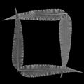
COMPOSITION... I really like what you did in composing this shot. A square frame, a square shape on the outer edges of the leaves, and on the inside... giving the image strong adherence to the week's theme and also makes an appealing composition. Not only does the image enforce square shapes, but the curves in the leaves imparts graceful lines and curves, which usually aren't found in square objects at all :) Very good background... all in all, very well done.
TECHNIQUE... I'm a little unsure of what manipulation was done to the photo, but it doesn't seem like a straight black and white conversion of the taken image. I look at the histogram and there's barely any information in it... If you did some extreme editing, I think it should have been just converted to black and white, and perhaps a contrast adjustment, and that's it. Your subject is beautiful and interesting enough on its own without enhancement. The contrast on the finished shot does need improvement. Try a levels adjustment and bring the left and right sliders closer to the area of the histogram that has information (the black bars). You'll see an overall improvement in the photo's contrast.
OVERALL... It would be nice to see what the original image straight off the camera looked like, and how it can be converted into a stunning black and white that retains a little more tonal information in the leaves than what was presented here. You have a very interesting composition and subject matter - be weary of any extreme image manipulation. |
| 02/09/2003 04:53:55 AM | Breakfast - your first square mealby psychephylaxComment: Greetings from the Critique Club!
COMPOSITION...This area could use some improvement. Objects seem to be placed in a haphazard fashion and are not tied together. There is also no main subject - nothing that the eye can immediately settle on or follow. Don't forget before snapping to try many ways of looking at your still life and don't hesitate to rearrange your items ad nauseum unitil you have some arrangement that stands out from the rest. Perhaps a more angled shot where some of the food items were at the forefront, (in this case it should be the square ones) with others playing a minor role in the background, would have worked better.
TECHNIQUE... To tell you the truth, the food items do not look appealing. Well its true that whenever food is photographed, so many (non-edible) treatments are applied to the food in question to make it look edible, but I doubt you or I would have access to this kind of stuff, or if we did, we wouldn't know about it. All I can think of is adding a bit of soft focus to the shot (for DPC, using an old filter with glycerin or vaseline smeared on it, or stocking net over the lens). That should hopefully soften out the "greasy" look which is really hard to avoid - food never looks appealing when photographed the way it is, one of the first things I learned in my studio still life course. Light is average, photo looks like it can be lightened a bit but I'll need to look at the photo on a calibrated monitor before I could say that. Background is simple and effective.
OVERALL... well, despite the food not looking appealing, its still a very good attempt which I imagine would take some effort. Food is a very challenging subject to try to photograph, kudos for taking it on :) | | Photographer found comment helpful. |
| 02/08/2003 12:30:15 PM | winter afternoon shadowsby kenboComment: Greetings from the Critique Club!
FIRST IMPRESSION... well I was definitely shocked by the score. There were a lot of great entries in this particular competition, which was of course to be expected considering anything went in this challenge. Still, I thought this photo got a lower mark than it deserved.
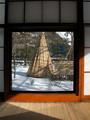
COMPOSITION... The frame within a frame is a very strong composition element, and I find it works very well here.It strongly adheres to the theme , since it seems you captured both a door and a window... I think the horizontal lines in the wall, around the frame, seem to give the semblance that they're "supporting" the frame, and strengthens the center of the image. The shadows on the floor give you something interesting to look at in the frame as well. As for the actual image you are framing, it is unique and interesting to look at. i think if you could have angled yourself to compose the scene with the tepee and bench following the rule of thirds, it may be more pleasing. I don't think a central composition though hurts it that much in this case because the rest of your photo is already centered and you stick to that theme if you center the teepee. I suppose either way - the difference is subtle.
TECHNIQUE... All I can offer here is the large shadow diagonally cutting through the frame. It distracts from an otherwise very well executed exposure. Fill-in flash may have worked well here, but I am no expert in flash photography. The light entering this room would have to be at another angle to give you an evenly lighted frame. Well, at least you can go back and make some DPC-illegal photoshop edits to correct this... If you haven't done so, and are interested in the procedure, you can private me. Its not long or hard - I did a quick correction and put it in //photos.yahoo.com (folder: DPChallenge Critiques).
|
Home -
Challenges -
Community -
League -
Photos -
Cameras -
Lenses -
Learn -
Help -
Terms of Use -
Privacy -
Top ^
DPChallenge, and website content and design, Copyright © 2001-2025 Challenging Technologies, LLC.
All digital photo copyrights belong to the photographers and may not be used without permission.
Current Server Time: 04/11/2025 04:35:57 PM EDT.
|