| Author | Thread |
|
|
02/09/2003 04:53:55 AM |
Greetings from the Critique Club!
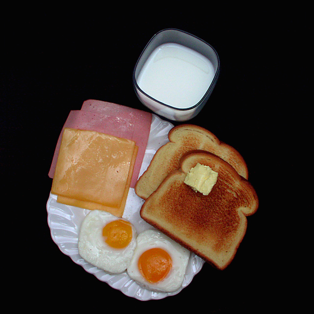
COMPOSITION...This area could use some improvement. Objects seem to be placed in a haphazard fashion and are not tied together. There is also no main subject - nothing that the eye can immediately settle on or follow. Don't forget before snapping to try many ways of looking at your still life and don't hesitate to rearrange your items ad nauseum unitil you have some arrangement that stands out from the rest. Perhaps a more angled shot where some of the food items were at the forefront, (in this case it should be the square ones) with others playing a minor role in the background, would have worked better.
TECHNIQUE... To tell you the truth, the food items do not look appealing. Well its true that whenever food is photographed, so many (non-edible) treatments are applied to the food in question to make it look edible, but I doubt you or I would have access to this kind of stuff, or if we did, we wouldn't know about it. All I can think of is adding a bit of soft focus to the shot (for DPC, using an old filter with glycerin or vaseline smeared on it, or stocking net over the lens). That should hopefully soften out the "greasy" look which is really hard to avoid - food never looks appealing when photographed the way it is, one of the first things I learned in my studio still life course. Light is average, photo looks like it can be lightened a bit but I'll need to look at the photo on a calibrated monitor before I could say that. Background is simple and effective.
OVERALL... well, despite the food not looking appealing, its still a very good attempt which I imagine would take some effort. Food is a very challenging subject to try to photograph, kudos for taking it on :) |
|
 Photographer found comment helpful. Photographer found comment helpful. |
Comments Made During the Challenge  |
|
|
01/30/2003 05:17:06 PM |
| Sure is tough to get those yolks square!! Creative idea. |
|
|
|
01/30/2003 11:13:02 AM |
| This a very nice idea. The photo looks very professional. Although I feel that some of the items is the photo do not fit the description of "square" very well. Good job. |
|
|
|
01/29/2003 03:09:50 PM |
| Good creativity. I like how you made the eggs square also. |
|
|
|
01/29/2003 05:48:09 AM |
|
|
|
01/28/2003 06:07:02 PM |
| Someone went to a lot of trouble for this one. Toast is a tad burnt on the top edge, one yoke of the outside egg is a little darker than the other, The butter on the toast did not melt. Now for the photo: It's great. I love it. A colored plate might have helped see clearly the eggs are also square. But it's still good. Now I'm hungary. I'll give you an 8 and fix me the same thing. |
|
| Photographer found comment helpful. |
|
|
01/28/2003 06:46:35 AM |
| Like the colors, might have composed it differently though, less centered? |
|
|
|
01/27/2003 04:54:38 PM |
| This shot makes me hungry. I like your choice of background. Interesting shot! jgillard8 |
|
|
|
01/27/2003 03:05:00 PM |
| Wow, you sure put a lot of preparation into this shot. |
|
|
|
01/27/2003 05:53:58 AM |
| Good shot. I like how the texture of the food comes through nice and crisp... Cub |
|
|
|
01/27/2003 05:14:37 AM |
| Great take on the "square" concept. It's a little dark though. 6 |
|
|
|
01/27/2003 03:34:03 AM |
| I think the composition of the items could be improved. Maybe layering toast, ham, cheese, egg instead of them seperate. |
|
|
|
01/26/2003 10:30:36 PM |
| Makes me not want to eat breakfast again. :) |
|
Home -
Challenges -
Community -
League -
Photos -
Cameras -
Lenses -
Learn -
Help -
Terms of Use -
Privacy -
Top ^
DPChallenge, and website content and design, Copyright © 2001-2025 Challenging Technologies, LLC.
All digital photo copyrights belong to the photographers and may not be used without permission.
Current Server Time: 04/07/2025 04:20:33 AM EDT.