|
|
|
Showing 111 - 120 of ~220 |
| Image |
Comment |
| 01/09/2003 05:51:36 AM | Lullabyby lukenickComment: Excellent mood, you've matched your song title extremely well! I don't know if the extreme softness of the picture is being caused by a focus issue (doesn't appear to me that's the case at first glance), or by some other mechanism, but I particularly like the softness and mood it creates. Now if there was a way to get some parts of it sharper, like just the child's face, I think the photo would be enhanced even more. Technically, the photo is a little too dark, a slight levels adjustment, even if it blows out a bit of the highlights slightly, might make the rest of the picture look better (you can always crop out the highlight since it will appear in the bottomright corner) |
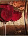
| 01/08/2003 09:51:15 AM | Red, red wineby JeanComment: This is definately an exceptional image! From the unique background and the patterns reflected on the glass, to the surrealistic distortion of the rightmost glass and the upper right shape that almost looks like a face... I don't know if the bottom shadow is recieving any critcism but I find it adds to the picture , making the background a little more dynamic. My only nitpick is that I find the glass object at the extreme right is a superflous element that didn't need to be there. Keepin the same height, and cropping your photo so that this glass is no longer present, at least in my eye, creates a much more visually pleasing photo. Very artistic, a great capture nonetheless, one of my favs this week. I hope a "How'd they do that?" is written on this one :) |  Photographer found comment helpful. Photographer found comment helpful. |
| 01/08/2003 03:23:09 AM | The Roseby autoolComment: In terms of lighting, exposure, focus, you're dead on. This is a more than technically sound image, it definately has an emotional component - the image conveys beauty. Some might think its a simple interpretation of a title but I think it works more than on just the literal level. My one gripe is the square format. I've tried looking at the photo cropped on the top and bottom and no matter how I do it, I always find the landscape format more appealing - maybe because the rose seems to be leaning towards the left,not sure. Overall, a shot to be very proud of. | | Photographer found comment helpful. |
| 01/08/2003 03:13:12 AM | Bridge over Troubled Waterby svitalComment: Nicely composed shot, love the colors - small points of bright red contrasting against a very muted and soft background. I like the composition of the bridge in the background, not so sure about the branches, seems a little busy. Hard to say if it could have been improved without being there. Nonetheless, a great shot! |
| 01/07/2003 11:22:42 AM | Night & Dayby gps_01Comment: You caught a beautiful sunset. Quite a transition from the bright colors down at the bottom to the somber greys at the top. I feel the photo lacks somewhat due to a sparse/uninteresting and tilted foreground. Sunset pictures combined with some other dominant element generally have more impact. Try finding a large, interesting natural or artificial feature (mountains, trees, interesting building(s), etc.) and stalk that location for a good sunset oppurtunity. | | Photographer found comment helpful. |
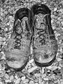
| 01/07/2003 08:05:33 AM | These Boots Are Made For Walkin'by vestanpanceComment: Exellent tonal range, an interesting and uncluttered background. Good focus. There is no mistake about the age of the boots, which is why the photo matches the song title well. Composition's a little static, a straight-on shot, but overall a well executed capture. |
| 01/07/2003 06:28:47 AM | I saw the light - Hank Williamsby andlbComment: Really neat abstract, good eye! Very busy image but still pleant to look at. I just find the faded section on top a little distracting. Not really sure how that could be fixed. |
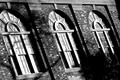
| 01/07/2003 05:42:33 AM | Three Windowsby pstuhrComment: Very effective b&w, I especially like the blown out highlights in the windows, creates good contrast. Nice brick textures. I find the angled composition very pleasing but keep noticing the lines on the top aren't parallel with the frame (should be angled a couple more degrees clockwise). The large dark shadow in thr lower right also distracts a little. |
| 01/07/2003 05:33:53 AM | Color My World (Chicago) by GraciousComment: Very interesting abstract, nicely compsed. A little unevenly lit, but otherwise a very sucessful shot. Meets challenge well! |
| 01/07/2003 05:31:52 AM | Here Comes the Sunby lmhrComment: Wonderfully lit and compsed flower, I especially like the subtle shadows in the bottom right corner that break an otherwise solid green background. Perhaps it would have more impact with the flower in general being more evenly lit, and although I like having the least amount of negative space possible, its a personal preference. Very well executed! |
|
Showing 111 - 120 of ~220 |
Home -
Challenges -
Community -
League -
Photos -
Cameras -
Lenses -
Learn -
Help -
Terms of Use -
Privacy -
Top ^
DPChallenge, and website content and design, Copyright © 2001-2025 Challenging Technologies, LLC.
All digital photo copyrights belong to the photographers and may not be used without permission.
Current Server Time: 04/18/2025 04:03:49 PM EDT.
|