| Image |
Comment |
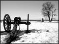
| 03/01/2004 01:24:27 PM |
Fire The Canonby xtwizxComment: Best photo so far in this series... I would have prefered a pano shot, but you probably didn't have that opportunity. Good work. |
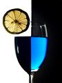
| 12/04/2002 11:58:07 PM |
Two Tone Tonic by jmsetzlerComment: Aah, I've seen your other works on PhotoSIG. And they are exceptionally good as this one. It's very hard to find a comment and/or critique for you, and I'm sure you want one. Your concept is well executed, and your idea in this shot is fresh and bold which are essential to hold the viewer's attention. (No doubt, the tutorial on 2 Tone Tonic will appear soon.) What I would like to see more, is maybe some addition of waterdrops running down on the side of the glass and have a few sparkle of bubbles rising from the bottom of the glass (it is a tonic, right?). This shot is a straight still life study. IMO, to enable to viewer to absorb completely into your shot, elements like I mentioned above, would create a deeper impact. Overall 9. (Might come back for that 10.) |
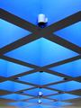
| 12/04/2002 11:39:51 PM |
Blue Symmetryby xertionComment: Shapes like these are fun and interesting when taking a shot of them. You have chosen the symmetrical way of portraying these squares. And it paid off. The lighting is good enough to keep the shadow to a bare minimum and your composition is near perfect. (Wild) suggestion: If you had turn this shot upside down, would it still be interesting to keep the viewer's attention? Overall 8. |
 Photographer found comment helpful. Photographer found comment helpful. |
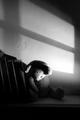
| 12/04/2002 11:33:15 PM |
Still Loving What's Goneby albright1Comment: Honestly, this is really a very interesting and brilliant shot. The expression is so well captured, even her nose has a slight tint of pink, giving the hint that she's been crying before. The lighting on the left is slightly too harsh or too direct and it seems that the shot has a slight yellow cast over it. Overall 8. |
| 12/04/2002 11:28:15 PM |
Blue Heart Shadowsby erin_m02Comment: There are 2 weak points in this interesting shot. Firstly, your angle of the shot is slightly off. If you had the heart shape bang in the middle, this would have made an intentional interesting symmetrical shot while also portraying the opposite in the shadows on the white wall. Secondly, a further crop on the top till the edge of the heart shape would have finished the composition, creating a deeper impact. Overall 7. |
| Photographer found comment helpful. |
| 12/04/2002 11:18:38 PM |
Peeling Blueby paynekjComment: A good macro shot. You have captured the details well enough. Yet the tiled background does not only disctract the viewer but also does not complement to your subject. Overall 6. |
| Photographer found comment helpful. |
| 12/04/2002 11:11:35 PM |
Forgotten...by TiNComment: Excellent shot. The viewer almost wants to reach out and touch this little teddy bear to reaussure its existence. And very daring indeed to turn this shot into B&W. However, a horizontal shot which may include other objects on the shelf would have a better and deeper impact on your forgotten teddy bear. Overall 8. |
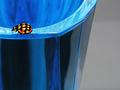
| 12/04/2002 11:05:57 PM |
Lady on Blueby JeanComment: A very good macro shot. However, the details on the glass is sharper than the little beettle. Suggestion: Focus on the beetle first, lock the exposure, than recompose your shot. Overall 7. |
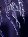
| 12/04/2002 11:02:52 PM |
Icy Coldby RiderGalComment: I know how difficult this shot must have been. Macro outdoors. You probably used a tripod. Somehow the focus seems slightly off, but only by a fraction and not really noticable at first glance. Good composition but a further vertical crop on the left would isolat the foreground even more. Overal 7. |
| Photographer found comment helpful. |
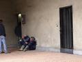
| 12/04/2002 10:50:07 PM |
Waitingby johnmkComment: A documentary shot. So what's story then? What are these gentlemen waiting for? You've included the metal door on the right which suggest that these workmen maybe waiting for it to open, but yet, they are all huddled on the left of the shot. The element you have not included in shot is the theme itself, pretty daring, I might say. Composition wise, the gentleman on the left can be left out completely and the same goes for the metal door; I don't believe these men are waiting for it to open. If it's "waiting" that you want to show, close up on the 2 gentlemen including the man in the doorway, so that the viewer can relate to what you want to show. Overall. 6. |
Home -
Challenges -
Community -
League -
Photos -
Cameras -
Lenses -
Learn -
Help -
Terms of Use -
Privacy -
Top ^
DPChallenge, and website content and design, Copyright © 2001-2025 Challenging Technologies, LLC.
All digital photo copyrights belong to the photographers and may not be used without permission.
Current Server Time: 04/17/2025 04:23:41 PM EDT.