|
|
|
Showing 131 - 140 of ~362 |
| Image |
Comment |
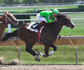
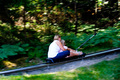
| 08/16/2006 09:20:47 PM | Pulling Awayby TommyMoe21Comment: Greetings from the Critique Club.
Hi Tom,
Congratulations on a great take. I\'m very impresed with the stopped motion, and the form of your subject. This has a real sense of movement.
I agree with BakerBug below that something about the picture does look unlevel. I\'m not convinced we can go by the fence in the background (who is to say if it is parallel with the subject). Nonetheless there is somethign about it that makes it look a little as if the horse is racing up hill. Perhaps a slight rotate was in order, but not usign that back fence for alignment.
I would have loved to have seen more detail in the front shadow of the horse and less blow-out on the jersey. I think you could corrcet the first with curves, but I doubt the blow-outs could have been saved (although this depends on if they were lost due to your contrast editing).
I hope my comments help and Good Luck in future Challenges!
Cheers
Paul |  Photographer found comment helpful. Photographer found comment helpful. |
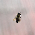
| 08/16/2006 05:20:02 PM | killer "B"by gocComment: Greetings from the Critique Club.
Hi Goran,
Well this shot exceeded your expectations by a fair bit. Thaks for all the detailed info in the Photographers Comments - it sure makes my job easier. This is a very different view of a bee - almost as if it is out of a hidden camera for a documentary on bees in their hive. In this sense I think you have achieved your stated aim.
It is a good thing that your flash didn't fire as I am pretty sure that without significant diffusion it would have created major blow-out reflections on the glass. Nonetheless it would have been nice if the underside of the bee had been more exposed to display more detail there. Looking at your settings I think your best bet would have been to open up your aperture a bit (not sure what lens you used, but you could have gone as wide as 2.8 and still kept the necessary DOF).
Regarding the composition. As comments below note the bee is centered with very little else happening in the image. Asthetically it is not a very interesting image as there is nothing to draw the eye in or really engage the viewer. Rule of thirds might have give it some balance. Also I think a slightly different POV, perhaps from higher up and to the right would have given the bee more depth.
I do think your score did suffer a bit from the DNMC crowd as it really does look like what it is; a bee resting on a piece of glass, which isn't stopped motion. And we know the cardinal sin on DPC is to not satisfy the voters that you have met the challeneg. Looking at your vote distribution I think a lot of voters gave you the benefit of the doubt.
I hope my comments help and Good Luck in future Challenges!
Cheers
Paul | | Photographer found comment helpful. |
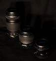
| 08/15/2006 05:58:55 PM | Lense Collectionby angela_packardComment: Greetings from the Critique Club.
Hi Angela,
I have really admired some of your work in the past so it is great to get draw you for a critique. Sadly this one doesn\'t grab me like some of your other shots. That said I have found it extremely difficult to put my finger on what doesn\'t work. The following critique is my best shot at what has been a difficult job (pushing the boundaries of my own understanding).
I\'m a little confused by the technical details. An Aperture of 1/60 seems odd to me. Have you entered aperture and shutter-speed in the wrong boxes?
Taking my lead from the other commentators - theis shot is very dark. Nothing wrong with a dark shot and good use of negative space, but it does put a huge responsibility on having some aspect of the shot to really draw the viewer in. I think this is what is lacking here. as my eye flicks from lens to lens my mind is thinking, \'So?\'.
The lighting is what lets you down most - to me it looks linear, direct from the camera. It does nothing to add depth or subtelty to your shot. I\'m no professional on the subject (by any means), but I think you would have wanted a stronger, difused light-source at a lower angle. Although as I say, what do I know.
I think the POV does nothing for this shot. As it stands the angle of the lenses draws my eye off the image. Two lines are created, one along the bottom of the lenses and one along the top, which together expand from the bottom right out to the top left; in fact out of the top left. I would have much preferred a lower point of view and moved round to the right more, perhaps with the lens order reversed. I think this would have brought the eye in and the change in perspective would have emphasised the lenses as a subject more.
I hope this has been useful.
Cheers
Paul
| | Photographer found comment helpful. |
| 08/15/2006 05:02:40 PM | This is the last time I take one for the team!by die2boardComment: Greetings from the Critique Club.
Hi Frederick,
Great humour value. You have managed to convey the oddness of the setting without becomeing too cheesy, as a result the shot tells its story effectively. I particularly like the expression of the red face looking on in horror as the dopey blue one 'takes one for the team'. It is this human aspect of your shot that I think endeared the voters to you.
The shot is technically sound. I think I would have preferred a greater depth of focus, although that would have meant an even longer shutter-speed then the 2 seconds you used. The whole shot would have been easier for you to pull-off with better lighting and a faster shutter-speed. Nonetheless I think you have done well.
Focusing on the lighting. I would have loved for the bowl to be properly white, instead of the off-whiet that it is. I am inclinded to think this is due to an inappropriate white-balance setting for the shot. The best solution is to shoot in RAW and sort this out in post-processing, failing that you should set to Tungsten when indoors.
The green background does not work - I think this is because it is sufficiently unusual to draw attention to itself, and away from your subject. I think a plain white background would have worked better. The gold rim around the bowl is another unnecessary detail that doesn't add to the shot and therefore detracts from the main subject.
For all my comments you still got a 5.6+ score which is very good. Just goes to show that the most important thing is that you say something to your viewer, whicvh you have managed to do.
I hope my comments help and Good Luck in future Challenges!
Cheers
Paul | | Photographer found comment helpful. |
| 08/14/2006 09:09:10 PM | Bits o fleshby timmotykaComment: Greetings from the Critique Club
Hi Timothy,
This is a nice aquarium shot. Man those creatures frighten me - even with a nice thick piece of glass between they give me the creeps.
I'm not a huge fan of the cool colour tones (the blue hue across the shot). Obviously it is an underwater scene and it is natural to expect these tones, but I would have liked the bright colours of the other fish to be more distinct. As a result the whole image looks a bit flat.
I think many voters did mark you down a little for not adequately demonstrating that you were shooting within the spirit of the challenge. Obviously Bits & Pieces is a bit of a indefinite challenge topic, nonetheless voters would have expected more evidence of you complying to it.
Cheers
Paul |
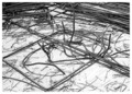
| 08/14/2006 05:14:29 PM | Steel Bitsby rapidComment: Greetings from the Critique Club,
Hi Claire,
I've spent some time looking at your shot trying to work out what I can comment on it. For soem reason this isn't easy. The shot is technically sound - nothing wrong there. Even the general composition is okay - admitabely a little full of clutter, but given the challenge that is to be expected.
The issue I think is to do with what the lines of the steel convey in terms of emotion and leading the eye. Somehow these factors just don't 'work' here. I have found the following article very useful in starting to understand this aspect of photography. Hope it helps you too.
//ronbigelow.com/articles/adv_comp/adv_comp.htm
I hope my comments help and Good Luck in future Challenges!
Cheers
Paul | | Photographer found comment helpful. |
| 08/14/2006 04:37:57 PM | What goes up, must come downby h0bbelComment: Greetings from the critique Club,
Hi Christian,
That looks like fun. I asusme you get pulled up the hill and can free run down the other side, or something like that. I think one reason this shot struggled is that very few of the voters are familiar with this form of entertainment. Unfortunately many will mark you down if they can't make sense of the shot.
The other reason this would have been voted down is that it looks a bit like a holiday snap-shot. The main reason for this is the busy foreground and background of green - it does distract from the main subject.
Please don't stop submitting photos; instead do start taking the challenge more seriously. It is great to have you involved. If you look at your voting distribution some voters obviously liked the shot. Keep at it.
Cheers
Paul |
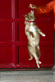
| 08/13/2006 09:28:40 PM | Ballerinaby k_n_rajaComment: Greetings from the Critique Club
Hi Nataraja,
The first thing that struck me about this shot was how well named it was - very appropriate. The second thing is the wonderful pose you managed to stop. I love these shots where the camera shows something that eye could never quite see.
As some of the voters commented; it would have been better to exclude the person on the right. I think the slip of body up the right margin detracts mroe from the image then the arm and hand. An effective pose could have been to have the hand coming in from above. Nonetheless; the point is that as it stands the person takes away from the story of the dog being a ballerina.
Regarding post-processing. I would have liked to see the image rotated so that the line where the floow meets the wall was at a right-angle to the frame. A little USM (unsharp mask) would have been good to help the dog stand-out from the background better.
I hope my comments help and Good Luck in future Challenges!
Cheers
Paul |
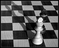
| 08/13/2006 09:07:25 PM | Parallel drawby marvinComment: Greetings from the Critique Club,
Hi Róbert,
Congratulations on this shot - not a negative comment to be seen. I like the tones; especially the B&W in B&W. Very nice. This is technically fine - all in focus and well lit.
Regarding the composition. I feel there are a number of areas you could have improved upon for a higher score. It is a great shame that the top of shadow to the black king has been cut of. The perspective of the checks on the board is a bit odd, the way they start parallel to the frame on the left and finish at such an angle to the right - this really throws the eye out. For some reason the whole balance of the shot conveys to me a feeling of angst - I can't really put my finger on exactly what though. My guess is that this is why the shot did not do as well as all the comments indicate it should.
I have always found the following article on the impact on lines and shapes in composition very useful: //ronbigelow.com/articles/adv_comp/adv_comp.htm
I hope my comments help and Good Luck in future Challenges! Keep on that hunt for the ribbon.
Cheers
Paul | | Photographer found comment helpful. |
| 08/13/2006 04:40:49 PM | Silenceby Rino63Comment: Greetings from the Critique Club
Hi Gennaro,
This is, as others have previously commented, a lovely still simple shot. There is no doubt that you met the challenge. In addition there is nothing technically wrong. The question therefore is why didn't this do better.
I can think of two potential reasons. The first is the colour tones - these are a little bit flat across the image. The surface of the water allow very little scope for texture and depth. The second is that the composition, although simple, is not easy on the eyes. Nothing draws the eye in. the kink where the pole meets its reflection is somehow jarring to the eye.
I hope my comments help and Good Luck in future Challenges!
Cheers
Paul | | Photographer found comment helpful. |
|
Showing 131 - 140 of ~362 |
Home -
Challenges -
Community -
League -
Photos -
Cameras -
Lenses -
Learn -
Help -
Terms of Use -
Privacy -
Top ^
DPChallenge, and website content and design, Copyright © 2001-2025 Challenging Technologies, LLC.
All digital photo copyrights belong to the photographers and may not be used without permission.
Current Server Time: 04/12/2025 05:35:29 PM EDT.
|