| Image |
Comment |
| 01/22/2007 03:22:25 PM |
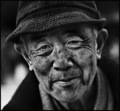
After a days playby hoffyComment: Greetings from the Critique Club.
Hi Ashley,
Welcome to DPC. Congratulations on your second submission.
As you mention in your comments - this is a lovely, relaxed, accessible candid shot (okay, you didn't use those words, but this is what I understood). Everyone can identify with this shot. I like how you have framed the arms so they lead towards the face. And I loe the lightly tussled hair - all wonderfully soft and gentle.
I think there are two main areas where the voters have marked you down. As luv2photo commented, it has a slight feel of being a snapshot. Nothing wrong with that when capturing a memory, but DPC voters like to feel people have made an effort for the challenge. The secord area is the eyes. There are exceptiosn, but usually it is the eyes that make a portrait work - they really enable the viewer to engage with the subject. I think you would have done loads better if you could hae got her to look at the camera. No need for fancy clothes and poses - just capture those eyes.
It is my hope that these insights are helpful and constructive. Please feel free to PM me if you have any questions regarding this critique. And please remember to mark it "Helpful" if you found it so. Good luck with future challenges.
Cheers
Paul |
 Photographer found comment helpful. Photographer found comment helpful. |
| 01/22/2007 03:11:03 PM |
"Thought"by holdingtimeComment: Greetings from the Critique Club.
Hi Greg,
This has scored lower than I would have thought. You have managed to capture a wonderful contemplative subject in an emotive way - looking at the image stirs thoughts in me : what is she thinking, who is she remembering, etc. This is the greta strength of your shot.
Most of the comments you have recieved already give you some clues to why this has not scored as well as it could have. One reason is the eyes - they say eyes are the window to the soul; in the case of portrait photography the eyes are where your focus should be, and where the viewers eye should be drawn. For some reason my eyes just slip over her eyes; I think it is the slightly soft focus and relatively flat tones there. It would have been brilliant to see the eyes sharper, with the catch-light more distinct. For myself I would have loved to have her chin included in the image - somehow I think chins help complete a face.
It is my hope that these insights are helpful and constructive. Please feel free to PM me if you have any questions regarding this critique. And please remember to mark it "Helpful" if you found it so. Good luck with future challenges.
Cheers
Paul |
| Photographer found comment helpful. |
| 01/20/2007 12:33:20 AM |
Next In Lineby WickedBComment: Similar to what I tried to execute, but far superior. I love the 'flow' of the lines in your image. Well done. |
| Photographer found comment helpful. |
| 01/16/2007 08:05:54 PM |
Fireworkby oscarmeyerComment: Oscar - nice piece of work. Under-rated IMO, as it has great punch and excellent negative space. The points below that it seems to be upside down seem right to me - I bet thos cost you a few points. |
| Photographer found comment helpful. |
| 01/16/2007 08:02:55 PM |
Serenadeby crazydaisyComment: Hi Danielle,
Lovely shot - the perspective works well. The real strength here is the calm of the women with the lines leading to the hand and face. What muckpond said - the motion blur really draws the eye in, and then doesn't give the viewer anythign to be interested in. I think you have struggled with the colour depth with the bright guitar and dark face - difficult to make a balanced exposure on that range. |
| Photographer found comment helpful. |
| 01/16/2007 07:56:48 PM |
|
| Photographer found comment helpful. |
| 01/15/2007 07:02:57 PM |
OH NOby fattypComment: Ver cool indeed - I love the shadow. |
| 01/11/2007 08:00:39 PM |
Sheby fotomann_foreverComment: Leroy; nice! Congratulations on the publication.
I don't have it in me to vote on this challenge. but hope you do well. I think you have done well to just touch on the boundaries of what people feel comfortable with - hopefully the DPC conservatives don't punish you too badly. Very much 'you'.
Only complaint is the slight blow-out on the face - a little harsh for my taste. |
| Photographer found comment helpful. |
| 01/07/2007 07:49:19 PM |
Up Hill & Down Daleby WellylenaComment: Greetings from the Critique Club.
Hi Helena,
Welcome to DPC! Congratulations on your first challenge submission - that's a big first step.
This is a difficult one to critique as there is nothing technically wrong, and I don't have much to go on in terms of your comments. The main issue here is one of composition. I recommend you take the time to read this tutorial on composition -> here
Based on this shot there are thwo aspects that I believe you should begin to consider. The first is colour: these greys tend to make an image look flat, and don't engage the voter. On DPC the voters usually like a nice bit of pop in the shots. The second is leadign lines: in this shot the pattern in the material leads the viewers eye right off the image, so there is no real focal point.
It is my hope that these insights are helpful and constructive. Please feel free to PM me if you have any questions regarding this critique. And please remember to mark it "Helpful" if you found it so. Good luck with future challenges.
Cheers
Paul |
| Photographer found comment helpful. |
| 01/07/2007 07:29:50 PM |
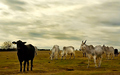
Leader of the Packby jeroweComment: Greetings from the Critique Club.
Hi Jon,
I can easily see why you liked this shot. The scene is very appealing and the colours are lovely and soft - a lovely bucolic scene. The main points I want to cover have already been mentioned in your other comments; namely the noise reduction and the halos. I happen to think the softened effect works very well on the scene, just that you have overdone it, and lost too much detail in the process. The halos above some of the cows are just plain unnecessary, and to me a clear indication that some of the post-processign has been taken too far. There is a really good video tutorial here that covers managing halos when sharpening. Hope this helps.
The main area I would have like to see more detail in on the black cow looking directly at the viewer. This to me is where everything in the image leads my eye, but when I get there it is just a large black patch with no detail. Given this was an advanced challenge I think this cow should have been edited seperately.
It is my hope that these insights are helpful and constructive. Please feel free to PM me if you have any questions regarding this critique. And please remember to mark it "Helpful" if you found it so. Good luck with future challenges.
Cheers
Paul |
| Photographer found comment helpful. |
Home -
Challenges -
Community -
League -
Photos -
Cameras -
Lenses -
Learn -
Help -
Terms of Use -
Privacy -
Top ^
DPChallenge, and website content and design, Copyright © 2001-2025 Challenging Technologies, LLC.
All digital photo copyrights belong to the photographers and may not be used without permission.
Current Server Time: 04/12/2025 12:09:30 PM EDT.