| Image |
Comment |
| 08/27/2006 08:47:47 PM |
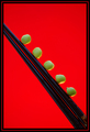
Flirting With Dangerby die2boardComment: Hi from the Critique Club!
Oh great, I have to critique an image that made 6th place!
Well, this truely is a great image. The colors are great compliments with each other and the focus and clarity are right on. Also, it has peas in it so it definitely fits the challenge hehe! The placement of the peas on the chopsticks is really fun and enjoyable. And I usually don't like borders but yours really does add some elements here, it gives a bigger push toward the feel of zen and all things Asian.
Great job on your wonderful photo and top 10 finish!
If you have any questions on with this critique you can just PM me.
:) |
| 08/27/2006 08:28:55 PM |
Enter the Forestby lifternessjtComment: Hi from the Critique Club!
For me, this photo doesn't hold my attention for too long. The exposure seems to be what you were going for (meaning black trees and the dark blue sky) but the composition could use some work. The alignment of the trees that you have captured, along with the "personalities" of the trees (How the branches spread, the angles, points, leaves and all) are presented here a little flat. Also, there is a distracting blob in the upper portion that seems to be haunting this photo and doesn't seem to be doing anything for it. I guess there isn't enough interesting elements to give this photo any real life.
Having said that, I want you to know that I think this idea is really something that you could work with. I like the contrast of black again that pretty blue. Maybe if you could find a different angle to shoot from that may help.
That's just my two cents.
:)
|
 Photographer found comment helpful. Photographer found comment helpful. |
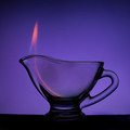
| 08/26/2006 07:52:38 PM |
Magic Lampby TejComment: Hi from the Critique Club!
Nice image here!
I like the background color and composition. The centering adds a lot to this photo in my opinion. I also think the vignetting helps.
The image is a little dark for my taste; particularly the center of the glass. If it were a little "clearer" I think it would have made this image pop. (Eg. Look at the smooth color and clarity of the glass handle.)
The flame is nice, it may have been a little more interesting if the flame was a little bolder and was pointed to the left. (Maybe a little wind)
Well that's just my two cents, take it or leave it. But, I really do like this image and I think it has potential.
:) |
| Photographer found comment helpful. |
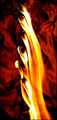
| 08/26/2006 09:44:29 AM |
Fire Fallsby Buckeye_FanComment: Hi from the Critique Club!
I think this is a neat little image. The composition is very nice. I like how the flame flows, and how each flame adds to the next. The exposure is nicely done. Also, the subtle detail on the flame heads (matches??) adds a nice touch.
The background color could maybe use a change. The contrast between the fg and bg is interesting like it is now, but maybe a more contrasting color like black or blue might have added a little "umph" to this image. I like the "crinkles"
Overall, a nice image!
:) |
| Photographer found comment helpful. |
| 08/26/2006 09:29:43 AM |
Firepower - keep your sponsors happy!by boomeraklComment: Hi from the Critique Club!
In my opinion, there are a couple things that are distracting in this image.
First, the crop. It seems that you have shaved off a little too much on the left of the image where the front bumper is. This adds a certain distracting element when viewing the photo.
Second, the top portion of the background showing the dirt and a shovel?? and something else white (not sure what all those items are) are very distracting. The track wraps around nicely but at the end of it you find the distracting items that don't add anything to the image.
Maybe a change in crop, maybe a little tighter and allow for a little more space in the front.
I really liked the colors, the exposure turned out nice. The focus is nice and clean and the fire from the exhaust is a good capture!
Overall, very nice try! |
| Photographer found comment helpful. |
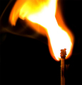
| 08/26/2006 08:55:12 AM |
explosionby gocComment: Hello from the Critique Club!
This image proved to be a little hard for me to critique.
The composition is very nice and the exposure on the match itself is excellent (you pulled a lot of detail out) but there is something bothering me.
The big white blob in the middle of the flame is overpowering the composition area. And the fact that there is no detail in that area makes the blob ever bigger to the eye. Don't get me wrong here you have a potentially excellent image here, and I could read all your post- processing remarks and tell you worked hard on this image, but in my opinion, it barely misses to present itself with full power.
Maybe there could be something done with the crop, (maybe shift it to the left just a tad) Or shoot the same shot with a slightly smaller flame.
The colors are nice and the background fits to give emphasis to both the match and the flame. I also like the shape of the flame. It fits the challenge perfectly.
Overall good job because I have found that working with fire isn't always easy.
:)
|
| Photographer found comment helpful. |
| 08/08/2006 01:49:40 PM |
Splash!!by LalliSigComment: Clean and clear, nice execution! Cliche but nice. Not everyone can do it (including me hehe) |
| Photographer found comment helpful. |
| 08/08/2006 01:48:16 PM |
The Questby aznymComment: Really neat image! I am blown away by the dramatic artistic value of this photograph. The colors are nice and the idea and composition are outstanding! If I could vote I'd give this a ten! Another favorite added :) |
| Photographer found comment helpful. |
| 08/08/2006 01:42:05 PM |
the waveby StagoleeComment: This seems like a really neat idea but the execution could use a little enhancing. First, it looks a tad dark and the colors a little dull. Try playing around with the lines and curves in your favorite photo editor. But, it really looks neat! |
| Photographer found comment helpful. |
| 08/08/2006 01:38:09 PM |
Fight Clubby steinarComment: Nice action with a nice composition. The lighting really works here as well. Nice shot! |
| Photographer found comment helpful. |
Home -
Challenges -
Community -
League -
Photos -
Cameras -
Lenses -
Learn -
Help -
Terms of Use -
Privacy -
Top ^
DPChallenge, and website content and design, Copyright © 2001-2025 Challenging Technologies, LLC.
All digital photo copyrights belong to the photographers and may not be used without permission.
Current Server Time: 04/12/2025 09:38:59 AM EDT.