| Image |
Comment |
| 03/19/2006 12:20:33 PM |
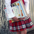
Education in the wordby gemjloComment: Cute! I love this composition idea! Great use of focus, good lighting - a light coming in from the side would have dressed this shot up, nice angle on the book too! Keep it up! |
| 03/19/2006 12:17:11 PM |
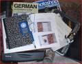
'readin, 'writin, and 'rithamticby yetiComment: Good idea for a composition - the lighting is a little off and although true to life there is too much chaos. You might have cropped in to take out the paisley couch and tried indirect lighting - bounced of the walls or ceiling instead of direct flash - that would have added some depth and texture to the shot. |
 Photographer found comment helpful. Photographer found comment helpful. |
| 03/19/2006 12:10:50 PM |
Watching, Listening and Learningby neenee1999Comment: Cute! I love the texture and color - the cropping is perfect! absolutely beautiful lighting and very keen focal point. Absolutely no distractions - great job!!! |
| Photographer found comment helpful. |
| 03/19/2006 04:43:24 AM |
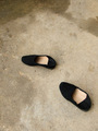
Movementby archivaComment: smashed shoes? - maybe try getting wet footprints to leave behind - and crop out the wet pavement above to cut down on distraction? The black absorbs too much light and doesn't leave much detail. |
| 03/19/2006 04:41:16 AM |
|
| Photographer found comment helpful. |
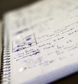
| 03/19/2006 04:40:09 AM |
Note to Selfby jdannelsComment: I am assuming you used a filter because of the strange focus on this shot, but I could be wrong. Basically it is a great idea, but with so much dead space in the photo it is hard to keep ones interest - I believe that cropping in on the focal point would be really helpful. The spirals add great texture, and the handwriting has a story all of its own. Maybe try putting the camera right down on the page? |
| Photographer found comment helpful. |
| 03/19/2006 04:36:18 AM |
The School of Hard Knocksby odiwanComment: I am not sure why the parking sign is so prominent in this shot - parking at jail? Also the water softens and makes this place more attractive, instead of fearsome... maybe black and white to take away all color and life from this shot would have had more of an impact, and a tighter crop on so that there is no down time trying to figure out what this shot is of. |
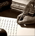
| 03/19/2006 04:33:45 AM |
Old fashioned learningby alexgarciaComment: ooooooh! I love it - such details, such texture - great lighting and absolutely artsy! Of course, the lack of a tip on that feather is a little disjointed, but this is a GREAT shot! very very fun to look at again and again |
| Photographer found comment helpful. |
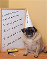
| 03/19/2006 04:32:04 AM |
Dunceby ShutterPugComment: Cute composition - I like the colors, and there are no distractions in the background. The problem is the focus - the dog is not in it - and as the subject - that really matters! You also have a shadow showing and that is distracting - when you have this good of an idea you need to not let anything in your picture detract from it. |
| Photographer found comment helpful. |
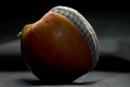
| 03/19/2006 04:29:56 AM |
A Slice of Knowledgeby StrontiousComment: Really great idea! I love this composition idea - it is amazing. The lighting coming in on an angle was a great idea too - but it is not quite right. The background texture is a little distracting to me as well. BUT, it is the best idea I have seen yet - great story! |
| Photographer found comment helpful. |
Home -
Challenges -
Community -
League -
Photos -
Cameras -
Lenses -
Learn -
Help -
Terms of Use -
Privacy -
Top ^
DPChallenge, and website content and design, Copyright © 2001-2025 Challenging Technologies, LLC.
All digital photo copyrights belong to the photographers and may not be used without permission.
Current Server Time: 04/12/2025 02:52:53 PM EDT.