| Author | Thread |
|
|
03/28/2006 12:16:26 PM |
Hi! Here’s a comment from the Critique Club.
First Impression:
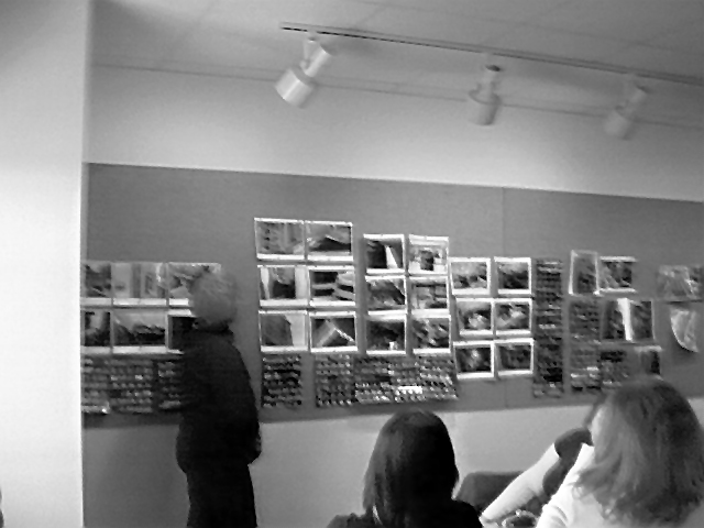
Oh Oh! Nothing in focus…not a pleasant photo to look at….
Composition:
Could have been cropped a little tighter. Left wall and ceiling lights are distracting.
Subject was good. Had lots of potential.
Subject:
Meets the challenge
Technical:
Unfortunately you didn’t include any notes or information so I don’t know what you intended. I don’t know if you intended for the picture to be as grainy and out of focus. If so, you got lots of feedback already. Too bad you didn’t have the D70. It could have provided the hardware to address the feedback given.
Summary:
Voters on DPC love to see detail and crispness. Fuzzy and soft only work if the impact is achieved. It’s all about the “Wow” factor to get higher scores.
|
|
 Photographer found comment helpful. Photographer found comment helpful. |
Comments Made During the Challenge  |
|
|
03/21/2006 10:26:13 PM |
| the focus, or lack there of, is very distracting, as well as the white strip on the left (crop), seems very pix-elated or over processed or something - not sure, but you're sure to get better - especially if this is the class you are in! Certainly meets the challenge - good job :) |
|
| Photographer found comment helpful. |
|
|
03/19/2006 05:14:42 PM |
| I think the focusing might have made this one better. |
|
| Photographer found comment helpful. |
|
|
03/19/2006 01:39:02 PM |
| bit blurry could use more focus???? |
|
|
|
03/19/2006 09:41:16 AM |
| Too blurry and grainy - try a tripod and autofocus? It is a good idea - but the distractions are too much |
|
| Photographer found comment helpful. |
|
|
03/18/2006 10:42:17 PM |
| Very poor quality, sorry. |
|
|
|
03/18/2006 01:41:00 PM |
| The is so out of focus it is distracting. |
|
| Photographer found comment helpful. |
|
|
03/18/2006 10:30:42 AM |
| blurred, wrongly exposed, terrible crop |
|
|
|
03/17/2006 02:28:45 PM |
| Looks oversharpened on the foreground, and far too blurry on the background. |
|
| Photographer found comment helpful. |
|
|
03/16/2006 09:11:48 PM |
|
|
|
03/16/2006 04:21:51 PM |
|
|
|
03/16/2006 03:55:05 PM |
| Very poor focus. Should have croped the left side. |
|
|
|
03/16/2006 10:45:41 AM |
I think the concept or idea is great, but I can't find anything for my eye to focus on. You may have meant it that way or didn't have enough lighting (I've never personally been in a darkroom that large) but it just isn't appealing enough.
The wall on the left seems to distract, as well.
Hope this helps. |
|
| Photographer found comment helpful. |
|
|
03/16/2006 10:41:18 AM |
|
| Photographer found comment helpful. |
|
|
03/16/2006 12:38:13 AM |
| not sure if the "out of focus" style was intentional???? |
|
| Photographer found comment helpful. |
|
|
03/15/2006 10:29:21 PM |
| I would have cropped out the track lights. I like the texture...nice work! |
|
| Photographer found comment helpful. |
|
|
03/15/2006 02:11:36 PM |
| Is this out of focus on purpose? |
|
| Photographer found comment helpful. |
|
|
03/15/2006 01:52:25 PM |
| Exposure on this is not too bad and composition is even OK but focus is off. |
|
| Photographer found comment helpful. |
|
|
03/15/2006 01:34:52 PM |
| Nice idea of a photography class for an entry in a photography contest. Appears to suffer from camera shake - try techniques for holding the camera steady, like propping the camera agains the pillar on the left. |
|
| Photographer found comment helpful. |
|
|
03/15/2006 06:00:12 AM |
| it's blurry and poorly done...you need to take the class ;-) |
|
|
|
03/15/2006 05:50:58 AM |
|
|
|
03/15/2006 02:52:50 AM |
| the room seems a bit out of focus but it seems intentional....was it? |
|
| Photographer found comment helpful. |
Home -
Challenges -
Community -
League -
Photos -
Cameras -
Lenses -
Learn -
Help -
Terms of Use -
Privacy -
Top ^
DPChallenge, and website content and design, Copyright © 2001-2026 Challenging Technologies, LLC.
All digital photo copyrights belong to the photographers and may not be used without permission.
Current Server Time: 02/01/2026 10:23:35 AM EST.