|
|
| Image |
Comment |
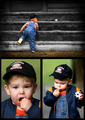
| 05/11/2007 04:44:11 PM | Childhood Easter Surprisesby jeroweComment: CRITIQUE CLUB COMMENT
First impression was "Oh no! Not children!!" After I got past the initial horror, I realized that this was actually done very well. Your arrangement of photos is nice and I particularly love the top pane of the tripytch. Nice vignetting at the edges and I love the pose and composition on this one. The child in the lower third, the ball in the upper third really makes a strong composition in my opinion. A solid stand alone by itself. The lower left photo seems a little soft to me, particularly around the eyes which is the center focus for a portrait shot. Maybe that's my imagination because after I said this and looked closer the focus looks ok. Strange. The biggest problem I have with the whole collection though is the lower left because he seems to be putting food in his mouth and I just personally detest photos of children putting things in their mouths or having food in her face. Probably just a personal issue I need to work through. Anyway, the lower right photo seems a HAIR over exposed on the cheek. I like the ball in this photo to tie in more with the ball in the top pane. Unfortunately I didn't notice the ball in the lower right at first..only saw it after examining closeley for this critique. That's probably because again my eyes are drawn to whatever it is he's putting in his mouth. Had the childs focus been on the ball and not the food it would have been perfect. The color and contrast are good in all the shots but I'm not sure I'm fond of the vibrant green. It seems out of place somehow. Overall this is a VERY solid entry that you should be proud of. I'm sure your friend is going to want a print of this for his wall. Your score is about where I'd expect it to be...right around a 6 but not more. It has a LOT of promise but a few distractions keeps it from being a top 10 contender. All in all a fantastic shot. Crongrats! |  Photographer found comment helpful. Photographer found comment helpful. |
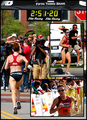
| 05/07/2007 04:48:24 AM | 'Ode to a Runnerby harmsusmcComment: CRITIQUE CLUB COMMENT
My first thoughts were "How cool would this look on someone's wall?" This fresh take on the triptych challenge is well deserving of a much higher mark in my opinion. I particularly like the arangement of photos as if the smaller photos are hovering over a much larger photo. It may not be unique but I'd never seen it done quite that way and I thought it worked excellent. I love the choice of angles you provided of the runner which definately gives the feel of a montage of the race. The only distraction I really find in the photo is the stop sign in the top right corner. By the way, having the time clock in the big shot was a fantastic choice. All of your shots are crisp clear focus with of course strong direct light. Though I'd normally say this is a distraction, I find myself so impressed with the photographers and cameras at the finish line. It really adds a great element to this. Your use of borders was excellent and the banner on the large photo almost gives the impression of being inside another border which is interesting. I'm STUNNED that this photo had no votes of 10. I really can't understand that at all. However, if it's any consolation, it's rare to find no 1's, 2's OR 3's so NO ONE thought your picture sucked. As I wrack my brain trying to figure out why you didn't score/place higher I would have to guess that perhaps the photos are just too busy for most people. There are indeed a lot of little things to draw the eye away but for me, I was still focused on the runner the instantly. Unlike many entries, yours truly tells a story, expresses a sense of emotion and should make you very proud! Honestly should have placed much higher in my opinion. Outstanding! | | Photographer found comment helpful. |
| 05/06/2007 09:11:39 PM | Florescenceby TlemetryComment: CRITIQUE CLUB COMMENT
First impressions were "wow, look at the color!" The wow factor really helps this shot score well. The images work well together even though the items in each picture only marginally relate. Obviously the tie in is the array of colors. The markers/highlighters and the sissors go together but on further reflection, the slinky is slightly out of place. Unfortunately, the slinky really is the focal point of your piece and you probably got your inspiration from that and worked in the other items for the color. Don't know how much better this might of scored if all the items more clearly related. I'm slightly distracted by the lighting only in that the outside photos were shot at a different angle and therefore reflected light differently than the center shot. This subtle change of lighting would have been less noticable or distracting had the frames been seperated from each other a bit by a black border perhaps. Obviously all three shots can be very different lighting but in this shot the effect appears that you wanted the same lighting but didn't get it right in all three shots. Overall, your lighting is really good. I particularly like the highlights on the middle shot. I notice from your voting that you got a good number of 9's and 10's but NO 1's or 2's. In other words NO ONE thought the shot sucked. That's remarkable because there are always trolls out there! I pretty much only have good things to say about your photo...it's a shame it didn't place higher. I imagine if you look at the competition there isn't much that seperates you from many positions higher. Great concept and excellent execution! | | Photographer found comment helpful. |
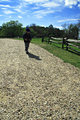
| 05/05/2007 12:58:42 PM | Me and My Shadowby pipersdComment: CRITIQUE CLUB COMMENT
First impressions: The child in the photograph is too backlit so we can't see them clearly. I realize it was intentional to have the shadow of the child come out toward the camera but the shadowed front of the child gives the appearance of being poorly shot. You possibly could have compensated a bit with some bounce reflectors of some sort to direct light back onto the front of your subject. The backlight particularly hurts you here because your subject sort of blends in with and dissappears against your background. Again, coming in closer and using bounce reflectors of some sort to light up your subject could have helped tremendously. In my opinion this photo is also hurt by the child not really being at the thirds intersection. It's close, but the child is a little low and the shadow only increases the feel that the subject is not truly in the thirds perspective perfectly. Overall this really isn't a bad entry at all. It did meet the challenge (though a bit off in my opinion) and for the most part was well exposed except the bad backlighting. Typically I warn people away from photos of children. It is common for people to take random snapshots of children and think they are great because they are emotionally attached to their child. Your commentors however didn't seem to mind. Having said that, a general rule is, if you are going to shoot children in your photo make sure it is an exceptional shot. Good entry...keep submitting. | | Photographer found comment helpful. |
| 05/05/2007 10:12:56 AM | Club Sodaby dtremainComment: CRITIQUE CLUB COMMENT
First impressions: The composition, colors, and focus are all quite good. Unfortunately, nothing impresses me about the photo. So why? There is no real "wow" factor which really helps in DPC voting because so many photos on DPC "wow" you it almost becomes expected. I think you did a great job photographically as far as picking the right shutter speed/apature settings to get a well exposed, crisp shot. The biggest reason I think it didn't score higher is that it has a sort of snapshot feel to it. In other words it appears as if no real effort went in to taking the shot. It is also taken from a perspective we are used to seeing signs at (i.e. shot from the stree looking up at the sign). It would help when shooting somewhat every day items to shoot them in some unique perspective we aren't used to seeing them at. In this example I might say shooting from a window on the side of the building and shooting down a bit on it to include the street MIGHT help. It is a bit of a shame it didn't score higher being that it certainly meets the challenge and it is well exposed and technically sound. |
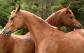
| 05/05/2007 07:27:48 AM | You scratch my back and I'll scratch yoursby sfmorrisComment: CRITIQUE CLUB COMMENT
Congratulations on a very inique capture. My first impressions when seeing the picture was, "wow, that's cool." Wow factor is really important on DPC and you started out on the right foot. Unfortunately for me, the next thing I noticed was the "details" and right away I noticed that the horse nearest us is slightly out of focus (on the mouth). That's a killer of this strong entry because the mouth is of course where the eye is naturally going to go to see what the horses are doing. Drawing the eye to a slightly out of focus area could have hurt your score a little. Along that line, each horses head has a cheek roughly where the third lines would fall in my understanding of the rule of thrids. This means that the mouth really isn't where the third lines fall and again, my eye is taken immediately to the mouth and away from the "rule of thirds." Now here is a comment I'm struggling with. On the one hand I loved the unique take on the rule of thirds by having TWO items in the locations for the third lines (two horse heads). By the same token however, this composition takes away some of the impact of a rule of thirds shot by doing so. In other words, when I see a rule of thirds shot I expect to see one subject, clearly centered in a thirds grid. This shot has two so it doesn't give the isolated effect you might want out of a rule of thirds shot. For me, the background is a slight distraction as well. While natural, I would have liked to see a much shallower depth of field and have those trees be blurred and significantly muted. Again, I spend a moment or two looking at the background trying to figure out what exactly it was and that serves as a distraction. Your voting on the curve is a nice bell shape trending around 6 which is great and you had a ton more 9's and 10's than 1's and 2's so I think the votors agreed with me that the wow factor here was worth some extra points. I think you came close to perfection on this shot. Keep up the great work! | | Photographer found comment helpful. |
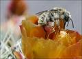
| 05/04/2007 04:21:09 PM | A Major Sugar Overloadby trolljentaComment: CRITIQUE CLUB COMMENT
Very nice close up/macro shot here with excellent crisp focus! My first impressions on the photo unfortunately were that I didn't like the coloring for some reason. I think the bee (which is your subject) is overpowered by his surroundings and that hurts the photo a little. If the bee had been bright yellow and the flower a softer or pastel color I think this would have scored even higher. Again, as I'm looking at it longer I'm so impressed with the razor sharp focus on your subject. To me it's obvious the incect is dead and perhaps that's why he's lost some color too. With basic editing I don't know if you could have fixed the coloring by bumping up the yellow channel but I would like to see what happens when you do. As far as the rule of thirds I do think the incect is right in that zone but the eyeball REALLY draws your attention and that is well off the verticle third line. I don't know if that hurt your or not but some might have felt it wasn't exactly in the thirds location. All in all I think you have a spectacular capture here and I think it was deserving of a 6.0+ score. You got robbed a little. :) | | Photographer found comment helpful. |
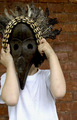
| 05/04/2007 04:09:55 PM | Boy with mask.by mariahdcComment: CRITIQUE CLUB COMMENT
My first impression of the photo unfortunately was, "why the brick wall?" In my opinion the brick wall does nothing to enhance the photo, does not seem to go with the headdress piece as far as I can tell, and seems therefore out of place. Additionally, the white t-shirt also is out of place with the headdress. In other words, right off the bat I see a photo that doesn't make any sense. Now here is the really difficult part. The photo challenge is rule of thirds and I think you did manage to get the headdress centered roughly where it should be. In other words, you technically met the challenge requirements. However, here is where you realize that to score well in a challenge you must first and foremost meet the challenge (which you did) but then you ALSO have to meet the challenge in a creative or photographically pleasing way. Because the photo doesn't have a lot of creativity (i.e. you didn't take time to dress up in an outfit that matched the headdress or shoot against a backdrop like say a jungle or such) your photo loses what it had going for it. The same mask shot on a dark background of thick jungle leaves where you (or the model) is dressed darkly hiding amongst the foilage would have scored much higher in my opinion. Again, it's not the mask or the composition that's hurting you here. Another minor distraction I see is that your skin (or that of the model) has some bruises or modled appearance and shadows or something make the hands look dirty in places. All of these things just add more to distract from your photo. You want people focused on that mask, not on bruises, spots, etc. Once again, technically I think you are very close to hitting the rule of thirds here. Drop the distractions and you'd be gold. Good luck. | | Photographer found comment helpful. |
| 05/04/2007 06:26:59 AM | The chicken's POVby purpleflutterby13Comment: CRITIQUE CLUB COMMENT
The idea is fairly clever and the title of this photo is what really sells it. Unfortunately, without the title the photo doesn't scream "kitchenware" as it should. In fact, the real focus of the photo is your face and your expression. As a viewer I spent too long trying to decide what your expression is conveying...joy...surprise...indifference? In any case, the longer I spend looking at your face the less time I spend seeing kitchenware. While your facial expression is intriguing, the subject of the challenge was kitchenware and a little more focus on the kitchenware would have helped. I have to agree with the comments you've already been receiving. The focus is a bit soft and the white balance is painfully shifted too yellow. While I see from your own write up that you liked the clutter and we should deal with it, I still feel compelled to comment that the best photos are kept somewhat simple. The clutter just adds more items to draw the eye away from the subject. As a critigue I'm trying to tell you ways you could increase your score (and thereby present a better picture). Less clutter would have helped your score. I think you came close here to having a much better score. A better white balance, sharper focus, and less clutter would probably translate into a score closer to 6 rather than 5. Keep looking for creative ways to shoot photos. I congratulate you on coming up with a fairly unique perspective and working at it to set it up. Good job! | | Photographer found comment helpful. |
| 05/03/2007 07:58:01 PM | Perfectby xianartComment: CRITIQUE CLUB COMMENT
This was an oustanding choice of subject matter for kitchenware! In order to set yourself apart in this challenge I felt you had to either shoot a unique piece of kitchenware that most people don't have or shoot something in a clever or unexpected way. This is obviously the unique side of the coin and an excellent choice. Unfortunately the blown out whites on the window behind the stove pipe probably held you back more than anything else. The window seems overexposed thereby making everything else seem underexposed by comparison. The lighting you captured on the dresser in the background was excellent and about the range of light I would have liked to see through the majority of the shot. All of the items in the shot seem to belong there (i.e. no distracting modern kitchenware). If you set up this prop shot you picked all the right props with the possible exception of what looks like styrofoam cups on the dresser. Not to take anything away from your photo but I was a little surprised by such a high place finish (25th). However, the 6.2 score seems pretty much where I would have scored it. As I said, I would have given you a 6 or better just for capturing something unique alone. Perhaps a suggestion to improve the lighting on the stove would be to use some very reflective white reflectors of some sort to bounce the sun back onto the object of focus. Perhaps you did this but didn't have enough reflection. It's a very worthy shot. | | Photographer found comment helpful. |
Home -
Challenges -
Community -
League -
Photos -
Cameras -
Lenses -
Learn -
Help -
Terms of Use -
Privacy -
Top ^
DPChallenge, and website content and design, Copyright © 2001-2025 Challenging Technologies, LLC.
All digital photo copyrights belong to the photographers and may not be used without permission.
Current Server Time: 04/07/2025 06:20:13 AM EDT.
|