| Image |
Comment |
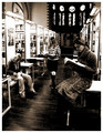
| 03/21/2006 05:45:51 PM |
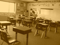
University of Luxembourgby glodaComment: like the layout and perspective, the eye wanders within the frame nicely, choice of the graininess in the processing works really well - good job :)
Passing through again and this is one of my choices for a ribbon :) |
 Photographer found comment helpful. Photographer found comment helpful. |
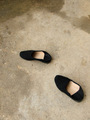
| 03/21/2006 05:42:17 PM |
Movementby archivaComment: I voted on every single image in this challenge EXCEPT for this one because I suspect you may have meant for it to be in the Footwear challenge :) |
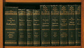
| 03/21/2006 05:42:04 PM |
The Classicsby jaxterComment: interesting - I kind of like the layout or crop - good choice to include the wood around the books - it frames it rather nicely. the focus could be much better in my opinion, good title though and certainly meets the challenge :) |
| Photographer found comment helpful. |
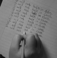
| 03/21/2006 05:40:18 PM |
"100 times by tomorrow" assigned the teacher.by rr_meyerComment: kind of small - your largest side should be as close to a 640 maximum as possible, focus seems like it could be better, nice choice of B&W though and a good idea for meeting the challenge well - good job :) |
| Photographer found comment helpful. |
| 03/21/2006 05:38:43 PM |
Desertedby RedRose460Comment: bummer this is soo small - you've probably gots tons of comments on that already and probably already know that your largest side can be a 640 max. having said that - it appears to be a pretty good image that meets the challenge a bit better than some others I have seen - so good job on that - can't really make out the quality of the image at this size but the sepia choice looks interesting, seems like there is a slight slant for effect - and I like the title :) Message edited by author 2006-04-29 09:25:38. |
| 03/21/2006 05:36:09 PM |
How to Really Learn...by meganoComment: I don't see "education" in this image - even with the use of your title, the quality isn't so good - very pixelated, I feel it's cropped too tight also - especially on the right, lighting seems pretty good though :) |
| Photographer found comment helpful. |
| 03/21/2006 05:36:06 PM |
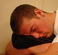
Hard Lessons Learned (Never By Some)by bowronfam3Comment: Not the prettiest of images but a very bold, true, and interesting statement. I do not think of "education" when I view this image, with the help of your title - it's a little bit better understood. I do like the processing used - wish I could do stuff like that - nice work :) |
| Photographer found comment helpful. |
| 03/21/2006 05:34:10 PM |
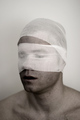
Blindfoldedby stars and sonsComment: Must be this is over my head, because I don't "get it". Education is Blind? or Blinding? Seems strange to me, I don't think of "education" when I look at it. Not very pretty and doesn't meet the challenge in my opinion. I might crop a little bit off the top, but the focus is good as well as any lighting used. I like that his face has a crisper focus than his neck/chest - good job :) |
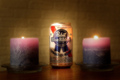
| 03/21/2006 05:29:30 PM |
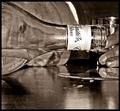
The Monet of beer!by parrotheadComment: LOL - I don't think "education" when I view this at all - even with the title, nice lighting though :) |
| Photographer found comment helpful. |
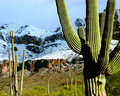
| 03/21/2006 05:28:36 PM |
Class Field Tripby ArtifactsComment: relying heavily on your title for this entry - It's a great image though - lovely locale - sun was behind you - good job :) |
| Photographer found comment helpful. |
Home -
Challenges -
Community -
League -
Photos -
Cameras -
Lenses -
Learn -
Help -
Terms of Use -
Privacy -
Top ^
DPChallenge, and website content and design, Copyright © 2001-2025 Challenging Technologies, LLC.
All digital photo copyrights belong to the photographers and may not be used without permission.
Current Server Time: 04/07/2025 06:14:50 AM EDT.