| Image |
Comment |
| 12/08/2002 10:56:16 AM |
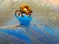
The thin iceby dadas115Comment: ...and the sky may look blue. i bet no one else got that one, but now i have to listen to the wall and it's all your fault. anyways. the near complimentary colors are beautiful. the almost-rule-of-thirds is good. not sure about the subject of a bug for the song, but the picture works with the title, so... ah what the hell. 10. |
| 12/08/2002 10:51:41 AM |
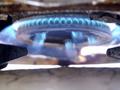
A Blue That Burnsby paully2k1Comment: i hate to say this, but it does look a little blurry. hopefully a simple unsharp mask could fix this. composition is ok, colors are ok. generally, other than that its a pretty decent photo. 6 |
| 12/08/2002 10:43:03 AM |
|
 Photographer found comment helpful. Photographer found comment helpful. |
| 12/08/2002 10:41:32 AM |
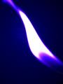
Blue flame.by HBunchComment: pretty, abstract, good composition, and interesting use of chromatic aberations. 9 |
| Photographer found comment helpful. |
| 12/08/2002 10:40:27 AM |
Touchdownby quarxComment: i don't like the composition that much, but the contrasts of colors and the creative dof really save this picture. 8 |
| 12/08/2002 10:38:42 AM |
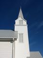
Steeple Bluesby darbComment: interesting shades of blue. the steeple puncuates the sky nicely, and the uneven roof line is interesting. 8 |
| 12/08/2002 10:37:06 AM |
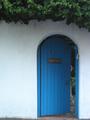
The Secret Gardenby andrewmComment: the line at the bottom of the image where the wall meets the ground is distracting. if the shot were lowered just a little, it would be much better. also i think it should be just a little bit brighter. not by much though. 7 |
| 12/08/2002 10:35:27 AM |
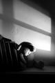
Forgotten...by TiNComment: black and white and oh so blue. there's nothing more blue than a sad teddy bear. no points for cuteness in my book, but technically, this is a fantastic photo. the lines shadows on the wall, and obscuring of the teddy bear on the bottom as the image delves into blackness really set the mood very well. the haze of to the right is a nice touch as well. great photo. 10 |
| 12/08/2002 10:32:34 AM |
Blue Bottleby waltomlComment: could use with being straightened a little. also, the composition (just set in the center of the frame) is rather untineresting. i would have tried shooting through or shooting the reflections in the subject, and/or placing it off one side of the frame. |
| 12/08/2002 10:30:42 AM |
Live Proudby memoComment: to be honest, i wasn't impressed by the thumbnail of this image, but i am by the actual picture. the look and style is very interesting. very abstract, and interpretive. i'm going to give you a 9, and only because: the half and half composition doesn't work too well (it's ok, but it'd work better closer to thirds). |
Home -
Challenges -
Community -
League -
Photos -
Cameras -
Lenses -
Learn -
Help -
Terms of Use -
Privacy -
Top ^
DPChallenge, and website content and design, Copyright © 2001-2025 Challenging Technologies, LLC.
All digital photo copyrights belong to the photographers and may not be used without permission.
Current Server Time: 04/09/2025 07:53:09 AM EDT.