| Author | Thread |
Comments Made During the Challenge  |
|
|
12/08/2002 10:37:06 AM |
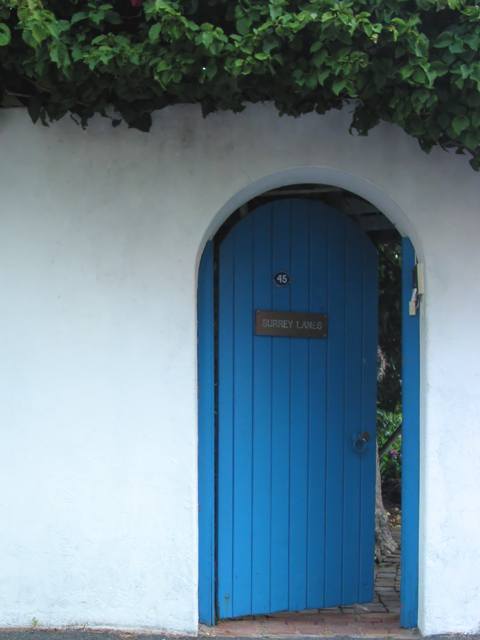
| the line at the bottom of the image where the wall meets the ground is distracting. if the shot were lowered just a little, it would be much better. also i think it should be just a little bit brighter. not by much though. 7 |
|
|
|
12/05/2002 07:03:08 PM |
|
|
|
12/05/2002 04:19:34 PM |
| A great idea and I love the off-centeredness (is that a word?) The bluish cast on the white walls is unfortunate, as is the harsh lighting on the wall. Still, overall a great picture that is perfect for the challenge. muckpond |
|
|
|
12/05/2002 01:10:15 PM |
| well done composition..I like the single blue element and the invitation of the open door. |
|
|
|
12/05/2002 09:19:44 AM |
| A simple blue door, who would think I would be drawen back to this image again and again. One of my top ten picks. |
|
|
|
12/01/2002 10:07:23 AM |
| You have captured a beautiful idea in this simple picture. Lovely work! |
|
|
|
12/04/2002 03:53:37 PM |
| I so want to go through that door. Wonderful way to draw a person into a photograph. BAMartin |
|
|
|
12/04/2002 02:26:29 PM |
| One of my favorites this week. I love the colors, the composition, and I must have a *thing* about photos of doors, because I seem to be drawn to them. At first, I didn't care for the darker area at the top of, and above, the door, but the more I look at it, the more I think it suits the photo. It gives it a more mysterious feel. lhall |
|
|
|
12/03/2002 07:52:00 PM |
lol someone did some checking into the red contest it appears.. I have seen this image before.. but I won't count off for that... if anything an extra point for doing your homework! nice pic
~anachronite |
|
|
|
12/03/2002 03:19:00 PM |
| i like this idea, 2 things I would try maybe a fill flash to get the door evenly lit and open the door wider to show what is behind it...okay 3 things I would try cropping out the lower floor to just start the pic at the white... 7 rll07 |
|
|
|
12/03/2002 08:28:00 AM |
challenge ~ met
composition (content) ~ nice framing by the growth over the wall at the top, and good placement of door to the side. colors are a little more muted than i personally prefer. good detail throughout though. i would've cropped the bottom just a little more, maybe just to the bottom of the blue panels, so that the sidewalk is not visible.
background ~ nice and simple, complements w/out distracting.
camera work (technical) ~ ok
digital processing (technical) ~ photo could be a little sharper through use of unsharpen mask. other than that, the photo is fine, no visible pixelation or anything like that.
my opinion ~ i have a thing for open doors, they suggest mystery and make you wonder what's behind. you enhanced this further by making just a little bit of what's behind the door visible. i don't care much for the signs on the door or the doorbell on the right, they take away a little from the oldfashioned kind of feel of the shot, but i understand you didn't have control over those and couldn't very well remove them ;)
~~ gr8photos |
|
|
|
12/02/2002 03:04:00 PM |
| Too bad it was probably overcast when you took this shot.....Lighting would have enriched (especially at sunset) the blue here...Love the subject though.....Good luck! |
|
|
|
12/02/2002 02:36:00 PM |
| The secret garden was one of my favorite books as a child. |
|
|
|
12/02/2002 02:15:00 PM |
| Eeewwie I like this shot very much. I would of liked the top of the door a bit lighter and you can still do that with levels. The bottom also needs to be trimmed just a hair! WOW this is cool.....The secret garden...Pretty shot. Love it very much. Where ever this is I hope you can go here and shoot more .....!!! Justine |
|
|
|
12/02/2002 12:49:00 PM |
| this should be a postcard :)...makes me wonder what behind the door. |
|
|
|
12/02/2002 10:37:00 AM |
| It's a beautiful picture. I just wish I could read the sign on the door better - "Burrey Lanes?" It's a really good photo. PTL |
|
|
|
12/02/2002 05:07:00 AM |
| This photo would be very nice if you had made it light to read the sign on the door. |
|
|
|
12/01/2002 11:45:00 PM |
| Picture seems a little dark. |
|
|
|
12/01/2002 08:18:00 PM |
| I like it... but what makes it blue besides paint? |
|
Home -
Challenges -
Community -
League -
Photos -
Cameras -
Lenses -
Learn -
Help -
Terms of Use -
Privacy -
Top ^
DPChallenge, and website content and design, Copyright © 2001-2025 Challenging Technologies, LLC.
All digital photo copyrights belong to the photographers and may not be used without permission.
Current Server Time: 04/06/2025 10:35:45 PM EDT.