|
|
| Image |
Comment |
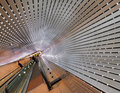
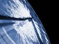
| 07/14/2010 01:31:20 PM | Leading to infinity by sekarmalathyComment: just thought you might want to know, there's a very similar photo in this month's pop-photo, it won 3rd prize for $100. aug 2010, pg 30. your pic is better. |  Photographer found comment helpful. Photographer found comment helpful. |
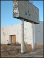
| 08/15/2003 08:40:15 PM | "Someone Used To Bowl Here..."by sfarrell23Comment: very desolate indeed. the sign nails it. good use of negative space, a good choice of angles. (i think the of-level quality works, but others will disagree) the colors are beautifully near-complimentary. eight. | | Photographer found comment helpful. |
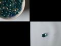
| 08/15/2003 08:37:52 PM | wait for me...by imagesloyolaComment: "now i know you may have made mistakes, but there's forgiveness and a second chance. so wait for me, darling..." and at the end of Wait could be Yes.
the black really, really hurts this picture, even though it provides an arbitrary sense of distance. the negative space of the surface and the shadows on it would have made for a much more interesting picture. the composition other than that is spot on, good choices in placement the bowl off the edge, and the single marble is at a good off center point to properly unbalance the two. i won't mark down for the focus, because i suspect this is the camera's doing, not yours. (still, an unsharp mask would have helped a little...)
if it weren't for the blatant symbolism, i'd probably mark this rather poorly, largely due to black. i don't know what this was, but i think (imho) it was a very poor decision, and probably breaking a few rules. either way, you obviously have a good eye and poor equipment. a better camera would suit you.
six. |
| 12/29/2002 08:01:54 PM | |
| 12/15/2002 05:28:28 PM | Time Fliesby LanaComment: very good concept. very good execution. i would have left it just a little longer, but the effect is great. 7 |
| 12/14/2002 07:43:06 PM | Medianby greenem2Comment: very standard type shot. good composition, colors. looks a little off straight. easily fixed though. 7 |
| 12/14/2002 07:42:06 PM | |
| 12/13/2002 06:57:31 PM | Ferris wheel of motionby billypComment: a shorter exposure and a larger aperature might have worked a little better. i think it might have been better with the spokes a little more distinct, but imagine this is more or less the effect you wanted. the composition is great. good contrast of form and void. keeping it to one basic color worked well too. 8 |
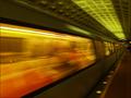
| 12/09/2002 09:54:47 PM | accelerationby magnetic9999Comment: obvious concept, amazing execution. colors are great (greens and oranges being near-compliments) and the blur is not excessive, and captures the motion well. also, the perspective, and the point you choice for the point of perspective (the angle you shot at) makes one's eyes follow the lines of the floor, windows, ceiling, etc, from one end of the picture to the other, which aids the idea of motion greatly. overall, a fantastic picture. 9 | | Photographer found comment helpful. |
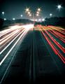
| 12/09/2002 09:47:52 PM | Adrenalinby oriontrailComment: another obvious concept, amazingly executed. the slight grain adds to the flow. the division of the colors (grey in the bottom quarter, white in the top, color in the other two) works, and the colors themselves work very well. the way the white stripe in the center flows is amazing. the focus of the "end" of the road being off center was a good choice, and it really draws your eye into the weaving motion of the road. 9 |
Home -
Challenges -
Community -
League -
Photos -
Cameras -
Lenses -
Learn -
Help -
Terms of Use -
Privacy -
Top ^
DPChallenge, and website content and design, Copyright © 2001-2025 Challenging Technologies, LLC.
All digital photo copyrights belong to the photographers and may not be used without permission.
Current Server Time: 04/06/2025 09:50:31 PM EDT.
|