| Image |
Comment |
| 10/25/2003 02:40:22 PM |
Breakdownby TooCoolComment: Somehow the toes distract. Too much light there. The rest is just a tad too dark to appreciate it. Maybe a spotlight toward the face would help. |
 Photographer found comment helpful. Photographer found comment helpful. |
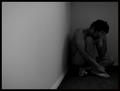
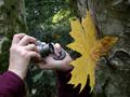
| 11/20/2002 09:56:00 AM |
Friendly Competionby Digital_DeamonComment: I really like the title and it's a nice idea. Hard to focus properly I guess with so much so near and so far, but at least the hands are very clear. I kind of wish it were the leaf instead though. Not a bad composition, and it's pretty balanced. 7 |
| 10/22/2002 10:00:00 AM |
Pearby KarenBComment: Hm, I like how you can feel the texture of the pear and how it stands out in the darkness. Nice use of 1-source light. |
| Photographer found comment helpful. |
| 10/22/2002 10:00:00 AM |
Totally Abract IIby JMSComment: It's just lovely. I'd like to blow it up and put it on my bedroom ceiling. But what is it? |
| 10/22/2002 10:08:00 AM |
tongue demonby g04tComment: Interesting idea. I wish the tongue would stand out more than the hands but I wouldn't know how to achieve that either. A little too much negative space to keep it interesting. |
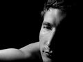
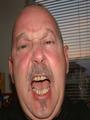
| 10/22/2002 12:55:00 PM |
effulgenceby nbortonComment: NIce photo but I'm confused by the title. He looks pensive, not effulgent. And the light isn't that radiant, so what do you mean? Nice portrait though, and use of 1-source light. 8 |
| Photographer found comment helpful. |
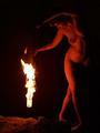
| 10/22/2002 10:06:00 AM |
Poi--fire twirlingby OakleyComment: Nice! Like the curvy shapes lit up from her arms to her stomach and hip. Looks like some pagan witchy ceremony and it's interesting. Great use of 1-source light. |
| 10/14/2002 11:24:00 AM |
Wrathby JakComment: I see the attempt at expression in the mouth but it's not coming through in his eyes. You need a better actor. |
| 10/14/2002 10:54:00 AM |
vanityvilleby queen 91Comment: I like the textures you've captured here. The even smoothness of the manequin and the individual strands in the wigs and the pale plastic light reflraction. Wish you could make the manequin head pop out in the foreground a little more, but otherwise a well done composition. 8 |
| 10/14/2002 11:10:00 AM |
Gambling Angerby freeoglasiComment: How many times did you flip the table to get that shot? It's interesting but somehow I don't feel the anger coming off of it. The drinks look like pop-up toys floating in a carnival and the gun is so 2-dimensional it almost looks like a gun-shaped hole in the table. And the design on the cards is too citrusy-lime green to get respect. And I kind of wish I could see a piece of the fellow behind the table-- his expression or something. Interesting idea though. 6 |
Home -
Challenges -
Community -
League -
Photos -
Cameras -
Lenses -
Learn -
Help -
Terms of Use -
Privacy -
Top ^
DPChallenge, and website content and design, Copyright © 2001-2026 Challenging Technologies, LLC.
All digital photo copyrights belong to the photographers and may not be used without permission.
Current Server Time: 02/01/2026 08:54:55 AM EST.