| Image |
Comment |
| 06/29/2005 02:46:03 PM |
Fallenby colourBlindComment: Not on topic to me, but I can see how other people might think it is... |
 Photographer found comment helpful. Photographer found comment helpful. |
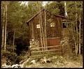
| 06/29/2005 02:43:40 PM |
Nobody's Homeby RonBeamComment: a slight rotate anticlockwise to straighten up the verticals would help, and possibly cropping off the right edge back to the blockwork. Actually, doing the same on the left would remove the distracting black ironwork at the top third. |
| 06/29/2005 02:40:51 PM |
Weathered Pianoby BAMartinComment: Lots of interesting textures here - I would have preferred more light on the keys, though. |
| Photographer found comment helpful. |
| 06/29/2005 02:38:31 PM |
Heredityby esdarbyComment: Nice composition! Love the line leading away from the scissors and comb to the subject! I'd prefer a slightly deeper DoF to keep the scissors sharp :p |
| Photographer found comment helpful. |
| 06/29/2005 02:35:41 PM |
Hey, Mom! It's for you.by hopnjohnComment: A slightly larger crop would help - the receiver is bleeding into the edge of the photo. The cord looks slightly blurred, as well. Good subject matter, though! |
| Photographer found comment helpful. |
| 06/29/2005 02:33:43 PM |
Obsolete, which one?by audinutComment: This doesn't feel quite square on, even though the bottom axle is obviously square with the bottom of the photo... I would try a few alternative clockwise rotates, to see if anything other angle works better. |
| 06/29/2005 02:30:43 PM |
|
| Photographer found comment helpful. |
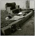
| 06/29/2005 02:28:51 PM |
Kick It To The Curbby sibelingComment: I like the composition, with the sweeping curve of the kerb emphasising the battered chair, but the cardboard ovelapping the kerb is distracting, as is most of the other bright rubbish - removing it from the shot would have simplified it and made it stronger. (although, then it wouldn't have been 'natural', but hey!) you would then have had 3 simple textures - the fence, the gravel and the tarmac with strong deliniations between them. |
| Photographer found comment helpful. |
| 06/29/2005 02:20:44 PM |
|
| 06/29/2005 02:15:46 PM |
|
| Photographer found comment helpful. |
Home -
Challenges -
Community -
League -
Photos -
Cameras -
Lenses -
Learn -
Help -
Terms of Use -
Privacy -
Top ^
DPChallenge, and website content and design, Copyright © 2001-2025 Challenging Technologies, LLC.
All digital photo copyrights belong to the photographers and may not be used without permission.
Current Server Time: 04/12/2025 05:21:27 AM EDT.