| Image |
Comment |
| 04/28/2005 12:30:26 AM |
|
 Photographer found comment helpful. Photographer found comment helpful. |
| 04/28/2005 12:29:11 AM |
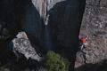
The Climberby grahampComment: Good shot. IMO it would have served you even better to wait until he was higher than the tree line - the tree tops create a reference point that detracts from the sense of scale. On the plus side I like that there is no reference point at the top. I would suggest cropping out the highlights on the left too. Overall I like this idea... |
| Photographer found comment helpful. |
| 04/27/2005 11:03:05 PM |
|
| Photographer found comment helpful. |
| 04/27/2005 11:01:01 PM |
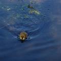
Little duckby TedvandenBerghComment: Very cute! IMO the image would be more effective if the duck was completely isolated - ie no evidence of the shallow bottom. A tighter crop at the top of the frame may improve this (but may have risked low marks for subject size in this particular challange). |
| Photographer found comment helpful. |
| 04/27/2005 10:53:21 PM |
|
| 04/27/2005 06:07:32 PM |
Small Duck Big Pondby eostylesComment: For me the expression on the duck lends itself to a non-centred composition. The white reflection on the water on the right is also a distraction - perhaps it could have been cropped. Would have been even better without so many ripples in the water. Otherwise a solid attempt for this challange. |
| Photographer found comment helpful. |
| 04/27/2005 06:04:15 PM |
Stingby StangComment: Always a fan of macros. I find the amount of absolute black and white in the frame a little distracting. Would have also like to see the hairs on the bee stand out a little more, and would be improved if the eye was not lost in the shadow below. But this shot is difficult and you should be proud of your result. |
| 04/27/2005 06:01:13 PM |
Guiding Lightby brett2004Comment: I'm sure some will score low simply because of size. I don't mind this, but I am concerned about the blown out highlights in the centre. Better exposure would have scored an extra 1-2 points in my mind. Definately worth going back to reshoot - lovely structure and could have some cracker colouring - I'd also aim to shoot just a touch earlier and get some more complimentary colours in the sky. |
| Photographer found comment helpful. |
| 04/27/2005 01:26:34 AM |
Flightby myceliumComment: I like this very much. Good job on keeping the sky out of the frame. Title draws attention to the great lines. Good composition and I think also good exposure. Well done - I hope you score well... |
| Photographer found comment helpful. |
| 04/27/2005 01:19:11 AM |
Blindsby JewellianComment: Nice lines. Looks a bit enlarged??? I support the concept, but I would have liked a smoother texture that suits the lighting - the pattern on the curtain too closely resembles digital artifacts from low quality light sensors - an unfortunate distraction. I think also the top right corner detracts from the symetry of the rest of the image. Pay close attention to the edges too - they apear either out of focus or enlarged, and suffer from sharpening effect. |
| Photographer found comment helpful. |
Home -
Challenges -
Community -
League -
Photos -
Cameras -
Lenses -
Learn -
Help -
Terms of Use -
Privacy -
Top ^
DPChallenge, and website content and design, Copyright © 2001-2025 Challenging Technologies, LLC.
All digital photo copyrights belong to the photographers and may not be used without permission.
Current Server Time: 04/09/2025 12:58:08 PM EDT.