| Image |
Comment |
| 08/08/2005 02:23:30 PM |
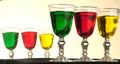
Three Glasses of colourby kiwinickComment: This is pretty! Coloured Jello? The glass touching the frame on the right unbalances it a bit, otherwise a very good strong image! |
 Photographer found comment helpful. Photographer found comment helpful. |
| 08/08/2005 02:21:28 PM |
Blue Lanterns of Illusionby ssodellComment: Nice shot and nice tones. Had too look twice to see what's going on.
The lanterns almost disect the image into top and botom halves, which is not as strong in composition as 1/3 2/3. I like it though. |
| Photographer found comment helpful. |
| 08/08/2005 02:18:25 PM |
See Yaby jrtoddComment: Nice one. The center composition might not do too good, and the white "glow" is a bit distracting. |
| Photographer found comment helpful. |
| 08/08/2005 02:12:03 PM |
X-Ray Vision : Framedby mesmerajComment: Interesting shot. I like the concept. A lot of the washed out wall on the far right doesn't really contribute, and the multiple shadows are distracting. I want that frame though hehe. Could be usefull! |
| Photographer found comment helpful. |
| 08/08/2005 02:08:57 PM |
combat lifesaverby militarygirl10Comment: Image is really too small.
I like the tones, allthough maybe a bit too saturated. Don't like the plaster on the hand. |
| Photographer found comment helpful. |
| 08/08/2005 02:06:59 PM |
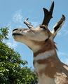
Glass Eyeby hblakeComment: Nice clear image, but the leaves are a bit distracting. Can't really see the illusion though. Thinking it's a stuffed dears head giving the illusion it's alive? |
| 08/08/2005 02:02:08 PM |
The Jugglerby MPRPROComment: Nice bokeh (Hehe I think it's the first time I've used that word) . The image invites you to look deeper, and that's a good thing. Would be nicer if you gave the viewr something to look at in the ball that contributed to the story. |
| 08/08/2005 01:59:22 PM |
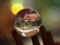
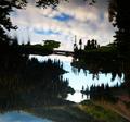
Not Quite What It Seems... Look Hard :)by ShannonLeeComment: A bit too contrasty imo, and tilted to the right. Be carefull with shots containing water and bridges and such with the tilting.
Nice concept too! The riiples in the water and mountains on the bottom give it away. |
| Photographer found comment helpful. |
| 08/08/2005 01:56:31 PM |
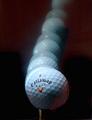
Reflection from a clubheadby marvinComment: That looks like a dangerous shot hehe. Nice with the grass at the bottom (where yo'd expect it). The lighter dots hijack the image a bit though.. |
| Photographer found comment helpful. |
| 08/08/2005 01:53:48 PM |
|
| Photographer found comment helpful. |
Home -
Challenges -
Community -
League -
Photos -
Cameras -
Lenses -
Learn -
Help -
Terms of Use -
Privacy -
Top ^
DPChallenge, and website content and design, Copyright © 2001-2025 Challenging Technologies, LLC.
All digital photo copyrights belong to the photographers and may not be used without permission.
Current Server Time: 04/13/2025 10:28:57 AM EDT.