| Image |
Comment |
| 03/06/2006 04:39:09 AM |
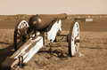
Port of Portland, 1861by bmoraComment: From the Critique Club:
Overall a decent image. But compositionally it just seems wrong. Their is background "clutter" right in like with the main subject. The barrle is positioned 2/3rd's the way up which normally might be good. But with an uninteresting sky with no detail it just makes it less uninteresting. The raking light from right to left makes the texture on the wood dull and flat. No pop to the weathered and beaten wood. I think a lower point of view with the cannon sticking more into the sky (even it it is a cloudless sky) would have worked alot better. The tones are not all that bad but the lighting from righ tot left make long shadows that trail off the image. |
 Photographer found comment helpful. Photographer found comment helpful. |
| 03/06/2006 04:24:01 AM |
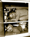
The perfect hiding placeby AnnaPComment: From the Critique Club:
Nice lively subjects. Alot of children pictures seem to be staged but this one does not. For me the image has too many lines. The door and frame then the lines seperating the 2 children. It just seems to overpower me. The shading is nice but for me the dark areas around the children seem a bit to dark. Looks like either strong lighting or a flash. You and the children will probrably remember this more then your score you ended up with. I am not sure what would have helped the image scoring wise. Most people either like or dislike children right off. Still a nice happy image. |
| Photographer found comment helpful. |
| 03/06/2006 04:02:00 AM |
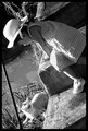
How are youby mknaceComment: From the Critique Club:
Very nicely done. I have to agree with the others. The twisting of the subjects forces the viewers eyes to line up with both the cat and the girls head. The lines on the steps are a little distracting to me but they do add a bit of charm to the overall photo. The tones are very nicely done. More of a straight black and white but still well within the challenge. The top overall seems a tad bit to dark to me. But it does balance well with the cat and light in the bottom of the image. If the girl had wore anything but a light colored dress I think it would had made for an unbalanced photo. I think what hurts the image is the lack of more face on the girl. Other then that I think its a good image. |
| Photographer found comment helpful. |
| 03/01/2006 03:42:28 AM |
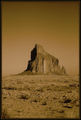
Rock with Wingsby DustDevilComment: Originally posted by Artyste:
Rock on Dusty! I nearly crapped myself when I saw a photo that *wasn't* mine in the scores for this lens. LOL |
Well you don't have to worry. I am selling my 2 sigma's and found out I didn't have the APO just the DL lol. So I edited it for the DL. |
| 02/26/2006 04:56:47 AM |
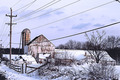
I Don't Miss Itby o2bskatingComment: From the Critique Club:
At first glance it looks a bit cluttered. But I mainly think that the power lines add to that problem more then the shrubs in the foreground. The coloring is ok but nothing really pops out. Might have been better to use black and white or even a light sepia. But thoose are just personal tastes.
The horizon seems to slope to the right. And the negative space in the sky on the right top seem to make the image lopsided to me. I think it is still a good image just nothing great that it might have been. Either by changing the point of view or getting closer to the fence line might have helped. Keep on trying. |
| Photographer found comment helpful. |
| 02/26/2006 04:46:57 AM |
A Creek Runs Through Itby melissiaComment: From the Critique Club:
I am sure you ahev heard alot about the size of the image already. I think that is just a small portion to what hurts the image overall. The foreground has no real detail or depth. Just stark white in color. While the top is darker but still further away and even less detailed. I can see where your point of view was and the angle that you were trying to create but it doesn't create any mood. Even if the image was larger I do not think it would have scored very much more.
Not sure if you cropped it or just resized it. But I would have liked to seen it from a different angle. Amnd not so much of the river in the center of the photo. Maybe even up against that tree shooting at the fence line with the water coming through the middle. Just an example.
But do not get discouraged. Try and work on one thing in a photo at a time...composition....subject matter...point of view. Then slowly try and put them all together. In time you will improve.
|
| 02/25/2006 06:46:00 AM |
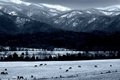
Cold Breakfastby PhilComment: From the Critique Club:
Great toning and coloring. Very nice compositioned with the horses/valley a 1/3rd of the way down. The spots of the horses against the white ground make for a nice touch. The only negative I see if the dark band in the middle of trees. Above and below it are lighter tones and to me it almost seems like negative space. But the overall impact and peacefullness of the image overcomes the rest. Nice image. |
| Photographer found comment helpful. |
| 02/25/2006 06:36:36 AM |
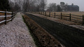
Countrylandby seebrownComment: From the Critique Club:
The image is overall nicely done. But some of the problems for me are with the fences. They are leading the viewers eyes up and away out of frame towards nothing of any detail. The lack of any available light makes the photo overall seem flat and less detailed. Maybe a different point of view shooting through the fences towards the buildings would have helped. Still a nice image. |
| Photographer found comment helpful. |
| 02/25/2006 06:26:53 AM |
In his father's footstepsby KitaComment: From the Critique Club:
The composition is a little to centered for me. Great tones in the hat and face. Great expression and subject totally fits the challenge. Not to sure about the undies/shorts. Probrably just a personal choice ie as some people vote down children just for being children. Very nice photo to remember for a long time. |
| Photographer found comment helpful. |
| 02/23/2006 04:17:08 AM |
...seen thru BLUE eyes...by dolphnz8Comment: The tones and colors are very nice. While I have seen other entries with alot of solid black elements I think yours really pulls it off well. The only distraction for me are the power lines. I gave it a 7. |
| Photographer found comment helpful. |
Home -
Challenges -
Community -
League -
Photos -
Cameras -
Lenses -
Learn -
Help -
Terms of Use -
Privacy -
Top ^
DPChallenge, and website content and design, Copyright © 2001-2025 Challenging Technologies, LLC.
All digital photo copyrights belong to the photographers and may not be used without permission.
Current Server Time: 04/07/2025 06:22:34 AM EDT.