| Author | Thread |
|
|
03/06/2006 09:39:09 AM |
From the Critique Club:
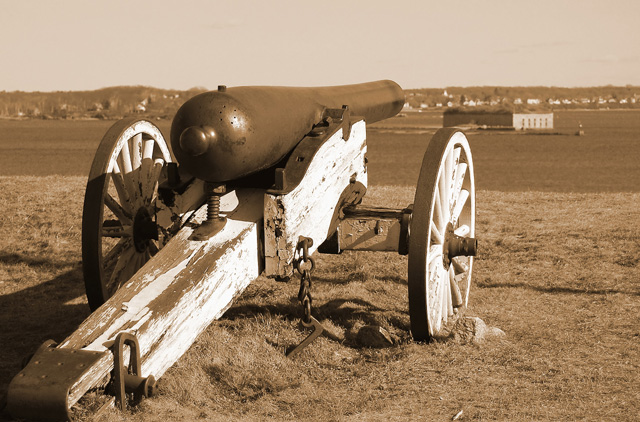
Overall a decent image. But compositionally it just seems wrong. Their is background "clutter" right in like with the main subject. The barrle is positioned 2/3rd's the way up which normally might be good. But with an uninteresting sky with no detail it just makes it less uninteresting. The raking light from right to left makes the texture on the wood dull and flat. No pop to the weathered and beaten wood. I think a lower point of view with the cannon sticking more into the sky (even it it is a cloudless sky) would have worked alot better. The tones are not all that bad but the lighting from righ tot left make long shadows that trail off the image. |
|
 Photographer found comment helpful. Photographer found comment helpful. |
Comments Made During the Challenge  |
|
|
02/28/2006 07:53:17 PM |
|
|
|
02/27/2006 05:56:30 PM |
|
|
|
02/27/2006 04:12:30 PM |
| Great tones. Very sharp focus. |
|
|
|
02/25/2006 09:46:13 PM |
| I like this shot, but what would it have looked like if you got a little closer to the barrel and used that as the perspective on the background a bit more? Just curious. |
|
|
|
02/25/2006 05:16:13 AM |
A snapshot of a cannon. Why?
Horizon doesn't seem to have been thought about. Why make it exactly level with the barrel of the cannon? This confuses what is presumably supposed to be the focal point of the photo.
Bad light, there are shadows on the cannon which takes away from the composition, and there is too much bright light on the wood.
It doesn't feel balanced compositionally. Although you've placed the cannon right up to the bottom-left corner which creates a nice leading line, the space to the right of the cannon feels odd. It might have worked better with more space to the right of the cannon.
No detail in the sky.
Nothing seems to be using rule of thirds.
It's a photo of a cannon... unless I was a cannon geek, why should this interest me?
Sepia tones don't do much for me with this image, and it seems a bit low on contrast. |
|
|
|
02/23/2006 08:06:49 PM |
| a bit too centered, i'd say. good choice of tones, though |
|
Home -
Challenges -
Community -
League -
Photos -
Cameras -
Lenses -
Learn -
Help -
Terms of Use -
Privacy -
Top ^
DPChallenge, and website content and design, Copyright © 2001-2026 Challenging Technologies, LLC.
All digital photo copyrights belong to the photographers and may not be used without permission.
Current Server Time: 02/01/2026 09:29:46 AM EST.