| Image |
Comment |
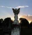
| 03/28/2005 12:03:41 PM |
Angle Glowby kirtiebuComment: Very nice! I would have cloned out that thin stream of clouds above the angel... I think they are distrating from the sun and the angel. Eyes normally focus on the light areas first. I also wish the angel's face was lighter. However, great idea and great choice of statue to focus on. =) |
 Photographer found comment helpful. Photographer found comment helpful. |
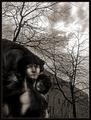
| 03/28/2005 12:01:26 PM |
On the banks of the Styxby jjbeguinComment: Great photo! =) I only wish that the statue was more in focus... it doesn't seem sharp. I like that you put it in black and white. |
| Photographer found comment helpful. |
| 03/28/2005 11:59:13 AM |
Missingby IceRockComment: I really love your composition and blue color cast. I would have like to see it cropped vertically instead of horizontally, even though I think horizontally works... but may have been stronger the other way. However, GREAT JOB! =) |
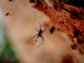
| 03/28/2005 09:03:44 AM |
Charlotte in her web...by ergoComment: Very nice photograph. I do not like how the closest spider is in the center of the photograph... I think it would have been stronger if you cropped it differently and removed that distracting black spot to the right of hte large spider. Otherwise, I like how you took a different take on the cemetary competition. |
| Photographer found comment helpful. |
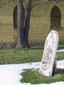
| 03/28/2005 09:00:55 AM |
Memories in stoneby saiphfireComment: The tombstone looks a little out of focus and the bright white background is very distracting. Otherwise I think that you had a great idea =) |
| Photographer found comment helpful. |
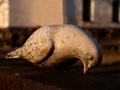
| 03/28/2005 08:59:20 AM |
ressurectionby messerschmittComment: All the dots make my eyes tired =) Very interesting photograph. I would like to see the ground burned so that the white spots are not as bring as the ones on the coffin... makes my eyes unable to look at your photo for long =( It's just very busy. But excellent idea!!! I really like your composition! |
| Photographer found comment helpful. |
| 03/28/2005 08:57:32 AM |
Tragicby moviemanComment: Definately tragic =( I feel that is is a very nice photograph and excellent exposure & contrast, however, it just doesn't stand out. Just looks like an ordinary picture of a tombsone, which is okay =) |
| Photographer found comment helpful. |
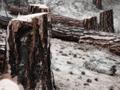
| 03/28/2005 08:54:49 AM |
Here Lies Our Forestby ArtysteComment: A nice take on the cemetery challenge =) Did you use diffuse glow? If, you did, I think it was a little over-done. Also, the light area in the lower left corner is very distracting. I would have cloned that out or recropped. Otherwise, I like your composition and your perspective of the challange. |
| Photographer found comment helpful. |
| 03/28/2005 08:53:17 AM |
For Bela...by Kaja LundComment: I really like the color and tone. I do not exactly know why, but the composition looks a little off for me. Also, I do not really understand how this picture fits in the "cemetary" category, except that maybe you found this statue in the cemetary. Otherwise I think it is a nice photo =) |
| 03/28/2005 08:51:31 AM |
Final Peaceby overcameComment: This picture looks very faded and the snow is really over-exposed. However, I really like the location and simplicity. |
Home -
Challenges -
Community -
League -
Photos -
Cameras -
Lenses -
Learn -
Help -
Terms of Use -
Privacy -
Top ^
DPChallenge, and website content and design, Copyright © 2001-2025 Challenging Technologies, LLC.
All digital photo copyrights belong to the photographers and may not be used without permission.
Current Server Time: 04/12/2025 09:17:33 AM EDT.