| Image |
Comment |
| 07/04/2006 10:53:43 AM |
|
 Photographer found comment helpful. Photographer found comment helpful. |
| 07/04/2006 10:51:31 AM |
|
| Photographer found comment helpful. |
| 06/22/2006 08:47:44 AM |
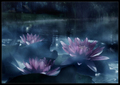
Shadows, color and textureby AndrewTOComment: Hi! HereГўҖҷs a comment from the Critique Club.
First Impression:
Nice blue! My eye is drawn to the lock, the bolt, the black vertical line, then the shadows
Composition:
I like the fact that the lock and bolt are not centered. The lighting really works well with the blue and the paint texture.
Subject:
Meets challenge, but the shadow was not the main point of interest.
Technical:
Despite what others said, I find it a bit grainy. Given the light IГўҖҷm surprised you used ISO800. You didnГўҖҷt include any post processing comments so IГўҖҷm not sure what you did, if anything.
Summary:
The blue and composition really carried the shot. Congratulations on your 71% placement. Supports your goal!
|
| Photographer found comment helpful. |
| 06/08/2006 08:24:07 AM |
the future looks brightby mambaComment: Hi! HereГўҖҷs a comment from the Critique Club.
First Impression:
My eye keeps getting drawn to the blown out white below the ball. Focus seams off. Nice lighting and focus on the wood.
Composition:
Chair creates nice lines supporting the paperweight. Nice use of negative space to provide balance and contrast. Works well with the chair. Ball support is distracting. Breaks up the flow.
Subject:
Meets challenge
Technical:
Over exposed. Light areas are blown. With such contrast between the dark background and the bright light, try dropping your exposure down ГўҖң-2ГўҖқ or ГўҖң-1ГўҖқ you may lose the chairs, but it will make the hi-lights more appealing. Focus appears off due to the overexposed areas. Option: Try reducing the intensity of the light source with a piece of paper over the light, or a piece of cardboard with a small hole.
Summary:
Welcome to DPC! Have you caught the ГўҖңupdateГўҖқ addiction? You had a good idea for the challenge, unfortunately I think the overexposure worked against you. The voters generally expect clear sharp pictures, and with only a couple of seconds to vote, they wonГўҖҷt spent too much time trying to figure out the shot.
Good luck in you future submissions.
|
| Photographer found comment helpful. |
| 06/07/2006 12:39:16 PM |
|
| Photographer found comment helpful. |
| 06/07/2006 08:58:08 AM |
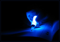
Enlightened Writingby diablo2097Comment: Hi! HereГўҖҷs a comment from the Critique Club.
First Impression:
Nice blue. Neat light source!
Composition:
Excellent positioning of your subjects. The pages really balance the negative space. Written text would have added some interest and action to the shot. Looks a bit static.
Subject:
Meets challenge
Technical:
DOF is shallow, but I donГўҖҷt know how much you could have influenced or ГўҖңout thoughtГўҖқ your camera settings.
Nice contrast and compromise between blowing out the light and getting hand/paper detail.
Soft focus works for this type of shot.
Summary:
Welcome to DPC. You have a good eye and you did very well with your second entry. Sooo close to a ГўҖң6.ГўҖқ Good luck with future entries!
|
| Photographer found comment helpful. |
| 06/07/2006 08:56:18 AM |
Enlightened Writingby diablo2097Comment: Hi! HereГўҖҷs a comment from the Critique Club.
First Impression:
Nice blue. Neat light source!
Composition:
Excellent positioning of your subjects. The pages really balance the negative space. Written text would have added some interest and action to the shot. Looks a bit static.
Subject:
Meets challenge
Technical:
DOF is shallow, but I donГўҖҷt know how much you could have influenced or ГўҖңout thoughtГўҖқ your camera settings.
Nice contrast and compromise between blowing out the light and getting hand/paper detail.
Soft focus works for this type of shot.
Summary:
Welcome to DPC. You have a good eye and you did very well with your second entry. Sooo close to a ГўҖң6.ГўҖқ Good luck with future entries!
|
| Photographer found comment helpful. |
| 06/06/2006 11:04:53 AM |
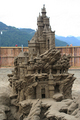
Master Sand Castleby dojogaComment: Hi! HereГўҖҷs a comment from the Critique Club.
First Impression:
Too bad the file is so small. More wow for the subject than the picture. I can see lots of shapes in the sand, but there is very little sand detail.
Composition:
Excellent light direction. Really brings out the shapes and depth. Works as a centered shot as the castle is the significant subject. Dropping the camera angle, and shooting up may have increased the visual impact. Are we missing anything in the front? Looks like there was some possible lead in features.
Subject:
Meets challenge
Technical:
Sky is washed out. Try to keep your pictures at the max 640 X pix dimension. Yours was 290 X 435. You lose detail with small files and voters will drop their score. Your 400 ISO probably didnГўҖҷt help the amount of detail either. Given the outdoor location a 100 ISO should have been possible
Summary:
The shot had lots of potential. Really interesting and visually appealing subject. Good eye. Sand grain detail is missing.
CongratГўҖҷs on your first entry. Looks like you have been around for awhile. No reason not to enter more submissions.
|
| 06/06/2006 09:20:41 AM |
Master Sand Castleby dojogaComment: Hi! HereГўҖҷs a comment from the Critique Club.
First Impression:
Too bad the file is so small. More wow for the subject than the picture. I can see lots of shapes in the sand, but there is very little sand detail.
Composition:
Excellent light direction. Really brings out the shapes and depth. Works as a centered shot as the castle is the significant subject. Dropping the camera angle, and shooting up may have increased the visual impact. Are we missing anything in the front? Looks like there was some possible lead in features.
Subject:
Meets challenge
Technical:
Sky is washed out. Try to keep your pictures at the max 640 X pix dimension. Yours was 290 X 435. You lose detail with small files and voters will drop their score. Your 400 ISO probably didnГўҖҷt help the amount of detail either. Given the outdoor location a 100 ISO should have been possible
Summary:
The shot had lots of potential. Really interesting and visually appealing subject. Good eye. Sand grain detail is missing.
CongratГўҖҷs on your first entry. Looks like you have been around for awhile. No reason not to enter more submissions.
|
| 06/06/2006 04:29:11 AM |
Fabulous 40'sby PhotopromoComment: Hi!
Re ГўҖңunnatural lighting backgroundГўҖВҰГўҖқ
On my monitor I see a lightness that follows just above the body from the waist down to the far right. Also a similar lightness just to the left of her head. I didnГўҖҷt know if it was intentional to show an edge? Still think itГўҖҷs an excellent picture. :-)
|
Home -
Challenges -
Community -
League -
Photos -
Cameras -
Lenses -
Learn -
Help -
Terms of Use -
Privacy -
Top ^
DPChallenge, and website content and design, Copyright © 2001-2025 Challenging Technologies, LLC.
All digital photo copyrights belong to the photographers and may not be used without permission.
Current Server Time: 04/12/2025 02:52:54 PM EDT.