| Image |
Comment |
| 09/21/2005 09:32:26 PM |
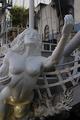
Last Graspby decadentsavantComment: You need much more contrast in this photo to brighten the statue so that it stands out from the background. Show us its true colors. |
 Photographer found comment helpful. Photographer found comment helpful. |
| 09/21/2005 09:31:21 PM |
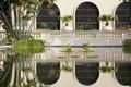
Sanctumby awpollardComment: Good picture. I agree that the water line should be centered since it enhances the symmetry of the building and its reflection. However, this doesn't leave you with much to follow the rule of thirds. The trees do, but those aren't a major element of the picture. I would suggest cropping them out and leave the potted plants and their reflections at the four "rule of thirds intersection" points. |
| Photographer found comment helpful. |
| 09/21/2005 09:05:58 PM |
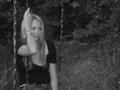
Nobody Puts Baby In The Cornerby xxam0ram0rxxComment: I took the liberty of saving this photo and doing a simple levels adjustment (Black = 25, White = 186, Gamma = 0.90) and it made a world of difference. Right now, this photo is quite lacking in contrast and has a very narrow tonal range (it consists of a very narrow range of shades of grey). That there are no pure black and no brighter areas leaves the eye wondering where to look. Increasing the contrast with levels gives shape to your subject (right now she looks very flat and two-dimensional) and brightens it to make it the focus of the photo. |
| 09/21/2005 08:41:37 PM |
Roostby zarniwoopComment: Blue bird against a blue sky? I think another time of day would provide better lighting. |
| Photographer found comment helpful. |
| 09/21/2005 08:35:30 PM |
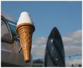
Inspiration could come from anywhereby redmoonComment: Brings back memories of Barcelona.
I don't think a narrow DOF serves you well here. The point is to compare the two cones and having one out of focus negates that idea. |
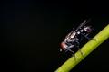
| 09/21/2005 08:32:05 PM |
Bugby hstegComment: A bit blurry (I assume from motion blur). I'm surprised you could get a fly to stay still even for a single frame. |
| Photographer found comment helpful. |
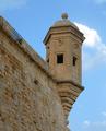
| 09/21/2005 08:29:09 PM |
GARDJOLAby keithborgComment: Interesting building. Unfortunately, the picture is at such a low overall contrast that I didn't see the eye and ear at first. I don't think there's much to be done with this picture except to go back and reshoot when the sun is nearer the horizon. This looks like noon/afternoon sunlight which doesn't cast enough light on the vertical walls (since the light is vertical) and provides too bright a sky to really make the subject stand out from the background. Early or late sun would throw more light on the walls and darken the sky, focusing attention on the castle and bringing out the textures of the walls and the odd features of the tower.
Also, better light would let you know whether the wall is interesting enough to keep in the photo. Otherwise crop it out and have the tower in the opposite corner of the picture with a twilight or night sky in the background. |
| Photographer found comment helpful. |
| 09/07/2005 01:41:37 AM |
Don't Think Twiceby The_ItinerantComment: Hmm... nobody understands what I'm doing or what the title means...
AHA! I'M AN ARTIST!
Actually, I agree. This is a shit picture--taken at the last minute and using an idea that I just couldn't get to work right. I was trying to use the hallway lights just outside my apartment door, which were directly overhead, hence the shoe in shadow. My camera was placed on it's end on the floor and propped up with a few books I had. I desaturated everything except the vase because the picture was so underexposed that the colors looked bad no matter what I did. I left the vase blue so it wouldn't be lost in the background (important because it's the only interesting thing in the picture).
The title comes from the Bob Dylan song "Don't Think Twice (It's Alright)" about a guy walking away from a relationship and I was trying to capture that here. Unfortunately, even before I submitted it I knew this was going straight to the bottom of the rankings (Lots of comments, though, thanks for putting up with this crap!).
Funny that of my six challenge submissions, my first three were the best (average score: 5.682) and my latest three have all been rather bad (average score: 4.29). I guess I haven't been inspired as of late (by the challenges at least, next week I'm picking up some enlargements of my own photos and hanging them on my walls).
Here's hoping for next week. *pours another pint*
By the way, how does one edit their comments next to the photo information after a challenge is over? |
| 08/30/2005 08:44:44 PM |
|
| Photographer found comment helpful. |
| 08/10/2005 07:20:26 PM |
1836by res0m50rComment: Quibble: I don't believe that there were folding chairs in 1836.
I think the white, blown-out sky detracts from the old, sepai-tinted look you were going for. It looks out of place in this photograph and attracts attention away from the house (at least my eye tends towards the bright sky more than the dull colors of the house).
Good try. |
| Photographer found comment helpful. |
Home -
Challenges -
Community -
League -
Photos -
Cameras -
Lenses -
Learn -
Help -
Terms of Use -
Privacy -
Top ^
DPChallenge, and website content and design, Copyright © 2001-2025 Challenging Technologies, LLC.
All digital photo copyrights belong to the photographers and may not be used without permission.
Current Server Time: 04/07/2025 06:22:46 AM EDT.