| Image |
Comment |
| 02/06/2005 06:59:31 PM |
|
 Photographer found comment helpful. Photographer found comment helpful. |
| 02/06/2005 06:59:05 PM |
Alleyway Refugeby redmoonComment: A little blurry, in some spots it works and in others it doesn't. I know I tried something like this in a challenge and it wasn't recieved well (last place actually) but in this image it seems to effect the image better. |
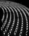
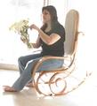
| 02/06/2005 06:36:27 PM |
light all aroundby singaleComment: I think the light, in this case, doesn't do any good for the photograph. It washes away the shadows a picture needs for dept. One never needs a lot, but this picture doesn't have any. Also, pick colors that can stand apart from the rest of exterior of the subject, such as instead of yellow and white flowers that blend in, pick deep red or blue. |
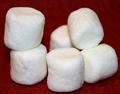
| 02/06/2005 06:33:20 PM |
..and fluffyby Erin_KComment: To me, this looks like only a pile of marshmellows. Though I get your concept from your title, thats it, its just blah. Next time, try to find a creative way to show how a subject can be how it can be. Such as, instead of a pile of marshmellows that looks heavy instead of 'light', stick some feathers in the sides of one and photography it with the sky behind it. It shows that it really can be lite as air. |
| Photographer found comment helpful. |
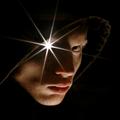
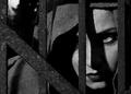
| 02/06/2005 06:28:03 PM |
The Watcherby labudsComment: This would be such a beautiful photo if is isn't for the huge star of David on the eye. The problem I have with it is it takes away from the rest of the image because it is sooooo bright. The values and details in the face are awsome. Next time, if you use something like a shine of light, try not to use it so bright that it overcomes the rest of the image. |
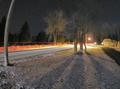
| 02/06/2005 06:19:59 PM |
Car Nightby thedemComment: Although the subjct is interesting, it is a bit sterotypical. Nor is the subject the focal point of your image (are my eyes are not drawn towards the red lights, i have to look for them). not colors pop and the only impasis is the street light. You've got the right idea, next time try to step over some bounderies. |
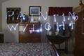
| 02/06/2005 06:14:01 PM |
Ghost Writer in my Bedroomby lwkimagesComment: I can't imaging how long it took rehursing this photo, but it turned out brillently! I love the face in the midground, that what tops it off. you better give a good detail how you accomplished this. |
| Photographer found comment helpful. |
| 02/06/2005 06:11:59 PM |
|
| Photographer found comment helpful. |
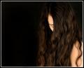
| 02/06/2005 06:11:21 PM |
Hiding from the Lightby NazgulComment: Everything about this image is perfect. All the textures are captured beautifully, and shadows/light are contrasted well. |
| Photographer found comment helpful. |
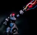
| 02/06/2005 06:10:16 PM |
I, Robosapienby ImagineerComment: a bit on the dark side, (pun intended) but who cares. I loved this image because of the wonderful 'lazers'. good job. |
| Photographer found comment helpful. |
Home -
Challenges -
Community -
League -
Photos -
Cameras -
Lenses -
Learn -
Help -
Terms of Use -
Privacy -
Top ^
DPChallenge, and website content and design, Copyright © 2001-2025 Challenging Technologies, LLC.
All digital photo copyrights belong to the photographers and may not be used without permission.
Current Server Time: 04/07/2025 06:11:24 AM EDT.