| Image |
Comment |
| 06/25/2003 12:49:45 PM |
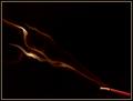
ojinikaby SatelliteSpeckComment: this is an interesting shot, but i'm not really diggin' it. the soft focus and in-your-face framing don't offer a lot to look at, and overall there is not much contrast to the shot, making it kind of muddied and dark. 5. |
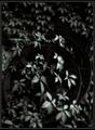
| 06/20/2003 12:04:22 PM |
Virginia Creeperby indigo997Comment: yeah, this is really nice. the soft focus effects give this a very ghostly feel, and the tones just add too it. i love the selective light that really brightens up the center part of this. possibly my only gripe is that, after all, it is just a shot of some leaves with little else really giving it any impact, but the mood is such that it really works. good job. 8. |
 Photographer found comment helpful. Photographer found comment helpful. |
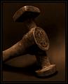
| 06/20/2003 12:02:45 PM |
Toilby jerrftComment: this is very nice. the sepia tones are working well here, and the diagonal composition of the hammer is nice. i feel like maybe a little more negative space would help balance this big hulking hammer, which really feels like it's overfilling the frame even though it technically isn't (if that makes any sense). perhaps just a tad too symmetical, as well. overall though, really well shot. 7. |
| Photographer found comment helpful. |
| 06/20/2003 12:00:47 PM |
Through the Looking Glassby magnetic9999Comment: i don't care for the subject matter here, as i really dislike pictures of cameras and camera equipment, but you've done a really good job capturing the light and contrast in and around the lens. the play of the light on the lens is really what makes this look good. i also like the framing and the tight crop on the bottom. good work. 7. |
| Photographer found comment helpful. |
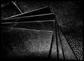
| 06/20/2003 11:58:20 AM |
Rough Stuff..by buzzrockComment: the textures and lighting in this image really create a striking mood. the subject matter is for the most part boring, but it creates such nice play with the light that it creates a lot to look at. nice crisp focus really makes this work. good job. 7. |
| Photographer found comment helpful. |
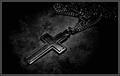
| 06/20/2003 11:49:26 AM |
The Key To Lifeby TarbiniComment: this is a strong image. the lighting is nice, almost like it was painted on to certain areas of the photo. only a couple of things bother me - the fact that the chains seeps into the border is kind of destracting, and also the loss of detail in the chain in the upper right corner. i'd rather see the chain stream out of the image instead of bunching up in the corner like that. the light reflecting off of the chain up there seems to become just a jumble of white specks and it detracts from the strong subject. a very good effort that could just use a little cleaning up. 7. |
| Photographer found comment helpful. |
| 06/20/2003 11:46:07 AM |
Incenseby jodiecostonComment: this is a nice shot. the tones and textures of the smoke are really cool. i'm not so sure about the placement of the incense stick, jutting into the photo in the corner like that, but the smoke really makes it. lighting and focus are very nice. good job. 7. |
| Photographer found comment helpful. |
| 06/20/2003 11:45:21 AM |
Black Watch on Black Velvetby JB707Comment: lighting and focus are good, and the fact that the object is centered in the frame seems to work okay here. i think the only thing that bothers me is that the watch is on its side. i think it makes me want to tilt my head to see what's going on. i'd rather see a vertical shot, and without the velvet textures below it. 5. |
| Photographer found comment helpful. |
| 06/20/2003 11:44:07 AM |
Black Cat on Black velvetby ladpupmoeComment: this more or less feels like a snapshot to me. the lighting is pretty flat and doesn't offer much contrast on the cat's hair. overall i just don't find the image very interesting. 4. |
| Photographer found comment helpful. |
| 06/20/2003 11:33:39 AM |
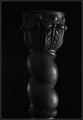
Candle Stickby DennisFComment: my primary gripe with this image is that it is a tad tilted to the right. this is so easily fixed in any photo editing software that it really makes me wonder why you didn't. although it is very very minor so maybe you didn't notice. the lighting here is pretty good, although i like to see more contrast in these types of images. brighter light on the one side of the candle stick and less light on the other side would serve to highlight the shapes and contours of the object. overall, a good effort. 6. |
| Photographer found comment helpful. |
Home -
Challenges -
Community -
League -
Photos -
Cameras -
Lenses -
Learn -
Help -
Terms of Use -
Privacy -
Top ^
DPChallenge, and website content and design, Copyright © 2001-2025 Challenging Technologies, LLC.
All digital photo copyrights belong to the photographers and may not be used without permission.
Current Server Time: 04/09/2025 07:50:44 AM EDT.