| Image |
Comment |
| 06/26/2003 06:05:40 PM |
Five Speedby GordonComment: good lighting, not so interesting sub ject. good framing. would rather a more subtle color in the border. 6. |
| 06/26/2003 06:00:19 PM |
Low Key Inheritanceby shareinncComment: this is a good effort and shows good control of your depth of field, but it feels kind of cluttered to me. perhaps without the pattern on the glass it would allow this image to be less cluttered and smoother. 5. |
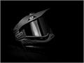
| 06/26/2003 05:59:28 PM |
Shades of Paintballby RuchartComment: this is really well focused and framed, but i feel like the light is maybe just a little flat. i'd like to see some more contrast on the edges of the mask. 6. |
 Photographer found comment helpful. Photographer found comment helpful. |
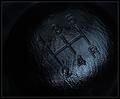
| 06/26/2003 05:58:41 PM |
The allowed on DPC version :(by dimitriiComment: this is a very nice image. i'm not sure i understand the title, this being an "open-to-editing" challenge, but it looks like you've done some work on the border, which gives the photo a more grungy feel. i like the lighting, thought it seems a tad flat. i'm thinking now that maybe the "not allowed on dpc" version includes a more liberal crop, but i think this works just fine. 8. |
| Photographer found comment helpful. |
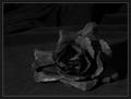
| 06/26/2003 05:55:47 PM |
Bloom On Velvetby auroraComment: one of the interesting things about flowers are their natural state of order and aesthetic appeal, but this one really looks like it's in bad shape. i think using a less worn subject would really allow this image to come alive. i'm also not a big fan of the background textures of the velvet. i think this would work better if the flower was alone in a darker environment with some stronger highlights and contrasts. 5. |
| 06/26/2003 05:53:48 PM |
3 Jacksby MusicmanComment: this has very poor focus. i understand the limitations of lower-end cameras, but maybe if you just backed off a bit you'd have been able to get a better focus lock on the jacks. the lighting and highlights seem pretty good, and maybe with a bit more work this would be an interesting shot. 4. |
| Photographer found comment helpful. |
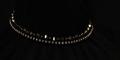
| 06/26/2003 05:49:14 PM |
Black Pearlsby jillzComment: i can see where you are going with this shot, especially with the long crop, but ultimately it ends up being a little boring. good light and reflections, though. 5. |
| Photographer found comment helpful. |
| 06/26/2003 05:48:28 PM |
Dignityby PaulkComment: good lighting to highlight nice textures and forms. this is a well done shot, but i'm not a big fan of shots that use some other form of art as their primary subject. 6. |
| Photographer found comment helpful. |
| 06/26/2003 05:47:23 PM |
Incenseby AntithesisComment: this is really just too dark. i'd like to see the light play more with the interesting curves and textures of the bowl. but as is, it's mostly just dark tones and then a central reflection on the bowl. 4. |
| 06/26/2003 05:43:20 PM |
black and grey nudeby boyte1Comment: a pretty nice shot, though not all that interesting. i'd like to see a less straigh-forward pose for this type of shot, to experiment with some of the curves that the light can bring out. also a very small crop, which doesn't really allow me to get a good feel for how this should really look. other than that, you've done a good job getting good light and tones. 6. |
Home -
Challenges -
Community -
League -
Photos -
Cameras -
Lenses -
Learn -
Help -
Terms of Use -
Privacy -
Top ^
DPChallenge, and website content and design, Copyright © 2001-2025 Challenging Technologies, LLC.
All digital photo copyrights belong to the photographers and may not be used without permission.
Current Server Time: 04/09/2025 07:53:18 AM EDT.