|
|
| Image |
Comment |
| 03/07/2006 09:03:00 PM | |  Photographer found comment helpful. Photographer found comment helpful. |
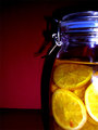
| 03/05/2006 10:07:10 PM | That's the spotby LKMoteComment: *Critique Club*
Per your request, here is your in depth critique from the critique club.
Since you didn't add any photographer's comments, my critique can only be based on personal opinion since I do not know what your intentions were for this photo.
Focus is spot on. Great clarity. The detail shown in his fur and face is amazing. Really great job with that.
The background is blurred nicely as well to prevent distracting elements in the background, but there is a horizontal line cutting straight through is poor head. Otherwise, the background works great.
I like the duotone treatment, I think it helps to enhance the detail and textures of his fur.
The level of interest for me isn't high. It's a technically well done shot, but it's not holding my interest for very long. It's lacking some type of visual appeal. Not sure what, as I said, it's technically very well done, but it's more of a personal opinion.
Lighting also appears very good, no blown out areas or distracting shadows. I think this is a great shot for a text book or documentary report.
~Heather~ | | Photographer found comment helpful. |
| 03/05/2006 09:38:23 PM | Neptune's Netby MRozzenComment: *Critique Club*
Well, you submitted, and ran. Haven't even logged on to check your comments, which leads me to believe you don't really care, so not sure why you'd ask me to spend my time writing this...but here goes.
Per your request, here is your in depth critique from the Critique Club.
Without any photographer's comments, my critique can be based only on personal opinion since I have no clue what your intentions were for this photo.
First off, the sucject doesn't appeal to me much at all. Not sure what you saw in this scene, but to me, it looks busy and cluttered with the power lines and poles.
The use of duotones doesn't add to this photo or the interest of this photo. It seriously lacks visual appeal. And without the color, it makes it even more dull.
Focus looks alright on the sign. Were the flowers suposed to add to the image or were they just in the way? It looks to me that they were just in the way, since they aren't really framing the subject in an interesting way.
The photo overall seems too grey. Some contrast would have helped some. There are no whites in the photo, which leaves the photo flat.
Overall, I feel that this photo was thrown in here for no reason at all, and the score reflects the effort put into this submission.
Sorry if I missed something.
~Heather~ |
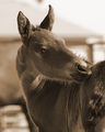
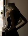
| 03/05/2006 09:24:35 PM | Blinding light of real lifeby LevTComment: *Critique Club*
Per your request, here is your in depth critique from the Critique Club.
Without any photographer's comments, it's difficult to tell what your intentions were for this photo, so my critique can be based solely on peronal opinion since I do not know what your intentions were.
The first thing I noticed was the left side of the photo. Like other commenters, I find it quite distracting and 'ugly' amongst the beauty of the subject.
Since we really can't see much of the fashion that is happening in this photo, I think that it's a stretch for the fashion category for me, but doesn't totally miss the challenge, since it is representative of fashion.
Focus appears ok, lighting is dark though, so hard to tell. There really isn't much to look at. The subjects are dark, and the only really clear part is the outside, which completely lacks interest for me.
The manequins are neat, I like the look and style of them, just wish they were possibly in a different setting somehow. I know, it's not like you can ask the store owner to move them so you can take pics, but non the less, the background hurts an otherwise alright photo.
~Heather~ | | Photographer found comment helpful. |
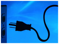
| 03/05/2006 08:54:10 PM | unpluggedby RikkiComment: *Critique Club*
She bangs! She bangs!
What an awesome photo! I really do love it Rikki. The color is great and I just love the silhouetted plug. I got the connection to the challenge right away and thought it was clever and funny.
Focus is right on, color is stunning and this has great visual appeal.
There appear to be some jaggies along the cord and the outlet is a little dark...wonder what the outlet would look like with some light coming through it like a beam? Almost welcoming the plug, even though there's really no way the 2 are going to hook up.
The angle at which you chose to capture this image is good...I like how the plug is the center of attention, but not in the center. the cord leads us into the photo and keeps us there.
Only a 5.4? I really can't imagine why this didn't score higher...but it's right between where you thought you'd be.
Rikki...I wish I could offer you more advice on the shot, but honesly, can't find anything I'd like to have seen differently. ~Heather~ | | Photographer found comment helpful. |
| 03/05/2006 06:58:00 PM | Celtic Crossby elpyComment: *Critique Club*
Per your request, here is an in depth critique from the Critique Club.
The first thing I notice about your photo is that it seems quite grey. There's a slight patch of cloud in the background that is whiter, but in my opinion it doesn't add anything visually appealing to the photo at all.
Focus seems ok, Nice detail in the artwork on the cross.
I think the background hurts the image. The little puffs of clouds are just enough to distract from the image and not add to it. The one closest to the cross is also a bit blown out.
I'm not really sure that the duotone treatment adds to the image either, but i'm sure it doesn't ruin the image either. So maybe it really wouldn't matter either way? I'm trying to imagine this with 'color' and can't imagine that there would be much color in the original to make it interesting anyway.
Overall, neat subject, would have preferred a different background.
~Heather~ |
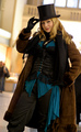
| 03/05/2006 06:30:48 PM | Nadineby glodaComment: *Critique Club*
Maybe it's just me, but between the darkness of the inside of the coat, the darkness of the shirt and the darkness of the pants, the actual clothing is almost hard to make out. I have to look really close and carefully to get any detail in the clothing itself. For this challenge, I think it would be good to have the clothing really clear in the photo. not sure if maybe a little front lighting would have helped this, or not, but maybe something to try.
I like the style, definately different, and definately fits the challenge of fashion.
Focus to me seems good. You mentioned softness, and if it is soft, it must work well, because it doesn't seem to affect the photo negatively at all.
Put me in the group that likes the angle you chose for this photo. I think it adds something to the photo and puts some personality on it.
The background is nicely blurred, but unfortunately the person in the background isn't obscured enough to not become a distraction. Wish there were some way you could have left that guy out. Otherwise though, the background is great. Nice compliment to the subject.
Overall nice for the challenge, and no major complaints.
~Heather~
| | Photographer found comment helpful. |
| 03/05/2006 06:12:23 PM | Gerbera Duoby sigrun_thComment: *Critique Club*
The first thing I notice about this is that the shot seems quite busy. The dots in the center with the lines of the petals almost seem to clash. Might not have been a big deal, but with the lack of color, the attention is automatically drawn to the textures of the photo making it seem busier than it probably actualyl is.
Focus is great. Nice detail. Almost too much actually.
The tonal range is good, but maybe a bit on the flat side. It all seems to be just about in the middle. There are nice darks, but not much brights/whites visible.
I like the way you have set the flower off to the side and didn't put it dead center of the photo. This adds a visual appeal to the image as a whole and sets it apart from 'just another flower shot'.
The lighting to me is also very nice. I like the way the shadows follow the petals down. Nice depth.
There is a spot of light in the background in the lower left corner which creates a bit of a distraction. Nothing totally serious, but something noticable.
Overall, fits the challenge by creating awesome detail in the flower, but leaving it a bit busy.
~Heather~ | | Photographer found comment helpful. |
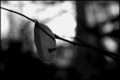
| 03/05/2006 05:50:57 PM | Last One Hangingby cfischlComment: *Critique Club*
Per your request, here is an in depth critique from the critique club. To me, the black and white treatment doesn't add anything to the photo. There are no textures that were enhanced, nothing for the lack of color to draw our eyes to and the overall photo seems too dark really.
The focus seems ok on the little leaf and the background is blurred nicely, but the dark areas of the background blend in too well with the dark coloring of the leaf, and kind of make the leaf have to compete for attention with the background.
Overall, the photo lacks interest. I'm not drawn into the photo and held there at all.
The shadow on the leaf is a distraction to me, unless you meant for that to be the main subject of the photo. Without much photographer's comments, it's hard to tell what your intentions were with this photograph.
The crop seems just a little too centered. I think I'd like for there to be a dramatic angle or something to add a bit of interest to the photo.
Maybe something to show us that he really is the last one hanging, or something to add to the story.
~Heather~
| | Photographer found comment helpful. |
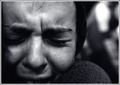
| 03/05/2006 03:34:01 PM | Anguishby bucketComment: *Critique Club*
The lack of comments on this one surprises me. Glad I get the opportunity to add my words here.
I looked at the photo, then read your comments. Without seeing the comments, it's hard to tell that we are looking at a girl in the embrace of another person. Not knowing this, makes the photo seem odd. It makes one question...why is the right (our left) side of her face chopped like that. Why is her shoulder up so high by her face? Those questions are answer by the comments. Thank you. However, for the photo to speak on it's own, I think maybe if we were to see a bit more of the scene, it would make a bit mroe sense to us. Back it up a bit and show a bit of the other person. I know I would personally like to see the whole mouth. There is much emotion there, and it's muted by the fact that it just dissapears off the edge of the photo.
You already know focus is softish. Bad lighting, handheld, once in a lifetime shot, you know what happened, and you know what could have made it better. No need to badger you about it.
The background works very well. Nothing distracting there. Blurred very nciely to keep the focus on the main subject.
I like the coloring of the photo as well. Nice tonal range and I think the choice you made enhances the feeling of sadness in the photo. Very good photo and editing for the challenge.
Overall, very emotional shot, good for the challenge, but I want to see just a bit more.
~Heather~ | | Photographer found comment helpful. |
Home -
Challenges -
Community -
League -
Photos -
Cameras -
Lenses -
Learn -
Help -
Terms of Use -
Privacy -
Top ^
DPChallenge, and website content and design, Copyright © 2001-2025 Challenging Technologies, LLC.
All digital photo copyrights belong to the photographers and may not be used without permission.
Current Server Time: 04/06/2025 09:50:09 PM EDT.
|